I want to talk to you today about declarative design. But before I get to that I want to talk to you about music.
I want to talk about two different approaches to musical composition. I want to compare and contrast.
Classical
On the one hand, I’ll take this man as an example. This is Wolfgang Amadeus Mozart, a classical composer. He’s got this amazing music in his head and he can get that down onto sheet music which is very specific, very accurate. You can note down what notes to play, how long to play each note for each instrument, even some instructions on how to play the music.
So very accurate, very specific. That’s one approach to to musical composition.
Jazz
The other approach is very different and I’m going to use this man as an example. This is Miles Davis, from the jazz side of things. And his approach to composition was very different to Mozart.
Take something like his classic album, Kind Of Blue. He comes into the studio with sketches, with maybe some scales and no rehearsal for the musicians. And what resulted was absolutely amazing!
Like So What?, the opening track. That’s where the instructions were literally “Let’s do 16 bars in D Dorian then another eight bars and D flat Dorian and go back to D Dorian eight bars.” That’s as much structure as there is. And what comes out is absolutely amazing.
So these are two different approaches to musical composition: the classical and the jazz approach. Very different styles.
I think there’s a corresponding kind of split that you can see in the world of programming. You can divide programming into two different categories as well.
Imperative programming
On the one hand you’ve got imperative programming. Most programming languages are imperative programming languages. This is where you describe step-by-step what the computer should do. You give it clear instructions. Very specific. This makes it very powerful. It makes it general purpose. Maybe hard to learn because there’s a lot you have to understand before you can write those instructions.
Classic pseudo-code for an imperative language would be something like this. These step-by-step instructions:
- create an array of stuff,
- loop through each item,
- check to see if a condition is true,
- return the result.
You’ve got arrays and loops and ifs and else’s and returns: all the classic bits that go into general purpose imperative programming languages.
Declarative programming
The other category of programming language is declarative programming. This is where you don’t give step-by-step instructions to the computer. Instead you describe the outcome you want and you leave the implementation details to the to the language. You don’t describe the specific steps.
These are often domain-specific. They’re usually not general purpose languages and they’re probably less powerful than imperative languages. But on the other hand they may be easier to learn because you don’t have to get into all the the nitty-gritty that you do with an imperative programming language.
A classic example of a declarative programming language would be something like Structured Query Language or SQL. You describe what you want. You leave the details to the database. So you write something practically in English here:
select items from table where condition is true
Now it might be that under the hood the programming language is going to create an array of items, loop through each one, check if the condition is true and return the result but you don’t need to care about that. You don’t have to write those specific instructions. You describe the outcome you want.
Those are the two categories of programming language: imperative and declarative.
With that in mind let’s turn our attention to the medium where I work and I’m sure a lot of you do as well, which is the World Wide Web.
The World Wide Web
Let’s go back to the the birth of the World Wide Web, which is thanks to this gentleman. This is Sir Tim Berners-Lee working at CERN in the 1980s. He’s trying to solve the problem that there’s just so much information and how to manage it. So he writes this memo, this proposal. Information Management: A Proposal.
Terrible title, riddled with typos, incomprehensible diagrams and yet his supervisor Mike Sendall must have seen some some promise in it because he scrolled across the top:
vague but exciting.
This was March 1989. Tim Berners-Lee gets to go ahead to do that information management project which turns into the World Wide Web.
Now Tim Berners-Lee had some ideas about how to approach programming in general but also information management. He’s got design principles.
The principle of least power
For example, one of the principles he wants to adhere to is the principle of least power. The principle of least power states that:
for any given purpose, choose the least powerful language
…which sounds really counterintuitive. Why on Earth would I choose a less powerful language to accomplish what I want to do?
But this goes back to the declarative/imperative split, because the less powerful language may also be easier to learn, maybe more robust, less fragile.
HTML
He certainly puts that into practice when he creates HTML which is very much a declarative language. The classic case of a declarative language. It’s domain-specific. It’s for the web only.
Interestingly it’s fault-tolerant. By that I mean if you write some HTML and you make a mistake or you just type out an element that doesn’t even exist, the browser doesn’t throw an error . It doesn’t refuse to render any of the HTML that comes after that mistake. It just ignores what it doesn’t understand and carries on.
That actually turns out to be very powerful and I think maybe it’s only possible because HTML is a is a declarative language.
CSS
A couple of years later we get the next language on the web which is CSS. This is also a declarative language. It is also fault tolerant. If you’re writing CSS and you give the browser something it doesn’t understand it doesn’t choke on it. It just ignores it and carries on processing the style sheet. Again that’s very powerful.
But you might be thinking, “Hang on— CSS? Declarative? No no no, surely when I’m writing CSS I’m telling the computer exactly what to do? I’m telling the computer exactly how to style things.”
No. You’re not. It’s worth remembering with CSS you’re not telling the browser to do anything you’re making suggestions. Eric Meyer once said that every line of CSS is a suggestion to the browser. I think that’s worth bearing in mind.
Cascading HTML Style Sheets
Now CSS did not come from Tim Berners-Lee. The original proposal came from Håkon Wium Lie in an email in 1994. The original proposal was called Cascading HTML Style Sheets and he puts forward some ideas for how this could look.
h1.font.size = 24pt 100%
h2.font.size = 20pt 40%
This isn’t what we ended up with. You can see the syntax isn’t like the CSS today but you can kind of make sense of it. You can kind of understand what’s going on. I see this is setting the font size of all the H1s to 24 points and all the H2s to 20 points.
But hang on. What’s going on here with these percentages? 100? 40?
Well, what the percentages indicate is this early idea called influence in CSS where you as the author would basically specify how much do you care about this particular style. Like 100, I really want the H1s to be 24 points. But 40, I don’t care so much.
Influence
The idea was that that there were these competing concerns. There’s you, the author of the style sheet, the person making the website. There’s the browser itself which will have opinions in the user agent style sheets about how things should be styled. And really importantly, the user. The user should also have a say.
And this was the default in early browsers. You would have user style sheets—not user agent style sheets—user style sheets so the user could specify how they wanted things.
The idea with influence was that the browser would somehow hand-wavingly figure out exactly the right number to come up with. It obviously didn’t work. And we don’t have user style sheets anymore in any of the major browsers, which is a real shame. You can install browser extensions to do the same thing so it’s a bit of a power user feature, although if anyone’s played around with The Arc browser they’ve kind of got a similar thing. They call it boosts but it’s basically like user style sheets.
Preference queries
I do see almost a little bit of resurgence of this idea of influence though coming back into CSS. I see it in media queries level five where we have the so-called preference queries, where now the user can at least specify their preference, usually at the operating system level. Like I prefer reduced motion. I prefer reduced data. I prefer a dark color scheme.
Now it’s not quite the same as influence because it’s it’s up to us as developers to honor those preferences. But I like it because it’s again getting back to not thinking of CSS about giving precise instructions but it turns it into more of a dialogue with the user. Instead of the designer dictating their wishes upon all the users, it’s more like a conversation.
“What do you want? What do you care about?”
“Well, here’s what I care about. Let’s come to some kind of agreement.”
I like that. I think that’s good. I want to see more of that kind of dialogue happen on the web rather than just us dictating to users.
JavaScript
There’s one final language on the web. That’s JavaScript. That came along a few years later.
This is not a declarative language. This is an imperative language which makes it more powerful. You can do a lot more with JavaScript.
But JavaScript is not fault tolerant. In other words if you do make a mistake in your JavaScript or give the browser something it doesn’t understand it will stop at that point it will not parse any further. So it’s less resilient than HTML or CSS.
So this is what we have on the front end of the web. These three languages: HTML, CSS ,and JavaScript. Two declarative and fault-tolerant languages. One imperative language that isn’t fault tolerant.
Fault tolerance
I fell into a trap of thinking for a while “Oh, all declarative languages are fault-tolerant.” I guess I was seeing causation where there’s just correlation. That’s not true. You can absolutely make a declarative language that is not fault-tolerant.
In fact XML is a perfect example. The parsing instructions for XML say “if you see a mistake, stop: do not render anything; just quit right then.”
So not all declarative languages are fault tolerant. But I think we’re lucky on the web that the two we have are fault tolerant. I think that makes the web more accessible to people.
I think it would be very hard to make a fault-tolerant imperative language. It would be impossible to debug an imperative language if it just ignored what it didn’t understand and carried on.
This is kind of how I like to approach building on the web, in this order:
- the foundations of HTML for the structure,
- I’ll layer on my suggestions for styling with CSS and then, if I need to,
- I’ll reach for JavaScript to do the more powerful behavioral stuff.
Mindset
So in programming we’ve got these two approaches, these two categories of programming languages: imperative and declarative. But I think more importantly what we have is two different mindsets, two ways of approaching how you solve a problem: an imperative way and a declarative way. And the kind of mindset you have will probably influence the kind of languages you prefer, the kind of languages you gravitate towards.
Let’s take a a problem we’re trying to solve on on the web where we want to make a component, a button component.
How will we go about making this button component? Because a nice thing on the web is there’s no one way of doing things. You can do things however you like.
One approach would be a very imperative way. We reach straight for JavaScript. We’d have the bare minimum HTML, just a div or something. Throw in a bunch of event handlers to handle those clicks. Don’t forget you got to handle keyboard support as well. Got to make sure it’s accessible too so you’ll need to put in some ARIA roles and all that stuff.
So that’s one way to do it.
Or just use a freaking button element.
This would be the declarative approach.
So which approach would you go for?
Now I know what I would do. Mostly because I’m just lazy. I don’t want to have to do all this when I can do this. I’m absolutely going to reach for the declarative approach, which kind of reflects my general approach with client-side JavaScript on the web which is:
JavaScript should only do what only JavaScript can do.
That means if there’s a way of doing it in HTML or CSS, do it in HTML or CSS. Only reach for JavaScript when you when you absolutely need to.
(This is client-side Javascript I’m talking about here. When you’re doing something on a server do what you want. It’s a different environment. I’m talking about in the browser on the World Wide Web.)
Okay, so I know how I would do it. But I’m trying to understand why would anybody do this? Why would anybody reach for JavaScript immediately and do the over-engineered version?
I don’t want to just think “Oh, they don’t know what they’re doing!” That doesn’t feel right. I want to understand the mindset that’s going on.
I’m going to reach for a button element because I get so much for free. I get some styling for free but I can change it. I get interactivity for free. I get the keyboard support for free. It’s accessible by default. So if the browser gives you all the styling and behavior for free, why would you invent everything from scratch and reject that?
I think it’s about control.
Control
This goes back to that mindset. I think if you have this imperative mindset then control is probably a priority. You want to understand exactly how things work in precise step-by-step instructions. I feel like people with this imperative mindset, they’re probably coming from a computer science background where you’re used to specifying everything very precisely. And if that’s your attitude then those free stylings and behavior you get from the browser, those aren’t features— they’re bugs.
Because, well, what if there’s some unintended side effects? If you haven’t written it yourself how do you know how it’s going to behave in every situation? You don’t. Whereas if you invent everything from scratch it feels like you’ve got total control.
Declarative approaches can feel like giving up control: I’m going to leave the details to the web browser, I’m going to trust that the web browser handles the keyboard support and accessibility.
But I feel like this control comes at a cost. I’m not sure you really gain control. I think you get the feeling of control. But it always involves making assumptions, whereas a declarative mindset is about avoiding assumptions.
Assumptions
Let me illustrate what I mean. To illustrate this I’m going to use a declarative language but show you how the mindset could still be imperative.
Let’s say we’ve got a button and we want to style it so we’re going to use CSS, a declarative language. I might write some CSS like this:
button {
  font-size: 16px;
  padding-left: 16px;
}
Absolutely nothing wrong with the CSS. Font size 16 pixels, padding left 16 pixels, on a button. That’s fine.
But is that what I really mean?
When I say font-size: 16px do I really mean the default browser font size? (which is 16 pixels most of the time)
I could be more intentional about this. When I say 16 pixels what I mean is the default browser font size: one rem.
button {
  font-size: 1rem;
  padding-left: 1rem;
}
Now if the user changes their default font size my button will change accordingly. I’ve removed that assumption that the default browser font size is always going to be 16 pixels.
Actually when I say padding-left is one rem, do I really mean padding -*left*? Or do I mean the padding at the start of the text?
If that’s what I mean then I can say that. I can say padding-inline-start is one rem.
button {
  font-size: 1rem;
  padding-inline-start: 1rem;
}
Now inline-start is the same as left if it’s a left-to-right language like English. But I’m making an assumption that it’s going to be presented in a left-to-right language like English when I use padding-left.
This is again removing that assumption. I might not have any plans to translate my website myself, but users can translate my website. It’s more of that that two-way conversation with the user. If they want to do that, let’s allow them to do that. So again I’ve removed an assumption there.
But if I want to really get into a conversation with the user and how they come to me to look at this website I could start to adjust the font size to be relative to their browser width by using the the viewport width unit here: vw.
button {
  font-size: calc(0.5rem + 0.666vw);
  padding-inline-start: 1rem;
}
I throw it into a calc with a bit of rem. The reason I’m doing this is that if you just use viewport width then the font size can’t respond to changing. So mixing it up with a relative unit like this keeps it accessible; people can change their their font size.
But the point here is that the text in the button now could change depending on the browser width. I could do that with media queries but then you’d be jumping at these different break points. This keeps it fluid the whole time.
But maybe I’ve gone too far here. Because maybe at small sizes it’s going to get way too small and at large screen sizes is going to get way too big. That’s okay. I can put guard rails in place.
button {
  font-size: clamp(
    1rem,
    0.5rem + 0.666vw,
    1.5rem
  );
  padding-inline-start: 1rem;
}
We’ve got this clamp function in CSS. In the middle I’ve got the same declaration I had before( but I don’t even need to use calc when I use clamp) but what I’ve got on either side is like a minimum and a maximum: don’t ever go below one rem and don’t ever go above 1.5 rems. Let it flow in between those.
Now the truth is I probably wouldn’t do this on a button element. I’d probably want my whole interface to to respond like this. So I’d probably do it on the body and say let the font size adjust. It’s going to be relative to the the viewport but it’s never going to be lower than that it’s never going to be higher than that. And then you end up with an interface that just scales fluidly with font size.
Now I’ve kind of given up a lot of control here. Because if you were to ask me “What is the font size when the screen width is 1024 pixels wide?”my answer would be “I don’t know …but I know it’ll look good.”
I know that everything will be in proportion and I know it will never get too small and it’ll never get too big.
In a way I’m giving up control so that I can have more of that dialogue with the user, more of that conversation.
Utopia
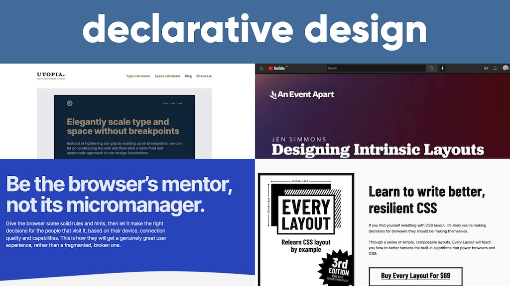
This idea of fluid typography—and fluid spacing as well—is what’s at the heart of a project called Utopia I highly encourage you to check out utopia.fyi
Full disclosure: Utopia started life at Clearleft, the agency I work at. It’s the work of Trys Mudford and James Gilyead.
It’s kind of like clamp on steroids. You set the boundary conditions. In this case it’s what type scale you want to use. And that type scale is probably going to be different for small screens than large screens. So you might say for small screens I want my type scale to be 1.2. That’s the the ratio. But on the large screen I want a larger type scale: 1.3.
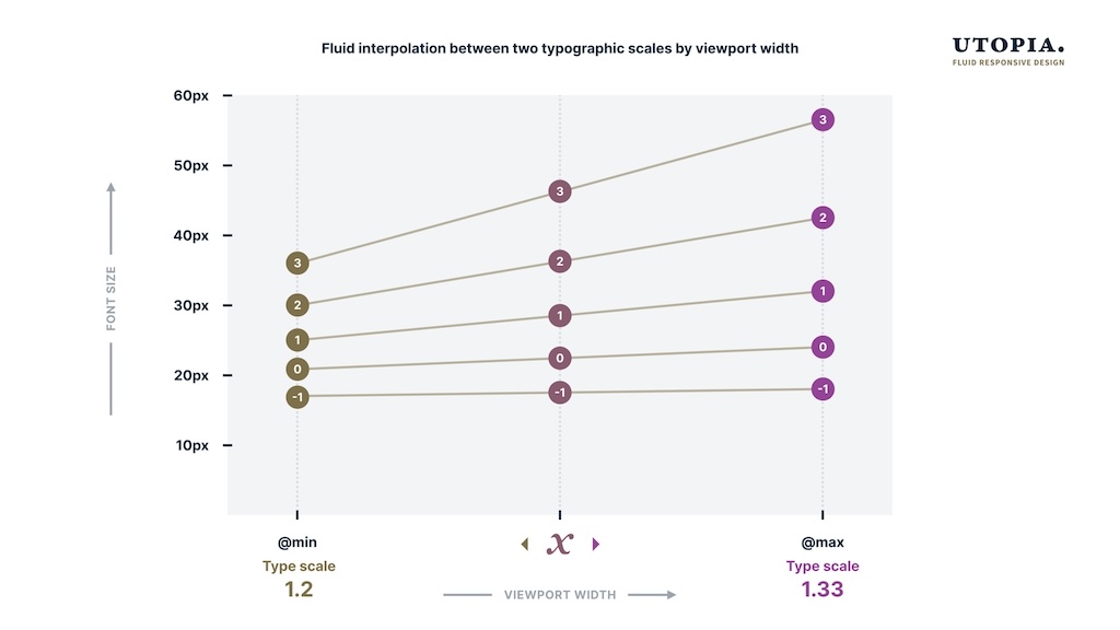
So you specify those those edges and then you let the browser figure it out. It does the calculations. Figures it out for you.
I like this diagram that James put together for it where it shows I designed the minimum and the maximum and then maths figured out the in-between. Handing over those controls.
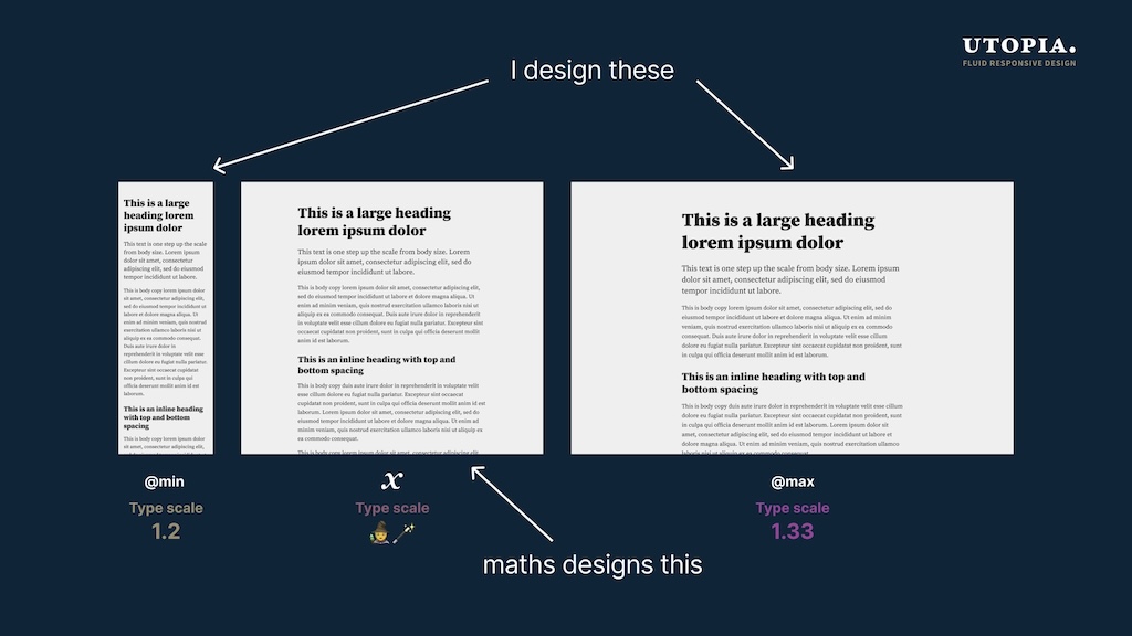
I think it’s this great use of machines and humans working together, doing what they’re best at. Because you got the human defining the boundary conditions, doing the design. And then handing over to the machine to do the calculations, to do the maths, which is what machines are good at.
You know when Steve Jobs described computers as a bicycle for the mind? I wonder can CSS be a bicycle for design? Where it’s amplifying design. You set the boundary conditions and then the browser does all the in-between.
Because CSS now is full of these functions that that work like this, where you give it the edges, you give it the boundary conditions and then it figures out the specifics. It does the calculations. It does the maths for you.
calc()
clamp()
min() and max()
fit-content
min-content and max-content
repeat()
minmax()
Intrinsic web design
This all opens up whole new ways of designing for the web that some people have been exploring. Jen Simmons in particular. She calls this intrinsic web design. She’s got a YouTube channel called Layout Land. It’s well worth checking out.
Watching her talks on this but I feel like it’s kind of got the same mindset that the Utopia project has: defined boundary conditions; let the browser figure out the specifics.
Be the browser’s mentor, not its micromanager
Every-Layout.dev is a project from Heydon Pickering and Andy Bell. It’s a book with various designs you can you can implement. Well worth checking out. I feel like the same mindset is there as well.
Even if you don’t buy the book it’s worth going to the website and reading the thinking behind it. If you go to the axioms there’s a quote there that says:
Instead of thinking of designing for the web as creating visual artifacts, think of it as writing programs for generating visual artifacts.
Declarative programs I would say.
Andy Bell,one of the guys behind that,he also built this website for a conference talk that’s called Build Excellent Websites. The talk was called “Be the browser’s mentor, not its micromanager”. Chef’s kiss! I think that is exactly what I’m trying to get at here:
Give the browser some solid rules and hints then let it make the right decisions for the people that visit it.
That’s exactly what I’m getting at!
Declarative design
So I feel like there’s something here. There’s this kind of declarative approach to design I’m trying to put my finger on and feel like they all share a mindset, a declarative mindset.
Now am I then saying that the the declarative approach is inherently better than the imperative approach?
The answer to that question is …it depends
…which is a bullshit answer. Anytime someone gives you this answer to a question you must follow up with the question, “it depends on what?”
Culture
In this case, whether the declarative approach is inherently better than an imperative approach depends on …culture, for one thing. The culture of the organization that’s producing the website, the culture of the organization that’s shipping.
Companies have different cultures which manifest in different ways, like management: how a company does management.
I think you could you could divide management into two categories like you can do with programming languages. There is a very imperative school of management where it’s all about measurements, it’s all about those performance reports, it’s all about metrics, time tracking. Maybe they install software on your machine to track how long you’ve been working. It’s all about measuring those outputs.
That’s one approach to management. Then there’s a more declarative approach, where you just care about the work getting done and you don’t care how people do it. So if they want to work from home, let them work from home. If they want to work strange hours, let them work strange hours. What do you care as long as the work gets done? This is more about giving people autonomy and trust
Now I know which approach I prefer and I would say at Clearleft we’ve definitely got a declarative approach. We give people lots of autonomy and trust.
That’s not always necessarily a good thing. If someone’s coming from an imperative background and on the first day of work is told “hey you’re a designer, you solve the problem; we’re not going to tell you what to do” people can really flounder if they’re not used to that level of autonomy and trust.
So again I’m not saying one is is right or wrong. I know which place I’d rather work at but I’m not saying one is is right and the other is wrong.
So companies have different cultures. There’s no one-size-fits-all way of thinking that will work for all company cultures.
Culture is one of those things that’s usually implicit and it’s unspoken. It’s rarely made explicit. It can be made explicit and one of the ways I think you can make a company culture explicit is through design systems.
Design systems
I know when normally we think of design systems we’re thinking of component libraries. We’re thinking of interface elements gathered together. To me that’s not what the design system is. My favorite definition of design systems comes from Jina Anne who knows a lot about design systems and she said that design systems are “the way we do things around here.”
I think focusing on those those components is maybe focusing on the the artifacts.
It will come as no surprise to you that I think you can kind of divide design systems into two categories. What are those categories? Imperative and declarative.
Before I look at how we divide design systems into imperative and declarative design systems I’m going to take a step back and talk about how we think about thinking.
I’m going to get meta here. And I don’t mean just on the web I mean how we approach problem solving as human beings.
Analytical thinking
I think there are two different ways historically to approach thinking and problem solving. One is analytical thinking. This isn’t new. This goes back centuries. This is what Emmanuel Kant was talking about in his critique of pure reason.
With analytical thinking you understand how something works by breaking it down into its constituent parts. This is what underpins the scientific method. It’s really, really useful for things that work exactly the same way everywhere in the universe: chemistry and physics and mathematics. I would say it’s probably not so great when you’re dealing with messy unpredictable things like human beings but analytical thinking has served us very, very well in our civilization.
Sytems thinking
On the other hand you’ve got systems thinking, which is almost the opposite of analytical thinking, where you understand the parts by looking at how they all work together as a whole.
To be very crude about it, analytical thinking is about zooming in and systems thinking is about zooming out.
So with that in mind let’s look at design systems.
Well the word “system” is right there in the title so surely what we’re talking about here is systems thinking, right?
Surprisingly most design systems to me seem to exhibit very analytical thinking: breaking things down into their constituent parts. Maybe you do an interface inventory; break things down into components, atoms, molecules.
It doesn’t have to be that way.
Let’s go back to our friend the button. Let’s say we’ve got our design system with a bunch of different button styles and you want to document this. That’ss what a design system for, right? Documenting the different styles you have.
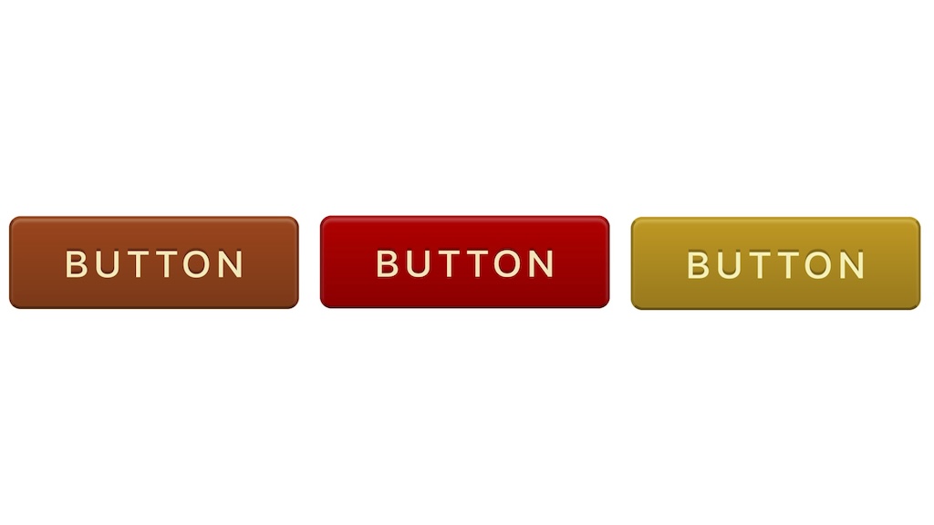
You can see these buttons have different background colours and different borders and one approach would be to document those colours. You put those in the design system. Maybe there’s nice tokens, right? And then when someone needs that information they go to the design system and they pluck out the colours. Done.
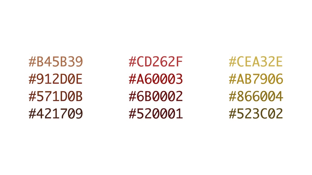
That’s one way of doing it. That’s a very imperative, very precise way of doing it.
The other way is to pull back and say “what’s the commonality across all these buttons?” And then you could come up with that rule, that boundary condition. which would be:
the border colour should be 10% lighter than the background colour.
You could convert this to CSS now using custom properties. We’re even gonna have a color-mix function in CSS.
But you see how this is a very different approach to just specifying what the final colours are.
So am I saying that when it comes to design systems a declarative approach is always better than an imperative approach?
I’m saying it depends.
“It depends on what?” you ask.
It depends on your team. It depends on their background and their mindset.
Teams
In a way it doesn’t matter whether you have a declarative or imperative mindset. What matters is what’s the mindset of the team working on this? That should dictate the approach you take.
When I hear someone say “design systems stifle creativity” what I’m hearing is “I’m a declarative designer and the design system is being very imperative, it’s fencing me in.”
But if you’re from an imperative background, “I need to know the color of the border for this button!” And if the design system says “well, you should make the border 10% lighter than the background,” that’s not useful—“Just give me the colors!” That’s the mindset I’ve got: “don’t make me think; just give me the data!”
I was I was talking about composers and I was comparing Mozart and Miles Davis. But let’s also compare their teams.
Classical musicians, they’re trying to sight read. It’s like a superpower they have. Whereas jazz musicians are trained to improvise. That’s their superpower.
With classical musicians, they could play a whole new piece of music without ever having heard it just from sight, which is absolutely amazing. But if Miles Davis had tried to record Kind Of Blue with a bunch of classical musicians I think it would have turned out very, very differently.
And then there’s the process, the design process.
The design process
I struggle with the design process on the web. I assume everyone does.
Jason Grigby has been blogging about this on the Cloud Four blog. The very first post in the series is Traditional Website process is Fundamentally Broken. I think we’d share that frustration.
He shows the traditional sort of very waterfall-y process that happens a lot, where particularly you’ve got this handover stage. The design all happens on this side of the handover and the development all happens on that side of the handover.
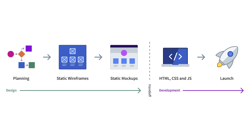
I think we can all agree that’s not good. That’s not going to lead to a great result.
He proposes something more like this, that goes backwards and forwards in time and also intertwingling design and development. And that’s that’s clearly better.
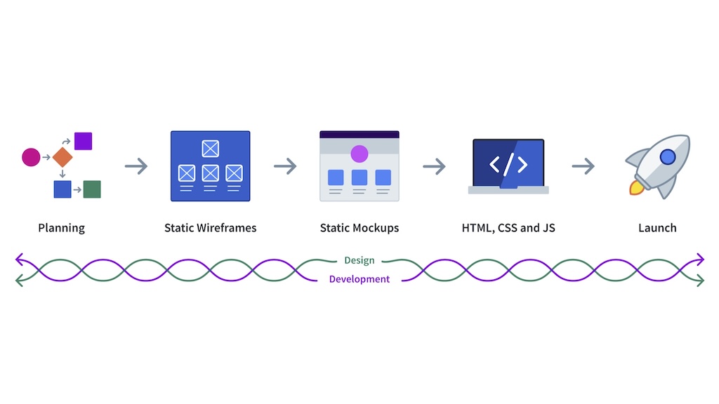
I still think there’s an issue here. Right here in the middle. Static mock-ups. Very precise, high-fidelity pictures of how something should look before you start actually building the thing.
Tools
Our tools tools influence us. They can’t help but do that.
We shape our tools and then our tools shape us.
Look at the tools we use for designing on the web. It used to be Photoshop and then it was Sketch. Now it’s Figma. Whatever it is, they’re very precise high-fidelity pixel-perfect tools. They’re very imperative. So we take imperative approach and then we try to translate it into a declarative language like CSS which is supposed to be about setting boundary conditions, leaving the browser to figure out the details.
There’s a mismatch there. So what’s the alternative?
We could jump straight to CSS, designing in the browser. Is that the answer? I’m not sure.
I like I like the phrase that Dan Mall uses which isn’t designing in the browser but deciding in the browser. He’s kind of talking about sign off . Instead of having something done in a mock-up and that’s what gets signed off, that’s the ideal we want and then you go to the browser. Instead do as much as you want in the in the design tool but that’s not the sign-off. You get it into the browser and at some point in the browser you go “Yes, that’s what we want” Sign off on that.
Now it’s already been translated into the the language of the browser so there isn’t going to be that disappointment with the traditional design process: the designer is disappointed because the end result doesn’t look like what they designed; the developer is disappointed because the designer did all this without consulting them; the client is disappointed; everybody is disappointed.
So I like the idea of deciding in the browser. But your approach to taking things into the browser sooner—maybe even designing in the browser—will depend entirely on your attitude to CSS.
If you’re from an imperative mindset you might think:
CSS is broken and I want my tools to work around the way that CSS has been designed.
Which is fair enough if you’re coming from that imperative mindset. I totally understand why you’d think that way. And there are tools to help you. This is pretty much what Tailwind does. Or CSS-in-JS. Treat the C in CSS as a bug and and work around. In that situation maybe you do want to stick to designing as much as possible in an imperative tool like Figma.
But if your mindset is more declarative you may think:
CSS is awesome and I want my tools to amplify the way that CSS has been designed.
Then, yeah, go check out Utopia, go check out those other websites I was talking about. Because that’s what they do. They go with the flow of CSS.
I’ve been saying “it depends”. It depends on your team. It depends on the culture of your company. You have to choose the approach that works best foryou and and your team. But to finish I want to point out one more thing that it depends on.
The medium
Choosing a declarative or an imperative approach to design also depends on the medium. The medium that you’re working in.
Now if you’re working in a medium that’s very precise like print or native apps, mobile or operating system specific apps for desktop, then you do actually have a lot of control. So an imperative approach might make a lot more sense. Those assumptions are maybe justified because you’ve got such a tightly controlled environment. So in that situation, yeah, go for it— be like Mozart; take the imperative approach.
But I don’t think that maps very well to the World Wide Web.
I think on the World Wide Web you want to be more Miles. You want to be more declarative.
We’ve tried them the past on the World Wide Web to shoehorn in an imperative mindset, to say “Well, let’s say things are really defined—let’s make assumptions about, you know, how wide everybody’s screen is.”
I’m showing my age here but when I started making websites, the assumption was everybody’s screen is 640 pixels wide. Later on it was 800 pixels wide. 1024.
Then mobile phones came along and everybody shat the bed because they didn’t know what they were supposed to do.
You understand why designers were doing this. It was to try and feel that sense of control. But it was always an illusion of control. It was a consensual hallucination to say “Yes, everybody’s screen is 800 pixels wide.” It doesn’t match with the reality, the messy beautiful reality of the World Wide Web.
To paraphrase the senator from Alderaan:
The more you tighten your grip, the more the World Wide Web slips through your fingers.
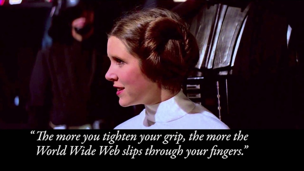
People have been talking about this for a long time. There’s an article called A Dao of Web Design by John Alsopp. It was published in 2000. 23 years ago it still holds up today. I recommend going back and reading it.
It was all about rejecting assumptions. Assumptions about devices. Assumptions about browsers. Assumptions about networks. Assumptions about people.
Look, you don’t have control over how people access the web. And that’s okay. That’s that’s not a bad thing.
Ten years after John published A Dao Of Web Design on A List Apart, Ethan Marcotte published Responsive Web Design on A List Apart. And the first thing he does in this article is he quotes John Allsopp’s A Dao Of Web Design. He was building on top of it. It was the same approach, the same mindset that was behind responsive web design.
That was 2010. And now, are we in a new era? Is it time for the next phase? A new era of declarative design maybe?
That’s up to you.
CSS is an incredibly powerful tool now. So let’s use it. Let’s lean into the the fluid, ever-changing nature of the World Wide Web.
It is a very very exciting time for design on the web right now and I can’t wait to see what you build.
