Chery Logo
Tags: cars that start with c | China cars | Silver Car Brands
The company entered the markets in 1997. Chery is owned by the Chinese government and when it comes to production volume it is among the top ten biggest car makers behind a huge wall. And when it comes to exports, it’s number 1.
Meaning and History
Chery logo symbolism, like many others, consists of the name of the company and the city in which the cars are produced.
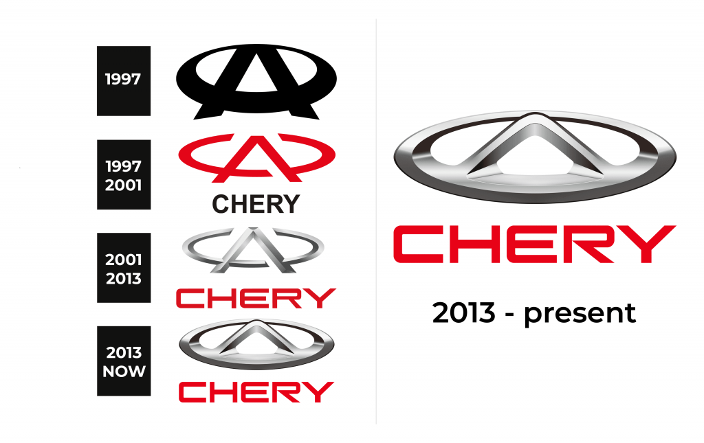
1997 (prelaunch)

Even before the brand was launched, the company has already determined its signature logo look. Of course, it was improved but the idea of a capital “A” and an oval shape that blends with the horizontal bar of the letters was born in early 1997. Originally, the designers stayed on the safer side and went for a classic, timeless color black. The original logo also featured thicker lines, which created a bolder look. As seen in the later versions, a more refined, elegant appearance gave the brand a more sophisticated feel.
1997 – 2001
The logo has several meanings. For example, the letter A is part of the abbreviation SAS, and the symbol of the place of foundation of the company (Anhui province), and the modified Chinese character “人”, which means “people”, and the designation “first class”, that is, a symbol of high quality cars. Letters C, as if enclosing A in an embrace, symbolize endless development, unity and strength.
2001 – 2013
The company logo has a three-dimensional shape. At the top is a symbol consisting of an inverted “C” (the first letter of the company name) and the letter “A”, which is inside the letter “C” and crosses out its outline. This letter stands for Anhui – the name of the city in which the production is localized. The badge is made in silver color. Beneath it is the name of the company, written in strong, sans-serif type in red capital letters.
2013 – 2023
In 2013, the logo was slightly modernized. The letter “C” is now connected in an ellipse shape. The letter “A” is clearly inscribed within the boundaries of the ellipse. Chiaroscuro was also improved, the icon became a little larger, and the text color became more crimson. The letter “R” in the title has also been slightly changed.
2023 – Today
In 2023 the Chery brand has created a more progressive version of its logo. Now it is a minimalistic black-and-white badge with no gradients or three-dimensional elements. The lettering was rewritten in a super cool and edgy sans-serif typeface with sharpened ends of the medium-thick bars. The top part of the “R”s vertical bar is erased, which only elevates the feeling of strength and determination, evoked by the style of the inscription.
Emblem and Symbol
The logo emblem is mainly composed of a silver color that comes out of gray, expresses a desire for freedom and an attempt to overcome all limitations. The font used and the color of the company name reflect the company’s desire not to believe in the effectiveness of the struggle, but to go and take what it wants. In 2013, the emblem took the form of an ellipse for a reason, as this symbol perfectly complements the main ideas of the company and is associated with dynamics, pressure, striving for the future and innovation. This geometric shape is often used by designers.


