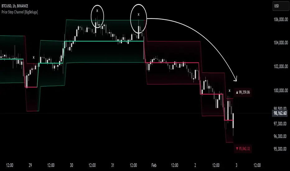
Price Step Channel [BigBeluga]Price Step Channel is designed to provide a structured look at price trends through a dynamic step line channel, highlighting trend direction and volatility boundaries.
🔵 Key Features:
Step Line with Boundaries: The central step line adjusts with price movements, creating upper and lower boundaries based on price volatility. The channel is green during uptrends and red during downtrends, visually signaling the trend’s direction.
Fakeout Markers: "✖" markers identify potential fakeouts—moments when the price breaches the channel boundary without confirming a trend change. These markers help you spot possible mean reversion points.
Dynamic Boundary Labels: Labels at the end of the channel show the price levels of the upper and lower boundaries. In uptrends, the upper label turns green; in downtrends, the lower label turns red, providing an instant read on the trend's direction.
Customizable Display: You can toggle off the boundaries and labels for a cleaner view, focusing only on the step line and its color-coded trend signals.
🔵 When to Use:
Price Step Channel is ideal for traders looking to follow structured trends with defined volatility boundaries. The step line and color-coded channel provide clear trend insights, while the fakeout markers and customizable display options enhance flexibility in different market conditions. Whether you’re focusing on clean trend signals or detailed boundary interactions, this tool adapts to your style.
Analyse de la tendance
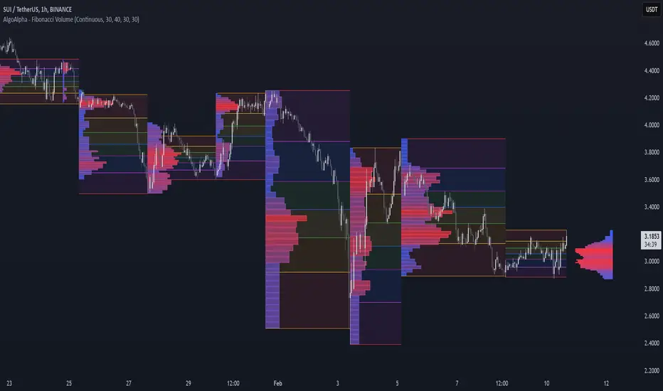
Fibonacci Volume Profiles [AlgoAlpha]Unlock a deeper understanding of price action with the Fibonacci Volume Profiles indicator by AlgoAlpha! This powerful tool blends Fibonacci retracement levels with customizable volume profiles, helping traders identify high-probability areas of support, resistance, and accumulation. Designed for both continuous dynamic levels and custom time periods, this indicator is a must-have for traders seeking confluence in market structure analysis.
🔑 Key Features
📈 Dual Mode Selection : Choose between Continuous Fibonacci levels, which adapt dynamically to pivots, or a Custom Period mode, where you set your own start and end points.
📊 Integrated Volume Profile : Visualize volume distributions at key Fibonacci retracement levels, revealing areas of strong buying/selling interest.
🎨 Customizable Colors & Transparency : Adjust Fibonacci level colors, fill zones, and profile transparency for a visually clear experience.
🔍 Profile Resolution & Scaling : Control the number of price levels and width of the volume profile for detailed market insights.
🛠 Extendable Levels : Optionally extend Fibonacci levels to the right of the chart for better visualization of future price interaction.
📌 How to Use
Add the Indicator: Click on the star icon to add it to your favorites and apply it to your TradingView chart.
Analyze The Market: Observe how price interacts with Fibonacci levels alongside the volume profile to confirm support/resistance zones. Switch between custom range or continuous mode to align the tool with your trading style.
⚙️ How It Works
The indicator calculates pivot highs/lows dynamically (or uses user-defined time periods) to plot Fibonacci retracement levels. It then builds a volume profile by analyzing historical volume data, grouping it into price bins to highlight volume-heavy zones. The Point of Control (PoC) is identified as the level with the highest traded volume, acting as a key price magnet. The color-coded Fibonacci levels help traders spot retracement zones, while the volume profile confirms strength or weakness in those areas.
KEMAD | QuantumResearchQuantumResearch KEMAD Indicator
The QuantumResearch KEMAD Indicator is a sophisticated trend-following and volatility-based tool designed for traders who demand precision in detecting market trends and price reversals. By leveraging advanced techniques implemented in PineScript, this indicator integrates a Kalman filter, an Exponential Moving Average (EMA), and dynamic ATR-based deviation bands to produce clear, actionable trading signals.
1. Overview
The KEMAD Indicator aims to:
Reduce Market Noise: Employ a Kalman filter to smooth price data.
Identify Trends: Use an EMA of the filtered price to define the prevailing market direction.
Set Dynamic Thresholds: Adjust breakout levels with ATR-based deviation bands.
Generate Signals: Provide clear long and short trading signals along with intuitive visual cues.
2. How It Works
A. Kalman Filter Smoothing
Purpose: The Kalman filter refines the selected price source (e.g., close price) by reducing short-term fluctuations, thus offering a clearer view of the underlying price movement.
Customization: Users can adjust key parameters such as:
Process Noise: Controls the filter’s sensitivity to recent changes.
Measurement Noise: Determines how responsive the filter is to incoming price data.
Filter Order: Sets the number of data points considered in the smoothing process.
B. EMA-Based Trend Detection
Primary Trend EMA: A 25-period EMA is applied to the Kalman-filtered price, serving as the core trend indicator.
Signal Mechanism:
Long Signal: Triggered when the price exceeds the EMA plus an ATR-based upper deviation.
Short Signal: Triggered when the price falls below the EMA minus an ATR-based lower deviation.
C. ATR Deviation Bands
ATR Utilization: The Average True Range (ATR) is computed (default length of 21) to assess market volatility.
Dynamic Thresholds:
Upper Deviation: Calculated by adding 1.5× ATR to the EMA (for long signals).
Lower Deviation: Calculated by subtracting 1.1× ATR from the EMA (for short signals).
These bands adapt to current volatility, ensuring that signal thresholds are both dynamic and market-sensitive.
3. Visual Representation
The indicator’s design emphasizes clarity and ease of use:
Color-Coded Bar Signals:
Green Bars: Indicate bullish conditions when a long signal is active.
Red Bars: Indicate bearish conditions when a short signal is active.
Trend Confirmation Line: A 54-period EMA is plotted to further validate trend direction. Its color dynamically changes to reflect the active trend.
Background Fill: The space between a calculated price midpoint (typically the average of high and low) and the EMA is filled, visually emphasizing the prevailing market trend.
4. Customization & Parameters
The KEMAD Indicator is highly configurable, allowing traders to tailor the tool to their specific trading strategies and market conditions:
ATR Settings:
ATR Length: Default is 21; adjusts sensitivity to market volatility.
EMA Settings:
Trend EMA Length: Default is 25; smooths price action for trend detection.
Confirmation EMA Length: Default is 54; aids in confirming the trend.
Kalman Filter Parameters:
Process Noise: Default is 0.01.
Measurement Noise: Default is 3.0.
Filter Order: Default is 5.
Deviation Multipliers:
Long Signal Multiplier: Default is 1.5× ATR.
Short Signal Multiplier: Default is 1.1× ATR.
Appearance: Eight customizable color themes are available to suit individual visual preferences.
5. Trading Applications
The versatility of the KEMAD Indicator makes it suitable for various trading strategies:
Trend Following: It helps identify and ride sustained bullish or bearish trends by filtering out market noise.
Breakout Trading: Detects when prices move beyond the ATR-based deviation bands, signaling potential breakout opportunities.
Reversal Detection: Alerts traders to potential trend reversals when price crosses the dynamically smoothed EMA.
Risk Management: Offers clearly defined entry and exit points, based on volatility-adjusted thresholds, enhancing trade precision and risk control.
6. Final Thoughts
The QuantumResearch KEMAD Indicator represents a unique blend of advanced filtering (via the Kalman filter), robust trend analysis (using EMAs), and dynamic volatility assessment (through ATR deviation bands).
Its PineScript implementation allows for a high degree of customization, making it an invaluable tool for traders looking to reduce noise, accurately detect trends, and manage risk effectively.
Whether used for trend following, breakout strategies, or reversal detection, the KEMAD Indicator is designed to adapt to varying market conditions and trading styles.
Important Disclaimer: Past data does not predict future behavior. This indicator is provided for informational purposes only; no indicator or strategy can guarantee future results. Always perform thorough analysis and use proper risk management before trading.

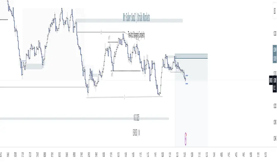
Turtle Soup Model [PhenLabs]📊 Turtle Soup Model
Version: PineScript™ v6
Description
The Turtle Soup Model is an innovative technical analysis tool that combines market structure analysis with inter-market comparison and gap detection. Unlike traditional structure indicators, it validates market movements against a comparison symbol (default: ES1!) to identify high-probability trading opportunities. The indicator features a unique “soup pattern” detection system, comprehensive gap analysis, and real-time structure breaks visualization.
Innovation Points:
First indicator to combine structure analysis with gap detection and inter-market validation
Advanced memory management system for efficient long-term analysis
Sophisticated pattern recognition with multi-market confirmation
Real-time structure break detection with comparative validation
🔧 Core Components
Structure Analysis: Advanced pivot detection with inter-market validation
Gap Detection: Sophisticated gap identification and classification system
Inversion Patterns: “Soup pattern” recognition for reversal opportunities
Visual System: Dynamic rendering of structure levels and gaps
Alert Framework: Multi-condition notification system
🚨 Key Features 🚨
The indicator provides comprehensive analysis through:
Structure Levels: Validated support and resistance zones
Gap Patterns: Identification of significant market gaps
Inversion Signals: Detection of potential reversal points
Real-time Comparison: Continuous inter-market analysis
Visual Alerts: Dynamic structure break notifications
📈 Visualization
Structure Lines: Color-coded for highs and lows
Gap Boxes: Visual representation of gap zones
Inversion Patterns: Clear marking of potential reversal points
Comparison Overlay: Inter-market divergence visualization
Alert Indicators: Visual signals for structure breaks
💡Example
📌 Usage Guidelines
The indicator offers multiple customization options:
Structure Settings:
Pivot Period: Adjustable for different market conditions
Comparison Symbol: Customizable reference market
Visual Style: Configurable colors and line widths
Gap Analysis:
Signal Mode: Choice between close and wick-based signals
Box Rendering: Automatic gap zone visualization
Middle Line: Reference point for gap measurements
✅ Best Practices:
🚨Use comparison symbol from related market🚨
Monitor both structure breaks and gap inversions
Combine signals for higher probability trades
Pay attention to inter-market divergences
⚠️ Limitations
Requires comparison symbol data
Performance depends on market correlation
Best suited for liquid markets
What Makes This Unique
Inter-market Validation: Uses comparison symbol for signal confirmation
Gap Integration: Combines structure and gap analysis
Soup Pattern Detection: Identifies specific reversal patterns
Dynamic Structure Management: Automatically updates and removes invalid levels
Memory-Efficient Design: Optimized for long-term chart analysis
🔧 How It Works
The indicator processes market data through three main components:
1. Structure Analysis:
Detects pivot points with comparison validation
Tracks structure levels with array management
Identifies and processes structure breaks
2. Gap Analysis:
Identifies significant market gaps
Processes gap inversions
Manages gap zones visualization
3. Pattern Recognition:
Detects “soup” patterns
Validates with comparison market
Generates structure break signals
💡 Note: The indicator performs best when used with correlated comparison symbols and appropriate timeframe selection. Its unique inter-market validation system provides additional confirmation for traditional structure-based trading strategies.
Fractal Breakout Oscillator (BETA)Fractal Breakout Oscillator (BETA)
This custom indicator is designed to help traders identify local tops and local bottoms using fractal analysis, price distance, and trend direction. It combines weighted components to generate the Fractal Breakout Oscillator (FBO). The oscillator reacts to extreme levels in price and trend behavior, with the ability to adjust sensitivity and smoothing parameters.
Components and Usage
1. Fractal Detection:
o Detects fractal tops and bottoms using a 3-bar pattern.
o The number of fractals averaged can be adjusted with the Fractals for Average parameter.
2. Oscillator Calculation:
o Combines price distance, trend direction, and fractal frequency using adjustable weights.
o Use the sensitivity control to tune how strictly the fractal signals respond.
o Extreme values of the oscillators indicate potential overbought or oversold conditions.
3. Customization:
o Customize top/bottom marker colors.
o Enable multipliers (e.g., Golden Ratio) to refine component behavior.
o Adjust smoothing periods and lookback to improve signal reliability.
Disclaimer
This indicator is provided for educational and research purposes only. It should not be considered as financial or trading advice. Always perform your own analysis and consult a financial advisor before making trading decisions. Past performance does not guarantee future results.

Order Block Forex Trading 4.0Order Block Forex Trading 4.0-Order Block Forex Trading 4.0-Order Block Forex Trading 4.0-Order Block Forex Trading 4.0-Order Block Forex Trading 4.0-Order Block Forex Trading 4.0-Order Block Forex Trading 4.0-Order Block Forex Trading 4.0-Order Block Forex Trading 4.0-Order Block Forex Trading 4.0

Aggressive Options Trade Strategy - CALLS (2025+) ASalehThis strategy is designed to trade CALL options using a combination of momentum, trend confirmation, and risk management techniques. It ensures early entries into strong uptrends while holding positions longer and exiting only when the trend weakens significantly.

Dynamic SL - 1 Pip (Up and Down)The Dynamic SL - 1 Pip Up and Down indicator creates two dynamic lines that follow the price at a distance of 1 pip above and below the closing price. This feature can be particularly useful for traders who want to visualize small stop-loss (SL) levels or track price movement in a highly responsive manner.
Unlike traditional stop-loss indicators, this script ensures that the lines only last for 5 seconds, keeping the chart clean and focusing only on the most relevant price movement.
Key Features
✔ Dynamic Stop-Loss Visualization:
The script draws a green line above the price (+1 pip).
A red line below the price (-1 pip) is also drawn.
✔ Auto-Clearing for a Clean Chart:
Each line lasts for 5 seconds only before automatically disappearing.
This prevents unnecessary clutter on the chart and ensures only the latest price movements are visualized.
✔ Adaptable to Multiple Assets:
Automatically calculates the pip size based on the instrument type:
Forex → Uses 0.0001 per pip.
Futures & Stocks → Uses the minimum tick size.
✔ Ideal for High-Frequency Traders & Scalpers:
Designed for 1-minute (M1) or lower timeframes where traders need to monitor price action closely.
Helps visualize ultra-tight stop-loss levels in scalping strategies.
Pipstocrat Market Participant Analysis📊 Pipstocrat Market Participant Analysis (MPA) Indicator
🔍 Uncover Market Intentions & Trade with Confidence
The MPA Indicator is a powerful sentiment tool that reveals the activity of different trader groups, helping you identify smart money movements, retail traps, and liquidity shifts.
📌 Who’s in Control?
🟠 Retail Traders (Gray) – Typically react late and move against institutional trends.
🔵 Hot Money (Blue/Orange) – Short-term aggressive traders who create liquidity spikes.
🟢 Smart Money (Green/Red) – Institutional traders who drive the market’s real direction.
Using RSI-based calculations, volume confirmation, and engulfing patterns, the MPA indicator highlights key liquidity zones and price exhaustion points.
⚡ Key Features
✅ Multi-Layered Market Analysis – Distinguish between retail speculation and institutional positioning.
✅ 🔥 Engulfing Volume Detection – Identifies high-volume bullish & bearish engulfing bars.
✅ 🎨 Dynamic Coloring – Histogram bars adapt based on market conditions.
✅ 🏦 Institutional vs. Retail Activity – Understand liquidity flow and market bias.
✅ 📏 Support, Neutral & Resistance Levels – Levels 5, 10, and 15 mark liquidity exhaustion zones.
✅ 🔍 Volume-Weighted Movements – Ensures signals align with actual liquidity shifts.
✅ 🎛️ Customizable Settings – Adjust transparency, background color, and visibility.
📈 How to Use MPA for Trading
🔹 Identify Smart Money Activity
🟢 Green → Institutions are accumulating (bullish bias).
🔴 Red → Institutions are distributing (bearish bias).
🔹 Spot Liquidity Grabs with Hot Money
🔵 Blue (Bullish Spike) → Short-term upside pressure (possible pullback before continuation).
🟠 Orange (Bearish Spike) → Short-term downside pressure (possible retracement).
🔹 Engulfing Volume Confirmation
📈 Bullish Engulfing + High Volume → Possible buy signal if in confluence with Smart Money accumulation.
📉 Bearish Engulfing + High Volume → Possible sell signal if institutions are distributing.
🔹 Use Key Support & Resistance Levels
🔹 Level 5 → Minor liquidity zone, watch for price reactions.
🔸 Level 10 → Neutral ground – Wait for a breakout confirmation.
🔺 Level 15 → Strong liquidity area; potential reversal zone.
🚀 Why MPA is a Game-Changer?
⚡ Avoid Retail Traps – Follow the money, not the herd.
🎯 Improve Entry Timing – Identify high-probability liquidity-driven setups.
🔍 Enhance Confluence – Works well with ICT, SMC, or any smart money strategy.
❌ Eliminate Noise – Focus on real market dynamics, not lagging indicators.
🔥 **Maximize Your Edge – Trade with Market Knowledge. 🔥
💾 Save, Share & Add to Favorites if you find MPA useful!

Triad Trade MatrixOverview
Triad Trade Matrix is an advanced multi-strategy indicator built using Pine Script v5. It is designed to simultaneously track and display key trading metrics for three distinct trading styles on a single chart:
Swing Trading (Swing Supreme):
This mode captures longer-term trends and is designed for trades that typically span several days. It uses customizable depth and deviation parameters to determine swing signals.
Day Trading (Day Blaze):
This mode focuses on intraday price movements. It generates signals that are intended to be executed within a single trading session. The parameters for depth and deviation are tuned to capture more frequent, shorter-term moves.
Scalping (Scalp Surge):
This mode is designed for very short-term trades where quick entries and exits are key. It uses more sensitive parameters to detect rapid price movements suitable for scalping strategies.
Each trading style is represented by its own merged table that displays real-time metrics. The tables update automatically as new trading signals are generated.
Key Features
Multi-Style Tracking:
Swing Supreme (Large): For swing trading; uses a purple theme.
Day Blaze (Medium): For day trading; uses an orange theme.
Scalp Surge (Small): For scalping; uses a green theme.
Real-Time Metrics:
Each table displays key trade metrics including:
Entry Price: The price at which the trade was entered.
Exit Price: The price at which the previous trade was exited.
Position Size: Calculated as the account size divided by the entry price.
Direction: Indicates whether the trade is “Up” (long) or “Down” (short).
Time: The time when the trade was executed (formatted to hours and minutes).
Wins/Losses: The cumulative number of winning and losing trades.
Current Price & PnL: The current price on the chart and the profit/loss computed relative to the entry price.
Duration: The number of bars that the trade has been open.
History Column: A merged summary column that shows the most recent trade’s details (entry, exit, and result).
Customizability:
Column Visibility: Users can toggle individual columns (Ticker, Timeframe, Entry, Exit, etc.) on or off according to their preference.
Appearance Settings: You can customize the table border width, frame color, header background, and text colors.
History Toggle: The merged history column can be enabled or disabled.
Chart Markers: There is an option to show or hide chart markers (labels and lines) that indicate trade entries and exits on the chart.
Trade History Management:
The indicator maintains a rolling history (up to three recent trades per trading style) and displays the latest summary in the merged table.
This history column provides a quick reference to recent performance.
How It Works
Signal Generation & Trade Metrics
Trade Entry/Exit Calculation:
For each trading style, the indicator uses built-in functions (such as ta.lowestbars and ta.highestbars) to analyze price movements. Based on a customizable "depth" and "deviation" parameter, it determines the point of entry for a trade.
Swing Supreme: Uses larger depth/deviation values to capture swing trends.
Day Blaze: Uses intermediate values for intraday moves.
Scalp Surge: Uses tighter parameters to pick up rapid price changes.
Metrics Update:
When a new trade signal is generated (i.e., when the trade entry price is updated), the indicator calculates:
The current PnL as the difference between the current price and the entry price (or vice versa, depending on the trade direction).
The duration as the number of bars since the trade was opened.
The position size using the formula: accountSize / entryPrice.
History Recording:
Each time a new trade is triggered (i.e., when the entry price is updated), a summary string is created (showing entry, exit, and win/loss status) and appended to the corresponding trade history array. The merged table then displays the latest summary from this history.
Table Display
Merged Table Structure:
Each trading style (Swing Supreme, Day Blaze, and Scalp Surge) is represented by a table that has 15 columns. The columns are:
Trade Type (e.g., Swing Supreme)
Ticker
Timeframe
Entry Price
Exit Price
Position Size
Direction
Time of Entry
Account Size
Wins
Losses
Current Price
Current PnL
Duration (in bars)
History (the latest trade summary)
User Customization:
Through the settings panel, users can choose which columns to display.
If a column is toggled off, its cells will remain blank, allowing traders to focus on the metrics that matter most to them.
Appearance & Themes:
The table headers and cell backgrounds are customizable via color inputs. The trading style names are color-coded:
Swing Supreme (Large): Uses a purple theme.
Day Blaze (Medium): Uses an orange theme.
Scalp Surge (Small): Uses a green theme.
How to Use the Indicator
Add the Indicator to Your Chart:
Once published, add "Triad Trade Matrix" to your TradingView chart.
Configure the Settings:
Adjust the Account Size to match your trading capital.
Use the Depth and Deviation inputs for each trading style to fine-tune the signal sensitivity.
Toggle the Chart Markers on if you want visual entry/exit markers on the chart.
Customize which columns are visible via the column visibility toggles.
Enable or disable the History Column to show the merged trade history in the table.
Adjust the appearance settings (colors, border width, etc.) to suit your chart background and preferences.
Interpret the Tables:
Swing Supreme:
This table shows metrics for swing trades.
Look for changes in entry price, PnL, and trade duration to monitor longer-term moves.
Day Blaze:
This table tracks day trading activity.It will update more frequently, reflecting intraday trends.
Scalp Surge:
This table is dedicated to scalping signals.Use it to see quick entry/exit data and rapid profit/loss changes.
The History column (if enabled) gives you a snapshot of the most recent trade (e.g., "E:123.45 X:124.00 Up Win").
Use allerts:
The indicator includes alert condition for new trade entries(both long and short)for each trading style.
Summary:
Triad Trade Matrix provides an robust,multi-dimensional view of your trading performance across swing trading, day trading, and scalping.
Best to be used whith my other indicators
True low high
Vma Ext_Adv_CustomTbl
This indicator is ideal for traders who wish to monitor multiple trading styles simultaneously, with a clear, technical, and real-time display of performance metrics.
Happy Trading!


NK Paid All in one 1Jan25Time frame 3miniute
Buy: candle close above the green , purple and black line
Sell : candle close below the red, purple and black line

Maverick Henderson Indicadores
Maverick Henderson Indicators
A comprehensive technical analysis tool designed to complement the Maverick Henderson trading strategy. This multi-dimensional indicator combines several advanced technical analysis techniques:
Volume Profile Analysis
RSI Divergence Detection
Momentum Oscillator
ADX Trend Strength
Stochastic Oscillator
Advanced Swing Detection
Key Features:
Adaptive EMA tracking (10, 50, 100, 200 periods)
Squeeze Momentum indicator
Dynamic trend strength assessment
Multiple oscillator divergence detection
Customizable settings for precise market analysis
Ideal for traders seeking a holistic view of market conditions and trend potential.
// ═══════════════════════════════════════════════════════════
Indicadores Maverick Henderson
Una herramienta de análisis técnico integral diseñada para complementar la estrategia de trading Maverick Henderson. Este indicador multidimensional combina varias técnicas avanzadas de análisis técnico:
Análisis de Perfil de Volumen
Detección de Divergencias RSI
Oscilador de Momentum
Fuerza de Tendencia ADX
Oscilador Estocástico
Detección Avanzada de Oscilaciones
Características Principales:
Seguimiento adaptativo de EMA (períodos 10, 50, 100, 200)
Indicador de Momentum de Compresión
Evaluación dinámica de la fuerza de tendencia
Detección de múltiples divergencias de osciladores
Configuraciones personalizables para un análisis preciso del mercado
Ideal para traders que buscan una visión holística de las condiciones del mercado y el potencial de tendencia.

JS Powerits very cool and easy. with this script we have a look on ema20 and liquidity.
we buy and sell according to the alarms.

Wolfe HuntingIntroducing Wolfe Hunting , the ultimate all-in-one trading tool designed to supercharge your market analysis! This powerful Pine Script indicator helps you pinpoint significant price movements with customizable boxes, spot trends using a smooth SMA overlay, and visualize key swings with dynamic zigzag-like lines. Whether you're tracking volatility, identifying support and resistance levels, or confirming trends, Wolfe Hunting has you covered. With fully customizable colors, line weights, and sensitivity settings, this versatile indicator adapts to any trading style—be it day trading, swing trading, or long-term investing. Elevate your strategy today with Wolfe Hunting and turn complex market data into actionable insights, all while enjoying a sleek, user-friendly experience tailored just for you!

MMD Bands + Ema cloudsTwo indicators combining in one.
MMD magic clouds + Ema clouds
You can color space between SMA and MA to create cloud/ribbon

Blockchain Fundamentals: Global LiquidityGlobal Liquidity Indicator Overview
This indicator provides a comprehensive technical analysis of liquidity trends by deriving a Global Liquidity metric from multiple data sources. It applies a suite of technical indicators directly on this liquidity measure, rather than on price data. When this metric is expanding Bitcoin and crypto tends to bullish conditions.
Features:
1. Global Liquidity Calculation
Data Integration: Combines multiple market data sources using a ratio-based formula to produce a unique liquidity measure.
Custom Metric: This liquidity metric serves as the foundational input for further technical analysis.
2. Timeframe Customization
User-Selected Period: Users can select the data timeframe (default is 2 months) to ensure consistency and flexibility in analysis.
3. Additional Technical Indicators
RSI, Momentum, ROC, MACD, and Stochastic:
Each indicator is computed using the Global Liquidity series rather than price.
User-selectable toggles allow for enabling or disabling each individual indicator as desired.
4. Enhanced MACD Visualization
Dynamic Histogram Coloring:
The MACD histogram color adjusts dynamically: brighter hues indicate rising histogram values while darker hues indicate falling values.
When the histogram is above zero, green is used; when below zero, red is applied, offering immediate visual insight into momentum shifts.
Conclusion
This indicator is an enlightening tool for understanding liquidity dynamics, aiding in macroeconomic analysis and investment decision-making by highlighting shifts in liquidity conditions and market momentum.

Previous Day & Current Day Levels (PDH/PDL/CDH/CDL) Indicator🔥 A must-have tool for price action traders! 🔥
🔹 What This Indicator Does
This indicator automatically plots key price levels from the previous and current day:
✅ Previous Day High (PDH) & Previous Day Low (PDL) – Critical support and resistance levels.
✅ Current Day High (CDH) & Current Day Low (CDL) – Helps track intraday structure.
✅ Works on ALL Timeframes – Whether you're scalping or swing trading.
✅ Fully Customizable – Change colors, line thickness, and visibility with ease.
💡 Why This Indicator is Useful
Understanding key price levels i s essential for trading success:
Identify support & resistance zones for potential trade setups.
Confirm breakouts & fakeouts when price interacts with these levels.
Enhance trade confidence by using historical highs/lows as reference points.
Works across all asset classes (Forex, Stocks, Crypto, Indices).
⚙️ How to Use
Add the indicator to your chart.
Open the settings panel to customize:
Toggle visibility of PDH, PDL, CDH, CDL.
Change line colors to match your strategy.
Adjust line thickness for better visibility.
Use these levels to analyze price action and improve trade decisions.
🛠 Customization Options
Show/hide PDH, PDL, CDH, CDL as per your trading style.
Adjust line color, thickness, and style to your preference.
Works seamlessly on stocks, forex, crypto, and indices.
🎯 Who Should Use This Indicator?
✅ Scalpers & Day Traders – Monitor intraday price movements.
✅ Swing Traders – Use previous day levels for market bias.
✅ Breakout & Reversal Traders – Identify key areas for entries.
✅ Price Action Enthusiasts – Get an edge with historical highs/lows.
📝 FAQ
❓ Will this work on lower timeframes?
✔️ Yes! It works on all timeframes , from 1-minute to daily charts.
❓ Does it repaint?
✔️ No! The indicator is based on fixed price levels from the previous and current day.
❓ Is this free?
✔️ Yes, it’s completely free to use!
🚀 Final Thoughts
This indicator simplifies your trading by highlighting high-probability price levels. Whether you're looking for breakout trades, rejections, or key support/resistance areas , this tool will be an invaluable addition to your chart setup.
🎯 Add it to your TradingView chart today and trade with confidence!
📢 Disclaimer:
This indicator is for educational and informational purposes only. It does not constitute financial advice, and past performance is not indicative of future results. Trading involves risk, and you should consult a financial professional before making any decisions. The author is not responsible for any losses incurred while using this indicator. Use at your own risk.

Volatility-Adjusted Momentum Oscillator (VAMO)Concept & Rationale: This indicator combines momentum and volatility into one oscillator. The idea is that a price move accompanied by high volatility has greater significance. We use Rate of Change (ROC) for momentum and Average True Range (ATR) for volatility, multiplying them to gauge “volatility-weighted momentum.” This concept is inspired by the Weighted Momentum & Volatility Indicator, which multiplies normalized ROC and ATR values. The result is shown as a histogram oscillating around zero – rising green bars indicate bullish momentum, while falling red bars indicate bearish momentum. When the histogram crosses above or below zero, it provides clear buy/sell signals. Higher magnitude bars suggest a stronger trend move. Crypto markets often see volatility spikes preceding big moves, so VAMO aims to capture those moments when momentum and volatility align for a powerful breakout.
Key Features:
Momentum-Volatility Fusion: Measures momentum (price ROC) adjusted by volatility (ATR). Strong trends register prominently only when price change is significant and volatility is elevated.
Intuitive Histogram: Plotted as a color-coded histogram around a zero line – green bars above zero for bullish trends, red bars below zero for bearish. This makes it easy to visualize trend strength and direction at a glance.
Clear Signals: A cross above 0 signals a buy, and below 0 signals a sell. Traders can also watch for the histogram peaking and then shrinking as an early sign of a trend reversal (e.g. bars switching from growing to shrinking while still positive could mean bullish momentum is waning).
Optimized for Volatility: Because ATR is built-in, the oscillator naturally adapts to crypto volatility. In calm periods, signals will be smaller (reducing noise), whereas during volatile swings the indicator accentuates the move, helping predict big price swings.
Customization: The lookback period is adjustable. Shorter periods (e.g. 5-10) make it more sensitive for scalping, while longer periods (20+) smooth it out for swing trading.
How to Use: When VAMO bars turn green and push above zero, it indicates bullish momentum with strong volatility – a cue that price is likely to rally in the near term. Conversely, red bars below zero signal bearish pressure. For example, if a coin’s price has been flat and then VAMO spikes green above zero, it suggests an explosive upward move is brewing. Traders can enter on the zero-line cross (or on the first green bar) and consider exiting when the histogram peaks and starts shrinking (signaling momentum slowdown). In sideways markets, VAMO will hover near zero – staying out during those low-volatility periods helps avoid false signals. This indicator’s strength is catching the moment when a quiet market turns volatile in one direction, which often precedes the next few candlesticks of sustained movement.
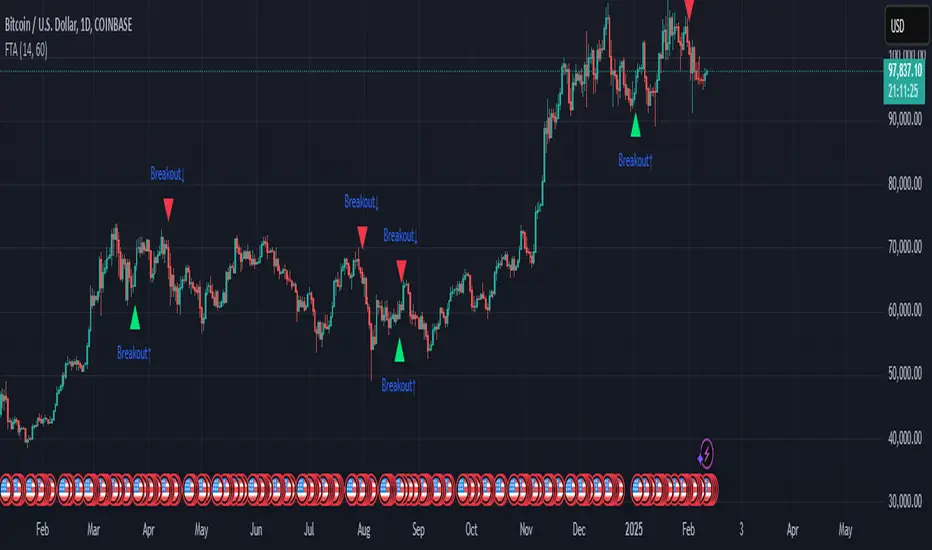
Fractal Trend Anticipator (FTA)How to Use FTA
Purpose:
FTA is designed to detect when a consolidating (or choppy) market—with a high choppiness index—is poised to break into a trend as indicated by an RSI crossover.
Signals:
Bullish Breakout: When the Choppiness Index is above your set threshold and the RSI crosses upward over 50, a bullish arrow (triangle up) appears below the bar.
Bearish Breakout: Conversely, when the RSI crosses downward from above 50 under high choppiness, a bearish arrow (triangle down) appears above the bar.
Trading Insight:
In crypto markets, when price is range-bound, a sudden release of momentum can be captured early by FTA. Use these signals as early alerts to join moves as they begin—whether you plan to ride a short-term spike or a medium-term trend.
Feel free to adjust the and parameters to suit your trading style and asset volatility. Enjoy trading with your updated Fractal Trend Anticipator!
Sma Indicator with Ratio (pr)SMA Indicator with Ratio (PR) is a technical analysis tool designed to provide insights into the relationship between multiple Simple Moving Averages (SMAs) across different time frames. This indicator combines three key SMAs: the 111-period SMA, 730-period SMA, and 1400-period SMA. Additionally, it introduces a ratio-based approach, where the 730-period SMA is multiplied by factors of 2, 3, 4, and 5, allowing users to analyze potential market trends and price movements in relation to different SMA levels.
What Does This Indicator Do?
The primary function of this indicator is to track the movement of prices in relation to several SMAs with varying periods. By visualizing these SMAs, users can quickly identify:
Short-term trends (111-period SMA)
Medium-term trends (730-period SMA)
Long-term trends (1400-period SMA)
Additionally, the multiplied versions of the 730-period SMA provide deeper insights into potential price reactions at different levels of market volatility.
How Does It Work?
The 111-period SMA tracks the shorter-term price trend and can be used for identifying quick market movements.
The 730-period SMA represents a longer-term trend, helping users gauge overall market sentiment and direction.
The 1400-period SMA acts as a very long-term trend line, giving users a broad perspective on the market’s movement.
The ratio-based SMAs (2x, 3x, 4x, 5x of the 730-period SMA) allow for an enhanced understanding of how the price reacts to higher or lower volatility levels. These ratios are useful for identifying key support and resistance zones in a dynamic market environment.
Why Use This Indicator?
This indicator is useful for traders and analysts who want to track the interaction of price with different moving averages, enabling them to make more informed decisions about potential trend reversals or continuations. The added ratio-based values enhance the ability to predict how the market might react at different levels.
How to Use It?
Trend Confirmation: Traders can use the indicator to confirm the direction of the market. If the price is above the 111, 730, or 1400-period SMA, it may indicate an uptrend, and if below, a downtrend.
Support/Resistance Levels: The multiplied versions of the 730-period SMA (2x, 3x, 4x, 5x) can be used as dynamic support or resistance levels. When the price approaches or crosses these levels, it might indicate a change in the trend.
Volatility Insights: By observing how the price behaves relative to these SMAs, traders can gauge market volatility. Higher multiples of the 730-period SMA can signal more volatile periods where price movements are more pronounced.

VIXION Follow The MoneyHow It Works
• Money Flow Visualization:
The indicator displays market money flow as a filled area. When the money flow is positive, it appears in GREEN, and when it is negative, it switches to RED. This dual display helps you quickly gauge the strength and direction of market momentum.
• Signal Markers:
Triangle markers are plotted when the money flow crosses the zero line:
• Green Triangle: Indicates that money flow has moved into positive territory, suggesting increasing bullish momentum.
• Red Triangle: Indicates that money flow has turned negative, suggesting increasing bearish momentum.
• Trend Context with WaveTrend:
Alongside the money flow, the indicator shows two trend waves. These elements provide additional context on the overall market trend, highlighting potential overbought or oversold conditions.
How to Use It
1. Observe the Money Flow:
Look at the filled area and its outline. A rising, GREEN colored area may signal strong buying pressure, while a falling, RED colored area may indicate selling pressure.
2. Watch for Crossover Signals:
Pay attention to the green and red triangle markers. These markers help you identify key moments when the momentum shifts, serving as potential entry or exit signals.
3. Consider the Trend Elements:
Use the WaveTrend waves and the fast-moving line to confirm the money flow signals. When both the money flow and trend elements point in the same direction, the signal is generally stronger.
4. Integrate with Your Strategy:
Combine the signals from this indicator with other technical analysis tools and risk management practices. This can help you make more informed trading decisions and manage your exposure effectively.

The Commitment of Traders (COT) IndexThe COT Index indicator is used to measure the positioning of different market participants (Large Traders, Small Traders, and Commercial Hedgers) relative to their historical positioning over a specified lookback period. It helps traders identify extreme positioning, which can signal potential reversals or trend continuations.
Key Features of the Indicator:
COT Data Retrieval
The script pulls COT report data from the TradingView COT Library TradingView/LibraryCOT/3).
It retrieves long and short positions for three key groups:
Large Traders (Non-commercial positions) – Speculators such as hedge funds.
Small Traders (Non-reportable positions) – Small retail traders.
Commercial Hedgers (Commercial positions) – Institutions that hedge real-world positions.
Threshold Zones for Extreme Positioning:
Upper Zone Threshold (Default: 90%)
Signals potential overbought conditions (excessive buying).
Lower Zone Threshold (Default: 10%)
Signals potential oversold conditions (excessive selling).
The indicator plots these zones using horizontal lines.
The COT Index should be used in conjunction with technical analysis (support/resistance, trends, etc.). A high COT Index does not mean the market will reverse immediately—it’s an indication of extreme sentiment.
Note:
If the script does not recognize or can't find the ticker currently viewed in the COT report, the COT indicator will default to U.S. Dollar.
