Nothing Special   »   [go: up one dir, main page]

Constructing comparable intimate partner violence indicators across the DHS, MICS, and PMA health surveys

By Miriam King, Anna Bolgrien, Mehr Munir, and Devon Kristiansen

The three data series comprising IPUMS Global Health—IPUMS DHS, IPUMS PMA, and IPUMS MICS—contain intersecting subjects related to women’s and children’s health, while retaining distinct patterns of temporal and geographic coverage. This content overlap opens the door to combining harmonized data across the three surveys, to extend time series and/or increase the number of countries in comparative analyses. However, there are important yet subtle differences between these survey types, in sample frames, questionnaire wording, and variable responses and universes, which require cautious consideration. As the example below demonstrates, researchers must use extra care to avoid errors when combining data across IPUMS DHS, MICS, and PMA.

A July 2024 article in the Journal of Public Health Policy, “Constructing Comparable Intimate Partner Violence Indicators across DHS, MICS, and PMA Health Surveys,” describes some challenges and solutions to combining data across these IPUMS databases, using measures of intimate partner violence as an example. The piece, authored by Devon Kristiansen and colleagues at IPUMS, notes two necessary steps in combining data across survey types:

  • Identify and combine only variables with similar question wording
  • Adjust the samples to include only comparable subpopulations
Continue reading…

Harmonized Malaria Indicator Survey (MIS) Data Now in IPUMS DHS

By Miriam King, Senior Research Scientist

Malaria is a pressing global health problem, with nearly 250 million malaria cases in 2022, according to the World Health Organization. Approximately 95 percent of malaria deaths were in Africa, with three-quarters of those deaths to children under 5. Climate change is increasing the transmission of mosquito-borne diseases, such as malaria. When IPUMS DHS recently received supplemental funding to support research on Climate Change Effects on Health, adding data on malaria was a top priority. Specifically, IPUMS DHS chose to integrate data from the DHS Malaria Indicator Surveys (MIS).

MIS have been fielded in nearly 30 African countries during the twenty-first century. Developed under an international partnership coordinating efforts to fight malaria, MIS surveys include some standard DHS variables on topics such as demographics, fertility, and household characteristics. MIS questionnaires also include hundreds of questions related to malaria. People’s knowledge about malaria causes, symptoms, and prevention; use of bednets; diagnosis and treatment of malaria, especially for pregnant women and children; exposure to public health messaging; and diagnostic blood testing for malaria in children under 5 are among the topics covered.

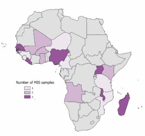
Map of Africa with the countries with MIS data in IPUMS DHS filled in with purple
Figure 1: Countries with MIS Data in IPUMS DHS

IPUMS DHS users now have access to harmonized data from 38 MIS samples, with geographic coverage shown in Figure 1. We prioritized harmonizing responses to MIS questions that matched variables already in the IPUMS DHS database, for approximately 700 widely available variables.

Continue reading…

Digitizing and Exploring Qatar’s Population Censuses

By Shine Min Thant

Qatar, a small yet influential state in the Middle East, is a very interesting case study for demographic research because of its rapid development over the past thirty years. Qatar occupies a peninsula only slightly larger than the U.S. state of Rhode Island that juts out into the Persian Gulf from its border with Saudi Arabia. The country has experienced relatively rapid economic growth since the late 20th century, mainly due to its vast reserves of natural gas and oil. This newfound wealth allowed Qatar to invest heavily in its healthcare, infrastructure, and education – therefore making the country an ideal case study for social change and development. Additionally, a recent surge in Qatar’s immigrant population (which constitutes over 78 percent of the population) also makes it an ideal country to study social mobility and social change.

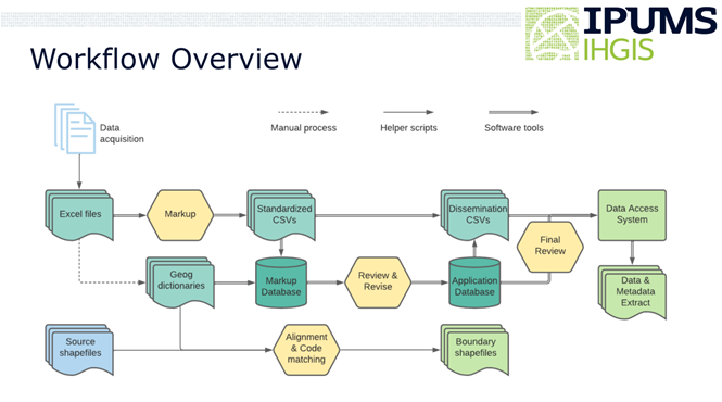
As part of the ISRDI Diversity Fellowship Program, I worked with Dr. Tracy Kugler, Professor Steven Manson, Professor Evan Roberts, and undergraduate student Rawan AlGahtani on a project to examine Qatar’s change using census data from 1984, 1997, and 2004. Summary tables from all three censuses were previously only available as printed documents. As a first step, we needed to transform the data from a hard-to-get printed format to widely accessible IPUMS IHGIS format. This process included multiple steps from conducting optical character recognition (OCR) to conducting data quality checks using R scripts (Figure 1).

Figure 1: IPUMS IHGIS Workflow

A workflow schematic that highlights the process of preparing summary tables and source shapefiles into consistent and machine-readable formats via IPUMS IHGIS

Continue reading…

New Data Release from IPUMS International – From Mexico to MOSAIC

By Lara Cleveland and Jane Lee

IPUMS International has released new data! Eighteen new census samples have been added to the collection, including data from Côte d’Ivoire, which is new to IPUMS International. Newly released census samples include Cambodia (2019), Côte d’Ivoire (1988, 1998), Denmark (1845, 1880, 1885), Laos (1995, 2015), Mexico (2020), Peru (2017), Puerto Rico (2015, 2020), Switzerland (2011), United Kingdom (1961, 1971), United States (2015, 2020) and Vietnam (2019). As always, we gratefully acknowledge the national statistical offices of all the countries partnering with IPUMS International to make data available for research.

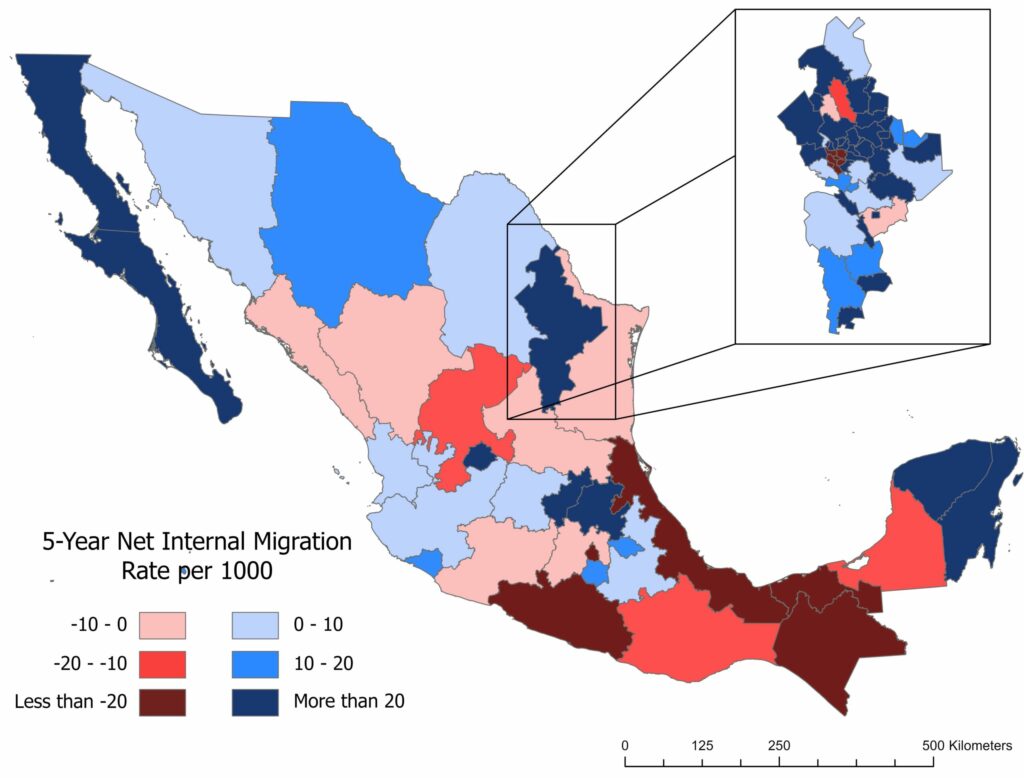
New geography variables are also now available with harmonized migration variables at the second-administrative level; the codes for the newly released migration variables match existing IPUMS International geography codes and labels. As an example, the geographic units in the migration variable for Mexico at the municipo level (place of residence 5 years ago, MIG2_5_MX) are reconciled to the boundaries for place of current residence (GEO2_MX).

This is a map showing the 2020 census 5-year migration rates for GEO1 in Mexico, and GEO2 in Nuevo Leon state
2020 census 5-year migration rates for GEO1 in Mexico, and GEO2 in Nuevo Leon state. Map by Quinn Heimann

Continue reading…

2020 Public Use Microdata Area (PUMA) Updates in the 2022 American Community Survey

By Natalie Mac Arthur, Senior Research Associate, SHADAC

Thank you to our collaborators at the State Health Access Data Assistance Center (SHADAC) for contributing this blog post; view the original blog on the SHADAC website.

A Public Use Microdata Area (PUMA) is a type of geographic unit created for statistical purposes. PUMAs represent geographic areas with a population size of 100,000–200,000 within a state (PUMAs cannot cross state lines). PUMAs are the smallest level of geography available in American Community Survey (ACS) microdata. They are designed to protect respondent confidentiality while simultaneously allowing analysts to produce estimates for small geographic areas.

Every ten years, the decennial census results are used to redefine ACS PUMA boundaries to account for shifts in population and continue to maintain respondent confidentiality. This process is intended to yield geographic definitions that are meaningful to many stakeholders.

Most recently, new PUMAs were created based on the 2020 Census; these 2020 PUMAs were implemented in the ACS starting in the 2022 data year. Although Public Use Microdata Area components remain consistent to the extent possible, they are updated based on census results and revised criteria. Therefore, they are not directly comparable with PUMAs from any previous ACS data years. For example, the 2020 PUMAs used in the 2022 data year are distinct from the 2010 PUMAs, which were used in the 2012–2021 ACS data years.

The 2020 PUMAs were created based on definitions that include two substantive changes relative to the 2010 PUMAs:

1) An increase in the minimum population threshold for the minimum size of partial counties from 2,400 to 10,000. Increasing the population minimum for a PUMA-county part aims to further protect the confidentiality of respondents. However, exceptions are allowed on a case-by-case basis in order to maintain the stability of PUMA definitions (that were based on the previous minimum of 2,400) and due to unique geography.

2) Allowing noncontiguous geographic areas. Allowing PUMAs to include noncontiguous geographic areas aims to avoid unnecessarily splitting up demographic groups in order to provide more meaningful data. This change is not intended to create highly fragmented PUMAs.

Other than the two changes listed above, PUMA criteria remained consistent, such as treating 100,000 as a strict minimum population size for PUMAs. The maximum population size for PUMAs can exceed a population of 200,000 in certain instances due to expected population declines or geographic constraints.

Continue reading…

Bivariate Proportional Symbol Maps, Part 2: Design Tips with Instructions for ArcGIS Pro

By Jonathan Schroeder, IPUMS Research Scientist, NHGIS Project Manager

How to make effective bivariate proportional symbol maps

A map of the share of population under age 18 in the Miami area in 2020. There is one colored circle for each census tract. There are five colors ranging from dark blue (representing less than 15% under age 18) to light green (representing 20 to 25% under age 18) to brown (representing 30% or more). The circle sizes correspond to tract populations. Most circles have similar sizes, representing around 1,000 to 10,000 people. The circles cluster together forming groups where there are more tracts and more people. The circles in central Miami and along the coast are bluer than elsewhere.
A bivariate proportional symbol map.
Click map for larger version.

In Part 1 of this blog series, I introduced bivariate proportional symbol maps and shared some examples to demonstrate their advantages. In short, when they’re well designed, they can make it easy to see multiple dimensions of a population all at once: size, composition, and spatial distribution.

A key part of that statement is, “when they’re well designed.” Standard mapping tools can make it easy to get started, but getting all the way to a good design still takes some extra effort.

In this Part 2 post, I discuss some key design considerations for bivariate proportional symbol maps, and I provide specific instructions to help you get to a good design.

Software considerations

I used Esri’s ArcGIS Pro to create the examples here and in Part 1. The design tips I share below should be relevant for any mapping tool, but my instructions are specifically for ArcGIS Pro (version 3.2). I expect there are ways to achieve similar designs with QGIS, R, Python, etc., quite possibly more easily than with ArcGIS Pro. I can only say that it’s easier to create effective bivariate proportional symbols now with ArcGIS Pro than it was with its predecessor ArcMap.

As I proceed, I’ll flag which instructions pertain specifically to ArcGIS Pro. All other tips are “tool neutral.”

General tip: Match size to “size” and color to “character”

When selecting which features to map, a framework that works consistently well is to use symbol color to represent an intensive property—e.g., the share of population under 18 years old, average household size, median household income, or the share of votes cast for a candidate—and use symbol size to represent the number of cases to which the intensive property pertains—e.g., the total population (when color corresponds to a population share) or the count of households (when color corresponds to average household size or median household income).

This framework enables the map to illustrate both the spatial distribution of the mapped characteristics and the frequency distribution of the intensive property—e.g., not only where a candidate received large or small vote shares but also how many votes were cast in each of those areas. Other frameworks can also work well (e.g., see the change maps in Part 1), but it’s generally very helpful if the two mapped characteristics relate to each other in a way that corresponds intuitively with “size” and “color.”

Continue reading…

Bivariate Proportional Symbol Maps, Part 1: An Introduction

By Jonathan Schroeder, IPUMS Research Scientist, NHGIS Project Manager

A powerful, underused mapping technique

The world could use a lot more bivariate proportional symbol maps. These maps pair two basic visual variables—size and (usually) color—to symbolize two characteristics of mapped features. When designed well, they convey multiple key dimensions of a population all at once: size and composition as well as spatial distribution and density.

A map of the share of population under age 18 in the Miami area in 2020. There is one colored circle for each census tract. There are five colors ranging from dark blue (representing less than 15% under age 18) to light green (representing 20 to 25% under age 18) to brown (representing 30% or more). The circle sizes correspond to tract populations. Most circles have similar sizes, representing around 1,000 to 10,000 people. The circles cluster together forming groups where there are more tracts and more people. The circles in central Miami and along the coast are bluer than elsewhere.
A bivariate proportional symbol map.
Click map for larger version.

Unfortunately, standard mapping software hasn’t made it easy to create good versions of these maps, and most introductions to statistical mapping stick to simpler strategies. As a result, bivariate proportional symbols aren’t used very often. With few examples and little guidance to go on, it’s understandable that mapmakers don’t realize how often they’re a viable, well-suited option.

This two-part blog series aims to spark more interest by providing a “few examples” (Part 1) and a “little guidance” (Part 2).

Picking up where I left off

In a previous blog post, I shared an example of a bivariate proportional symbol map and described some of the technique’s advantages. But that post focuses on a mapping resource (census centers of population) rather than on mapping techniques. Most of the examples in the post are also simply “proportional symbol maps,” without the more intriguing “bivariate” part.

To close that post, I suggested “a tantalizing next step” would be to use bivariate proportional symbols with small-area data (for census tracts or block groups), and I shared a few technical notes and design tips without much detail. I later expanded on those ideas in a conference talk, sharing some new examples with small-area data and going a little deeper with design tips.

In these new posts, I’m sharing and building on the examples and tips from the conference talk.

Continue reading…