The post A new look for repositories appeared first on The GitHub Blog.
]]>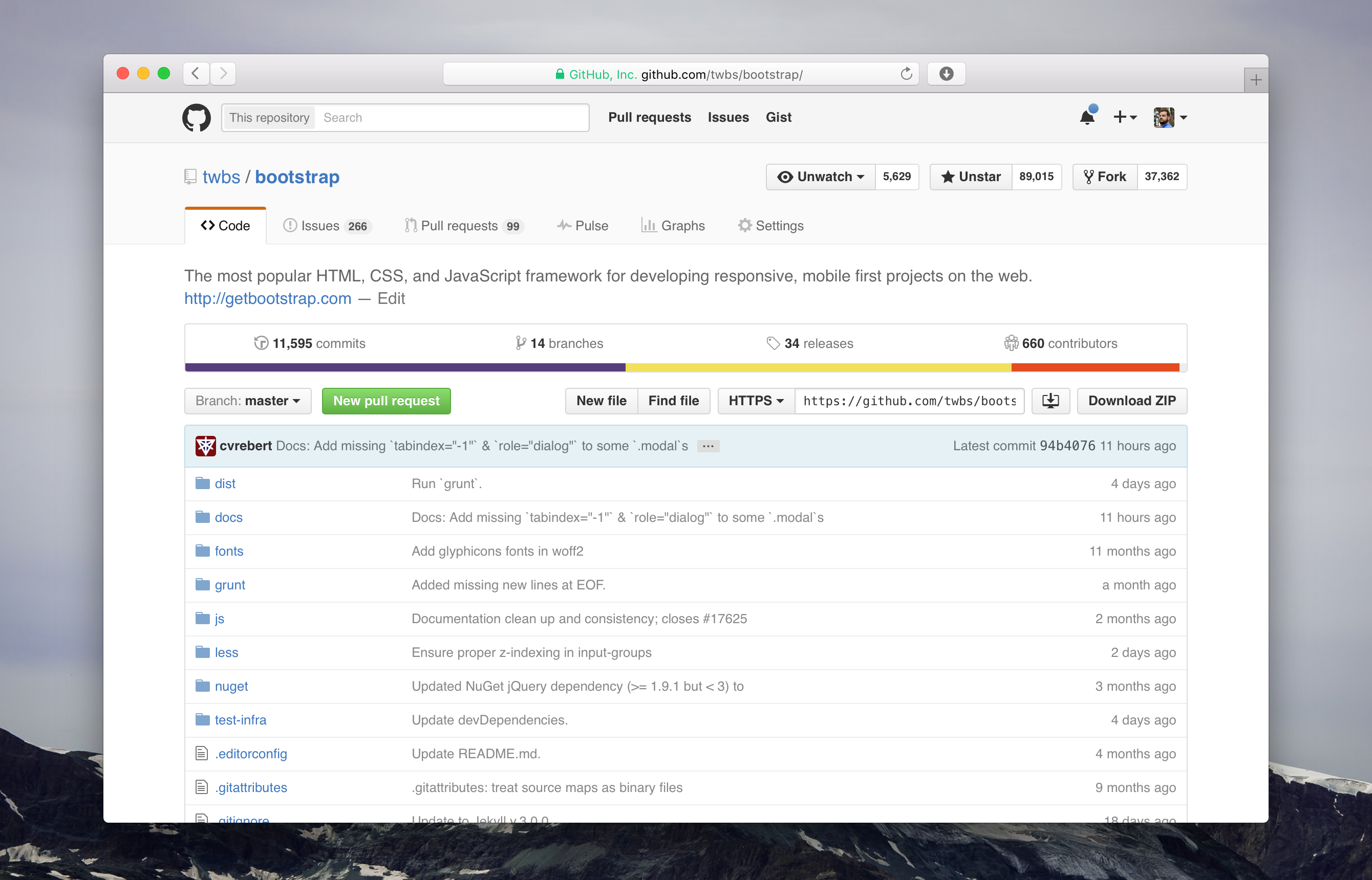
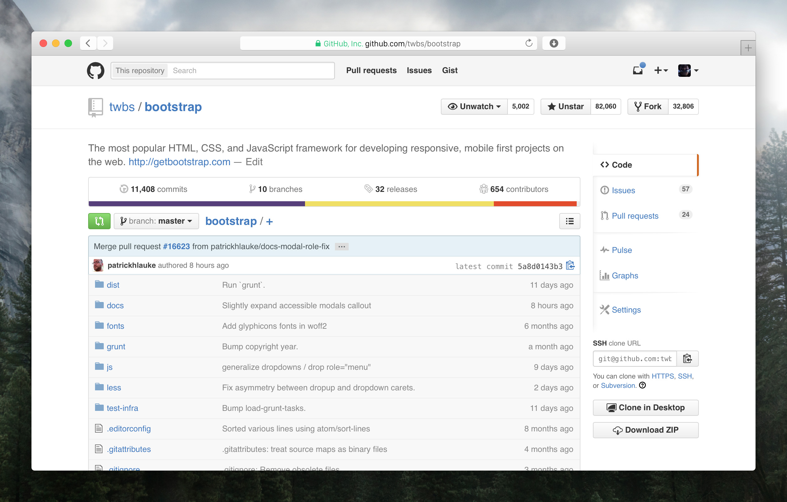
The collapsing side menu is now a single, always present navigation at the top of every page within a repository. This improves accessibility, makes navigating more coherent, and allows you to always see the labels for each tab without requiring tooltips.
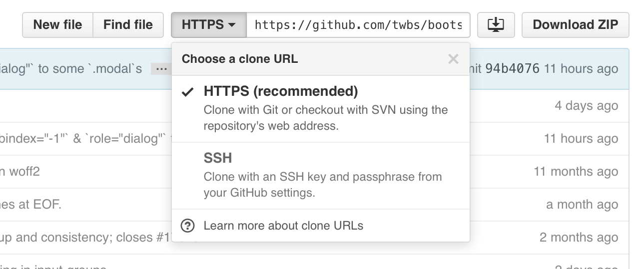
The Code tab now more prominently emphasizes cloning. Clone with confidence using the redesigned protocol switcher, which now contains explicit menu items with explanatory text for each cloning method instead of simple text links.
With the navigation at the top, it’s easier to focus on what matters most to you: your content on the page. For example, with the extra horizontal space, issues and pull requests are simpler with a wider and more legible sidebar.
Large changes like this one can be disruptive. To help make the transition as smooth as possible for you, the new design is opt-in for the next two weeks, and after that, you’ll switch over automatically.
We’re super excited to share the new design with you and can’t wait to keep iterating on it moving forward. Enjoy, and happy collaborating!
The post A new look for repositories appeared first on The GitHub Blog.
]]>The post An updated header, just for you appeared first on The GitHub Blog.
]]>
The new header gives you faster access to your pull requests and issues dashboards from anywhere on the site. If you’re unfamiliar with them, these dashboards list all of your open pull requests and issues—as well as those you’ve been mentioned in or are assigned to—in one place. Use them to stay up to date on what needs to be done across your projects.
Lastly, clicking your avatar now opens a new dropdown menu with links to your profile, account settings, and more. As a small bonus, we’ve also included a new Your stars link for easy access to your starred repositories.
Enjoy!
The post An updated header, just for you appeared first on The GitHub Blog.
]]>The post Introducing mobile web notifications appeared first on The GitHub Blog.
]]>If you already use web notifications, you’ll see a familiar indicator in the top right of every page whenever you have unread activity.
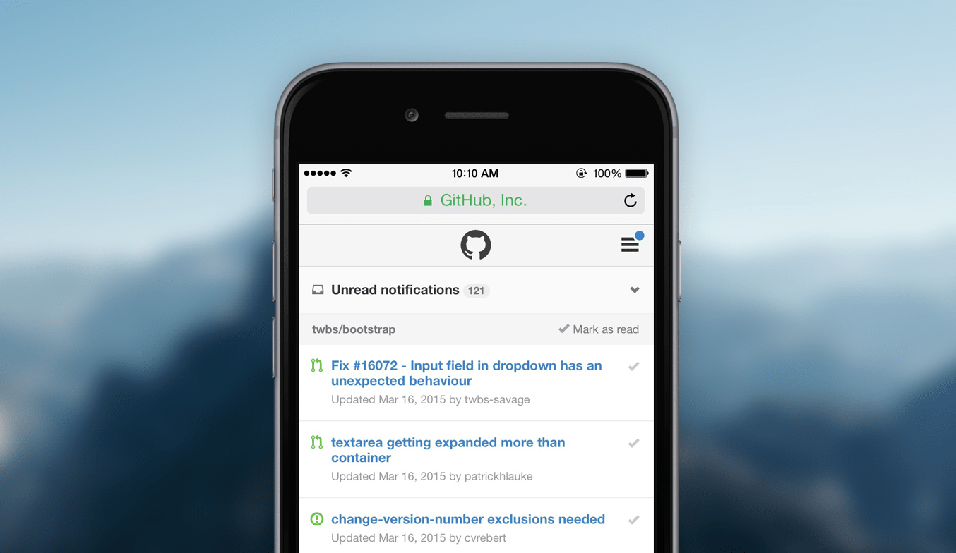
Use the switcher at the top of the page to filter your notifications. By default we show all your unread activity across the repositories you watch, but filtering to a specific repository—or even just the threads you’re participating in—is just a couple taps away.

When you want to skip a notification, you can always mark it as read. Tap the checkmark on the right of individual notifications and they’re immediately updated. You can also use the link in each repository group’s header to mark multiple notifications as read.
New to web or email notifications on GitHub? Head to your account settings to customize how and where you receive notifications for the repositories you watch.
The post Introducing mobile web notifications appeared first on The GitHub Blog.
]]>The post Introducing split diffs appeared first on The GitHub Blog.
]]>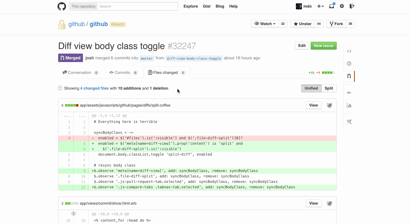
Diffs now come in two flavors, unified and split. Switch between them on pull request, commit, and compare pages using the toggle in the top right of the page. The mode you last used will become your preferred default.
The post Introducing split diffs appeared first on The GitHub Blog.
]]>The post Redesigned Conversations appeared first on The GitHub Blog.
]]>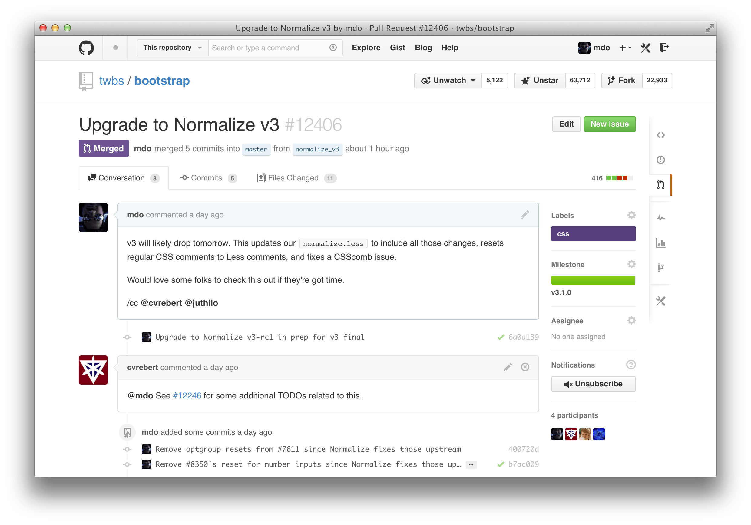
More meaningful conversations
Scanning and working with all the content available in conversations—replies, CI status, commits, code review comments—is now easier than ever.
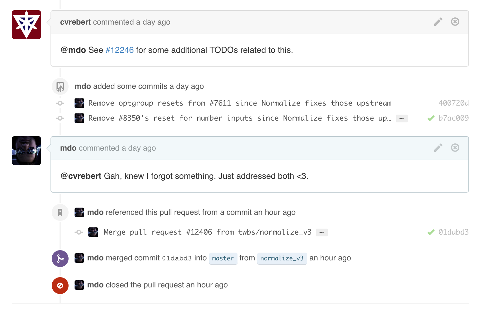
Comments now stand out as the most important elements in a conversation. Comments that you make are also highlighted blue. Anything that isn’t a comment—like commits or issue references—has been subdued to better differentiate content. All of these changes come together to help you focus on what matters most in a particular conversation.
Streamlined layout
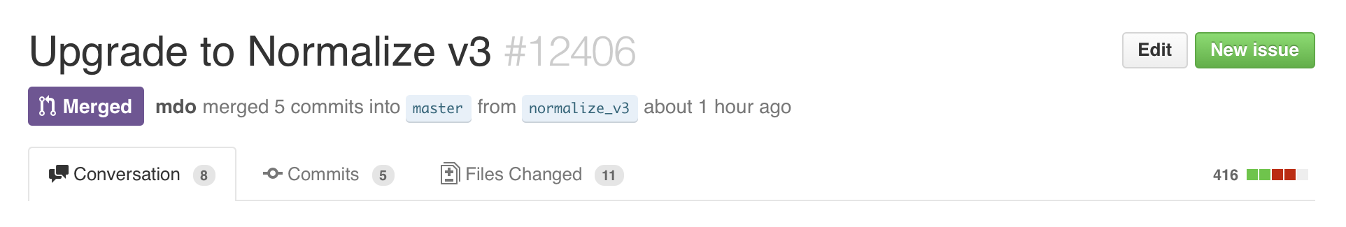
We’ve consolidated and moved management tools for Issues and Pull Requests into the sidebar. Add or remove labels, update milestones, subscribe to notifications, and assign people within one spot. Also, you can now manage labels directly on Pull Requests.
Additionally, titles and state indicators (open, closed, or merged) have been moved to a more prominent header to quickly and easily identify the Issue or Pull Request you’re viewing.
See the new conversations today in one of your favorite GitHub repositories.
The post Redesigned Conversations appeared first on The GitHub Blog.
]]>The post Redesigned merge button appeared first on The GitHub Blog.
]]>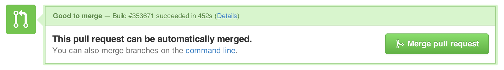
In addition to being easier to read, the new merge button includes helpful instructions for checking out a branch and resolving any conflicts using Git on the command line.
Deleting branches after you merge has also been simplified. Instead of confirming the delete with an extra step, we immediately remove the branch when you delete it and provide a convenient link to restore the branch in the event you need it again.
Head over to your latest pull request and get merging to check it out.
Keep
The post Redesigned merge button appeared first on The GitHub Blog.
]]>The post New Enterprise.GitHub.com appeared first on The GitHub Blog.
]]>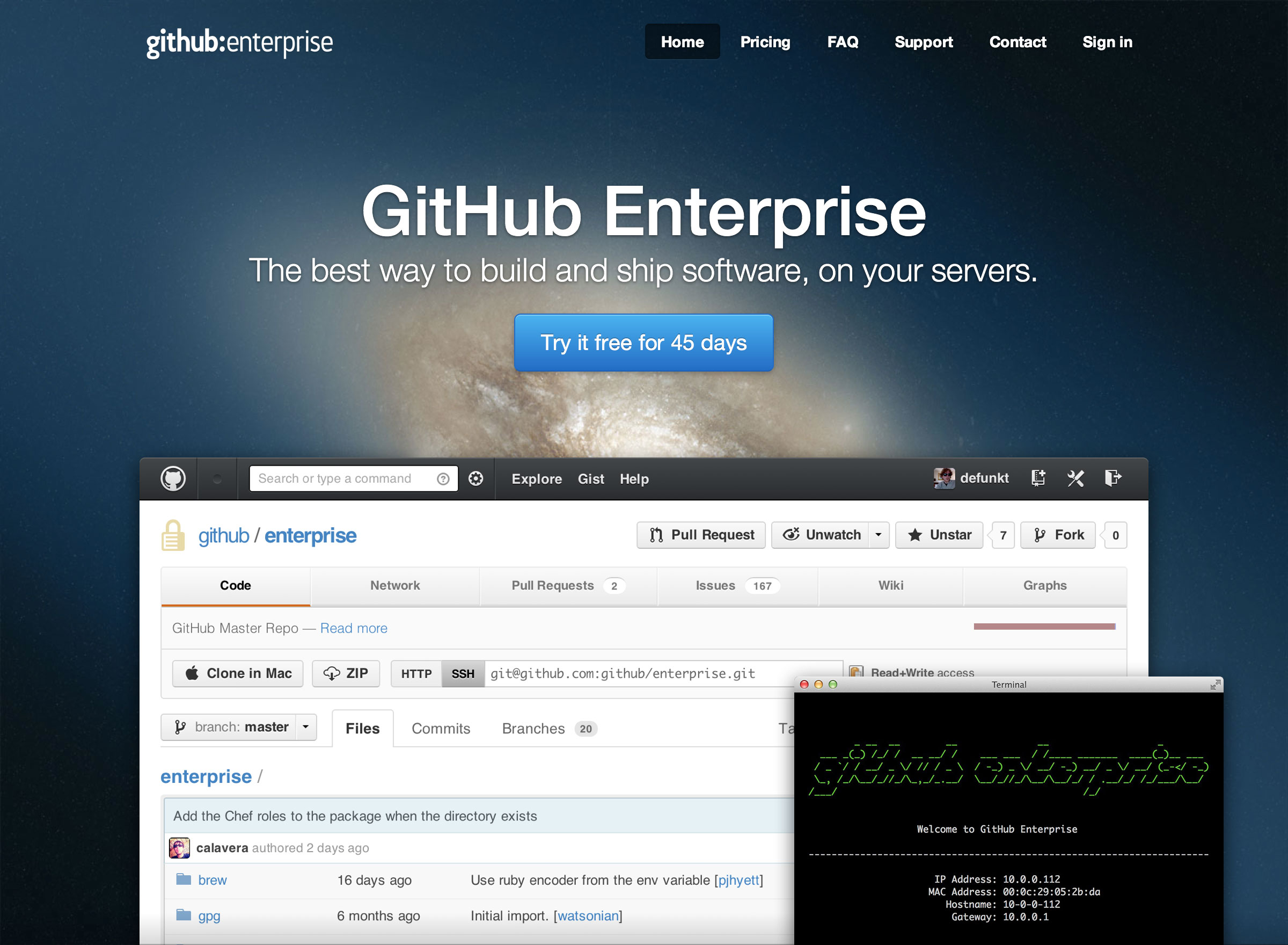
Check out the new GitHub Enterprise, still the best way to build and ship software on your servers.
The post New Enterprise.GitHub.com appeared first on The GitHub Blog.
]]>The post New header and footer appeared first on The GitHub Blog.
]]>
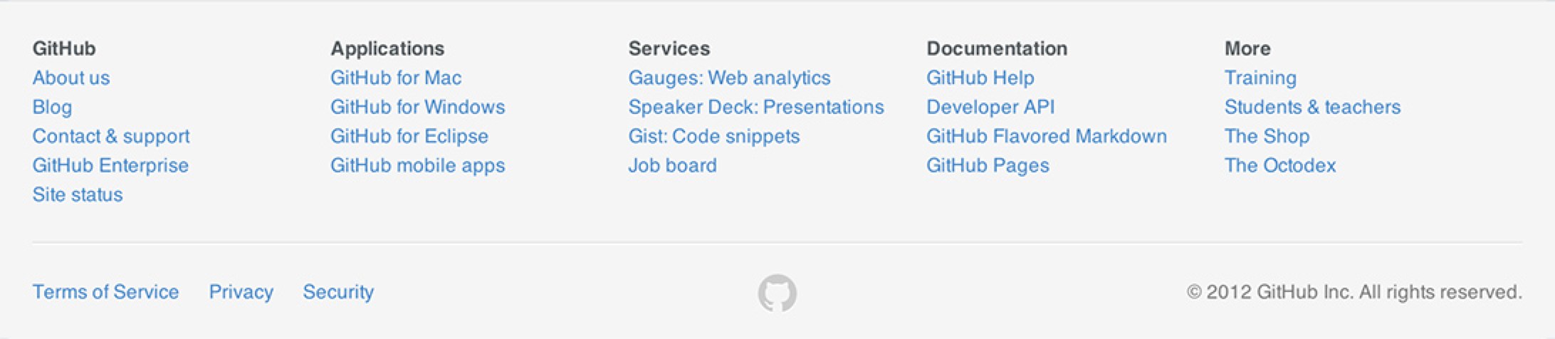
Rock on!
The post New header and footer appeared first on The GitHub Blog.
]]>