The post Design system annotations, part 2: Advanced methods of annotating components appeared first on The GitHub Blog.
]]>In part one of our design system annotation series, we discussed the ways in which accessibility can get left out of design system components from one instance to another. Our solution? Using a set of “Preset annotations” for each component with Primer. This allows designers to include specific pre-set details that aren’t already built into the component and visually communicated in the design itself.
That being said, Preset annotations are unique to each design system — and while ours may be a helpful reference for how to build them — they’re not something other organizations can utilize if you’re not also using the Primer design system.
Luckily, you can build your own. Here’s how.
How to make Preset annotations for your design system
Start by assessing components to understand which ones would need Preset annotations—not all of them will. Prioritize components that would benefit most from having a Preset annotation, and build that key information into each one. Next, determine what properties should be included. Only include key information that isn’t conveyed visually, isn’t in the component properties, and isn’t already baked into a coded component.

Prioritizing components
When a design system has 60+ components, knowing where to start can be a challenge. Which components need these annotations the most? Which ones would have the highest impact for both design teams and our users?
When we set out to create a new set of Preset annotations based on our proof of concept, we decided to use ten Primer components that would benefit the most. To help pick them, we used an internal tool called Primer Query that tracks all component implementations across the GitHub codebase as well as any audit issues connected to them. Here is a video breakdown of how it works, if you’re curious.
We then prioritized new Preset annotations based on the following criteria:
- Components that align to organization priorities (i.e. high value products and/or those that receive a lot of traffic).
- Components that appear frequently in accessibility audit issues.
- Components with React implementations (as our preferred development framework).
- Most frequently implemented components.
Mapping out the properties
For each component, we cross-referenced multiple sources to figure out what component properties and attributes would need to be added in each Preset annotation. The things we were looking for may only exist in one or two of those places, and thus are less likely to be accounted for all the way through the design and development lifecycle. The sources include:
Component documentation on Primer.style
Design system docs should contain usage guidance for designers and developers, and accessibility requirements should be a part of this guidance as well. Some of the guidance and requirements get built into the component’s Figma asset, while some only end up in the coded component.
Look for any accessibility requirements that are not built into either Figma or code. If it’s built in, putting the same info in the Preset annotation may be redundant or irrelevant.
Coded demos in Storybook
Our component sandbox helped us see how each component is built in React or Rails, as well as what the HTML output is. We looked for any code structure or accessibility attributes that are not included in the component documentation or the Figma asset itself—especially when they may vary from one implementation to another.
Component properties in the Figma asset library
Library assets provide a lot of flexibility through text layers, image fills, variants, and elaborate sets of component properties. We paid close attention to these options to understand what designers can and can’t change. Worthwhile additions to a Preset Annotation are accessibility attributes, requirements, and usage guidance in other sources that aren’t built into the Figma component.
Other potential sources
- Experiences from team members: The designers, developers, and accessibility specialists you work with may have insight into things that the docs and design tools may have missed. If your team and design system have been around for a while, their insights may be more valuable than those you’ll find in the docs, component demos, or asset libraries. Take some time to ask which components have had challenging bugs and which get intentionally broken when implemented.
- Findings from recent audits: Design system components themselves may have unresolved audit issues and remediation recommendations. If that’s the case, those issues are likely present in Storybook demos and may be unaccounted for in the component documentation. Design system audit issues may have details that both help create a Preset annotation and offer insights about what should not be carried over from existing resources.
What we learned from creating Preset annotations
Preset annotations may not be for every team or organization. However, they are especially well suited for younger design systems and those that aren’t well adopted.
Mature design systems like Primer have frequent updates. This means that without close monitoring, the design system components themselves may fall out of sync with how a Preset annotation is built. This can end up causing confusion and rework after development starts, so it may be wise to make sure there’s some capacity to maintain these annotations after they’ve been created.
For newer teams at GitHub, new members of existing teams, and team members who were less familiar with the design system, the built-in guidance and links to documentation and component demos proved very useful. Those who are more experienced are also able to fine-tune the Presets and how they’re used.
If you don’t already have extensive experience with the design system components (or peers to help build them), it can take a lot of time to assess and map out the properties needed to build a Preset. It can also be challenging to name a component property succinctly enough that it doesn’t get truncated in Figma’s properties panel. If the context is not self-evident, some training or additional documentation may help.
It’s not always clear that you need a Preset annotation
There may be enough overlap between the Preset annotation for a component and types of annotations that aren’t specific to the design system.
For example, the GitHub Annotation Toolkit has components to annotate basic <textarea> form elements in addition to a Preset annotation for our <TextArea> Primer component:
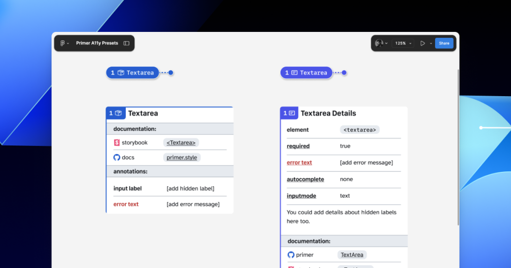
In many instances, this flexibility may be confusing because you could use either annotation. For example, the Primer <TextArea> Preset has built-in links to specific Primer docs, and while the non-Preset version doesn’t, you could always add the links manually. While there’s some overlap between the two, using either one is better than none.
One way around this confusion is to add Primer-specific properties to the default set of annotations. This would allow you to do things like toggle a boolean property on a normal Button annotation and have it show links and properties specific to your design system’s button component.
Our Preset creation process may unlock automation
There are currently a number of existing Figma plugins that advertise the ability to scan a design file to help with annotations. That being said, the results are often mixed and contain an unmanageable amount of noise and false positives. One of the reasons these issues happen is that these public plugins are design system agnostic.
Current automated annotation tools aren’t able to understand that any design system components are being used without bespoke programming or thorough training of AI models. For plugins like this to be able to label design elements accurately, they first need to understand how to identify the components on the canvas, the variants used, and the set properties.
With that in mind, perhaps the most exciting insight is that the process of mapping out component properties for a Preset annotation—the things that don’t get conveyed in the visual design or in the code—is also something that would need to be done in any attempt to automate more usable annotations.
In other words, if a team uses a design system and wants to automate adding annotations, the tool they use would need to understand their components. In order for it to understand their components well enough to automate accurately, these hidden component properties would need to be mapped out. The task of creating a set of Preset annotations may be a vital stepping stone to something even more streamlined.
A promising new method: Figma’s Code Connect
While building our new set of Preset annotations, we experimented with other ways to enhance Primer with annotations. Though not all of those experiments worked out, one of them did: adding accessibility attributes through Code Connect.
Primer was one of the early adopters of Figma’s new Code Connect feature in Dev Mode. Says Lukas Oppermann, our staff systems designer, “With Code Connect, we can actually move the design and the code a little bit further apart again. We can concentrate on creating the best UX for the designers working in Figma with design libraries and, on the code side, we can have the best developer experience.”
To that end, Code Connect allows us to bypass much of our Preset annotations, as well as the downsides of some of our other experiments. It does this by adding key accessibility details directly into the code that developers can export from Figma.
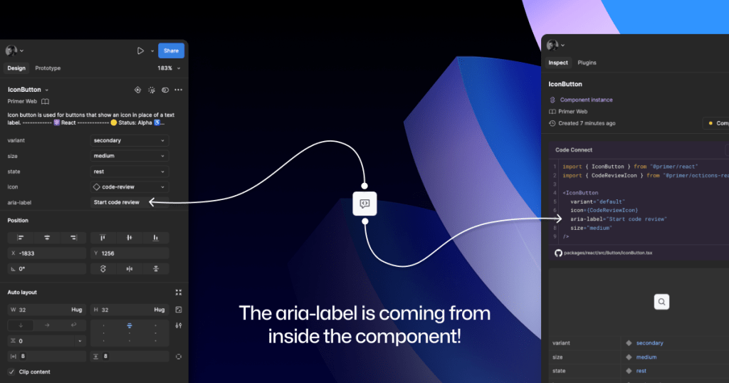
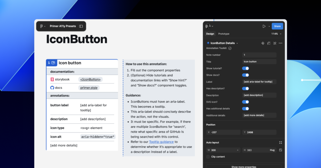
GitHub’s Octicons are used in many of our Primer components. They are decorative by default, but they sometimes need alt text or aria-label attributes depending on how they’re used. In the IconButton component, that button uses an Octicon and needs an accessible name to describe its function.
When using a basic annotation kit, this may mean adding stamps for a Button and Decorative Image as well as a note in the margins that specifies what the aria-label should be. When using Preset annotations, there are fewer things to add to the canvas and the annotation process takes less time.
With Code Connect set up, Lukas added a hidden layer in the IconButton Figma component. It has a text property for aria-label which lets designers add the value directly from the component properties panel. No annotations needed. The hidden layer doesn’t disrupt any of the visuals, and the aria-label property gets exported directly with the rest of the component’s code.
It takes time to set up Code Connect with each of your design system components. Here are a few tips to help:
- Consistency is key. Make sure that the properties you create and how you place hidden layers is consistent across components. This helps set clear expectations so your teams can understand how these hidden layers and properties function.
- Use a branch of your design system library to experiment. Hiding attributes like aria-label is quite simple compared to other complex information that Preset annotations are capable of handling.
- Use visual regression testing (VRT). Adding complexity directly to a component comes with increased risk of things breaking in the future, especially for those with many variants. Figma’s merge conflict UI is helpful, but may not catch everything.
As we continue to innovate with annotations and make our components more accessible, we are aiming to release our GitHub Annotation Toolkit in the near future. Stay tuned!
Further reading
Accessibility annotation kits are a great resource, provided they’re used responsibly. Eric Bailey, one of the contributors to our forthcoming GitHub Annotation Toolkit, has written extensively about how annotations can highlight and amplify deeply structural issues when you’re building digital products.
The post Design system annotations, part 2: Advanced methods of annotating components appeared first on The GitHub Blog.
]]>The post Design system annotations, part 1: How accessibility gets left out of components appeared first on The GitHub Blog.
]]>When it comes to design systems, every organization tends to be at a different place in their accessibility journey. Some have put a great deal of work into making their design system accessible while others have a long way to go before getting there. To help on this journey, many organizations rely on accessibility annotations to make sure there are no access barriers when a design is ready to be built.
However, it’s a common misconception (especially for organizations with mature design systems) that accessible components will result in accessible designs. While design systems are fantastic for scaling standards and consistency, they can’t prevent every issue with our designs or how we build them. Access barriers can still slip through the cracks and make it into production.
This is the root of the problem our Accessibility Design team set out to solve.
In this two-part series, we’ll show you exactly how accessible design system components can produce inaccessible designs. Then we’ll demonstrate our solution: integrating annotations with our Primer components. This allows us to spend less time annotating, increases design system adoption, and reaches teams who may not have accessibility support. And in our next post, we’ll walk you through how you can do the same for your own components.
Let’s dig in.
What are annotations and their benefits?
Annotations are notes included in design projects that help make the unseen explicit by conveying design intent that isn’t shown visually. They improve the usability of digital experiences by providing a holistic picture for developers of how an experience should function. Integrating annotations into our design process helps our teams work better together by closing communication gaps and preventing quality issues, accessibility audit issues, and expensive re-work.
Some of the questions annotations help us answer include:
- How is assistive technology meant to navigate a page from one element to another?
- What’s the alternative text for informative images and buttons without labels?
- How does content shift depending on viewport size, screen orientation, or zoom level?
- Which virtual keyboard should be used for a form input on mobile?
- How should focus be managed for complex interactions?
Our answers to questions like this—or the lack thereof—can make or break the experience of the web for a lot of people, especially users with disabilities. Some annotation tools are built specifically to help with this by guiding designers to include key details about web standards, platform functionality, and accessibility (a11y).
Most public annotation kits are well suited for teams who are creating new design system components, teams who aren’t already using a design system, or teams who don’t have specialized accessibility knowledge. They usually help annotate things like:
- Controls such as buttons and links
- Structural elements such as headings and landmarks
- Decorative images and informative descriptions
- Forms and other elements that require labels and semantic roles
- Focus order for assistive technology and keyboard navigation
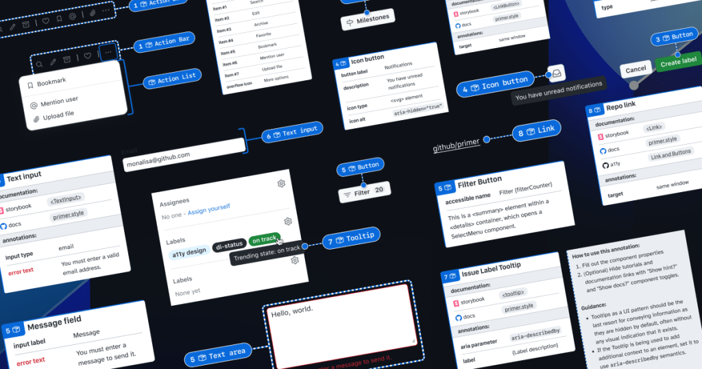
GitHub’s annotation’s toolkit
One of our top priorities is to meet our colleagues where they’re at. We wanted all our designers to be able to use annotations out of the box because we believe they shouldn’t need to be a certified accessibility specialist in order to get things built in an accessible way.
To this end, last year we began creating an internal Figma library—the GitHub Annotation Toolkit (which we aim to release to the public soon). Our toolkit builds on the legacy of the former Inclusive Design team at CVS Health. Their two open source annotation kits help make documentation that’s easy to create and consume, and are among the most widely used annotation libraries in the Figma Community.
While they add clarity, annotations can also add overhead. If teams are only relying on specialists to interpret designs and technical specifications for developers, the hand-off process can take longer than it needs to. To create our annotation toolkit, we rebuilt its predecessor from the ground up to avoid that overhead, making extensive improvements and adding inline documentation to make it more intuitive and helpful for all of our designers—not just accessibility specialists.
Design systems can also help reduce that overhead. When you audit your design systems for accessibility, there’s less need for specialist attention on every product feature, since you’re using annotations to add technical semantics and specialist knowledge into every component. This means that designers and developers only need to adhere to the usage guidelines consistently, right?
The problems with annotations and design system components
Unfortunately, it’s not that simple.
Accessibility is not binary
While design systems can help drive more accessible design at scale, they are constantly evolving and the work on them is never done. The accessibility of any component isn’t binary. Some may have a few severe issues that create access barriers, such as being inoperable with a keyboard or missing alt text. Others may have a few trivial issues, such as generic control labels.
Most of the time, it will be a misnomer to claim that your design system is “fully accessible.” There’s always more work to do—it’s just a question of how much. The Web Content Accessibility Guidelines (WCAG) are a great starting point, but their “Success Criteria” isn’t tailored for the unique context that is your website or product or audience.
While the WCAG should be used as a foundation to build from, it’s important to understand that it can’t capture every nuance of disabled users’ needs because your users’ needs are not every user’s needs. It would be very easy to believe that your design system is “fully accessible” if you never look past WCAG to talk to your users. If Primer has accessible components, it’s because we feel that direct participation and input from daily assistive technology users is the most important aspect of our work. Testing plans with real users—with and without disabilities—is where you really find what matters most.
Accessible components do not guarantee accessible designs
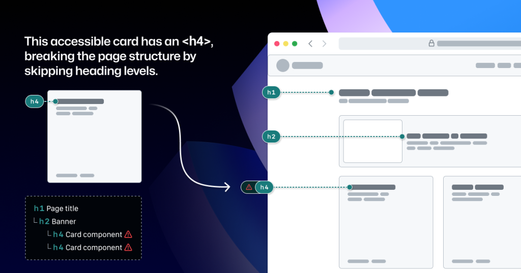
Arranging a series of accessible components on a page does not automatically create an accurate and informative heading hierarchy. There’s a good chance that without additional documentation, the heading structure won’t make sense visually—nor as a medium for navigating with assistive technology.
It’s great when accessible components are flexible and responsive, but what about when they’re placed in a layout that the component guidance doesn’t account for? Do they adapt to different zoom levels, viewport sizes, and screen orientations? Do they lose any functionality or context when any of those things change?
Component usage is contextual. You can add an image or icon to your design, but the design system docs can’t write descriptive text for you. You can use the same image in multiple places, but the image description may need to change depending on context.
Similarly, forms built using the same input components may do different things and require different error validation messages. It’s no wonder that adopting design system components doesn’t get rid of all audit issues.
Design system components in Figma don’t include all the details
Annotation kits don’t include components for specific design systems because almost every organization is using their own. When annotation kits are adopted, teams often add ways to label their design system components.
This labeling lets developers know they can use something that’s already been built, and that they don’t need to build something from scratch. It also helps identify any design system components that get ‘detached’ in Figma. And it reduces the number of things that need to be annotated.
Let’s look at an example:

If we’re using this Primer Button component from the Primer Web Figma library, there are a few important things that we won’t know just by looking at the design or the component properties:
- Functional differences when components are implemented. Is this a link that just looks visually like a button? If so, a developer would use the
<LinkButton>React component instead of<Button>. - Accessible labels for folks using assistive technology. The icon may need alt text. In some cases, the button text might need some visually-hidden text to differentiate it from similar buttons. How would we know what that text is? Without annotations, the Figma component doesn’t have a place to display this.
- Whether user data is submitted. When a design doesn’t include an obvious form with input fields, how do we convey that the button needs specific attributes to submit data?
It’s risky to leave questions like this unanswered, hoping someone notices and guesses the correct answer.
A solution that streamlines the annotation process while minimizing risk
When creating new components, a set of detailed annotations can be a huge factor in how robust and accessible they are. Once the component is built, design teams can start to add instances of that component in their designs. When those designs are ready to be annotated, those new components shouldn’t need to be annotated again. In most cases, it would be redundant and unnecessary—but not in every case.
There are some important details in many Primer components that may change from one instance to another. If we use the CVS Health annotation kit out of the box, we should be able to capture those variations, but we wouldn’t be able to avoid those redundant and unnecessary annotations. As we built our own annotation toolkit, we built a set of annotations for each Primer component to do both of those things at once.
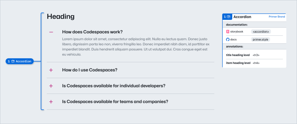
This accordion component has been thoroughly annotated so that an engineer has everything they need to build it the first time. These include heading levels, semantics for <detail> and <summary> elements, landmarks, and decorative icons. All of this is built into the component so we don’t need to annotate most of this when adding the accordion to our new designs.
However, there are two important things we need to annotate, as they can change from one instance to another:
- The optional title at the top.
- The heading level of each item within the accordion.
If we don’t specify these things, we’re leaving it to chance that the page’s heading structure will break or that the experience will be confusing for people to understand and navigate the page. The risks may be low for a single button or basic accordion, but they grow with pattern complexity, component nesting, interaction states, duplicated instances, and so on.
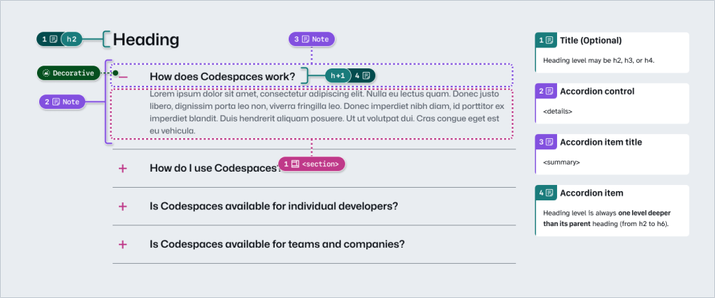
Instead of annotating what’s already built into the component or leaving these details to chance, we can add two quick annotations. One Stamp to point to the component, and one Details annotation where we fill in some blanks to make the heading levels clear.
Because the prompts for specific component details are pre-set in the annotation, we call them Preset annotations.
Introducing our Primer A11y Preset annotations
With this proof of concept, we selected ten frequently used Primer components for the same treatment and built a new set of Preset annotations to document these easily missed accessibility details—our Primer A11y Presets.
Those Primer components tend to contribute to more accessibility audit issues when key details are missing on implementation. Issues for these components relate to things like lack of proper labels, error validation messages, or missing HTML or ARIA attributes.
Each of our Preset annotations is linked to component docs and Storybook demos. This will hopefully help developers get straight to the technical info they need without designers having to find and add links manually. We also included guidance for how to fill out each Preset, as well as how to use the component in an accessible way. This helps designers get support inline without leaving their Figma canvas.
Want to create your own? Check out Design system annotations, part 2
Button components in Google’s Material Design and Shopify’s Polaris, IBM’s Carbon, or our Primer design system are all very different from one another. Because Preset annotations are based on specific components, they only work if you’re also using the design system they’re made for.
In part 2 of this series, we’ll walk you through how you can build your own set of Preset annotations for your design system, as well as some different ways to document important accessibility details before development starts.
You may also like:
If you’re more of a visual learner, you can watch Alexis Lucio explore Preset annotations during GitHub’s Dev Community Event to kick off Figma’s Config 2024.
The post Design system annotations, part 1: How accessibility gets left out of components appeared first on The GitHub Blog.
]]>