Abstract
Drought is a complex natural hazard that can occur in any climate and affect every aspect of society. To better prepare and mitigate the impacts of drought, various indicators can be applied to monitor and forecast its onset, intensity, and severity. Though widely used, little is known about the efficacy of these indicators which restricts their role in important decisions. Here, we provide the first validation of 11 commonly-used drought indicators by comparing them to pasture and browse condition data collected on the ground in Kenya. These ground-based data provide an absolute and relative assessment of the conditions, similar to some of the drought indicators. Focusing on grass and shrublands of the arid and semi-arid lands, we demonstrate there are strong relationships between ground-based pasture and browse conditions, and satellite-based drought indicators. The soil adjusted vegetation index has the best relationship, achieving a mean r2 score of 0.70 when fitted against absolute pasture condition. Similarly, the 3-month vegetation health index reached a mean r2 score of 0.62 when fitted against a relative pasture condition. In addition, we investigated the Kenya-wide drought onset threshold for the 3-month average vegetation condition index (VCI3M; VCI3M  35), which is used by the country's drought early warning system. Our results show large disparities in thresholds across different counties. Understanding these relationships and thresholds are integral to developing effective and efficient drought early warning systems. Our work offers evidence for the effectiveness of some of these indicators as well as practical thresholds for their use.
Export citation and abstract BibTeX RIS
Original content from this work may be used under the terms of the Creative Commons Attribution 4.0 license. Any further distribution of this work must maintain attribution to the author(s) and the title of the work, journal citation and DOI.
1. Introduction
Droughts are complex climatological hazards that impact society in numerous ways. With no consensual definition, they are often defined as how they are perceived leading to several types of drought (Mishra and Singh 2010). Insufficient precipitation is described as meteorological drought which if it persists, can cause a decline in surface and subsurface water resources leading to hydrological drought, and eventually soil moisture (SM) decline and crop failure that cause agricultural drought (Wilhite and Glantz 1985). If these events adversely impact society then we deal with socio-economic droughts. Recently, additional definitions have been suggested that focus on ecological (Crausbay et al 2017) and flash droughts (Otkin et al 2018). As a consequence of these varying definitions, a host of metrics and indicators have been developed to systematically assess the extent and intensity of these hazards remotely in order to mitigate their impacts on lives and livelihoods.
Drought-related food insecurity is particularly devastating as it not only leads to food (Lesk et al 2016) and water (Calow et al 2010) shortages but also perpetuates poverty and under-development (Below et al 2007). Throughout the last two decades, they have affected over 1.4 billion people and led to ∼25 000 deaths (CRED 2020). A large proportion (20%) of these drought events occurred in East Africa, a region where a substantial population of agro-pastoralists relies on rain-fed pastures and crops for their livelihood (Nyariki and Amwata 2019). Subsequently, several drought early warning systems (DEWSs) promoted by government and donor agencies are applied to mitigate their impacts.
The Famine Early Warning System (FEWSNET; Funk et al 2019) offers near and medium term food security outlooks that are based on a comprehensive analysis of key sectors such as markets, livelihoods, nutrition, and agro-climatology. The latter is mainly based on historical and future rainfall, climate modes, and satellite-based normalized difference vegetation index (NDVI) (Ross et al 2009). In Kenya, the National Drought Management Authority (NDMA) operates the country's DEWS. They assess drought situation in the 23 arid and semi-arid counties by collecting key biophysical and socio-economic data through a blended approach of satellites and surveys. In particular, the NDMA rely on the standardized precipitation index (SPI; McKee et al 1993) and the vegetation condition index (VCI; Kogan 1995) to empirically evaluate the biophysical situation, with set thresholds indicating drought intensity. Recently, they have also included information on SM using TAMSAT ALERT (Boult et al 2020). However, what is often lacking is a direct comparison of these metrics with ground observations in order to fully evaluate their usefulness, and the thresholds of drought intensity and severity that should be used.
Previous studies have shown that indicators such as NDVI, VCI, and SPI can be successfully used to monitor crop yield in Europe and the United States (Salazar et al 2007, Kogan et al 2012, Labudová et al 2017, Bachmair et al 2018, García-León et al 2019). Conversely, in countries with large expanses of sparsely inhabited land, obtaining detailed ground observations can be tricky. Within African smallholder systems, the same methods are less effective due to the insufficient data collection (Burke and Lobell 2017). This issue is compounded when pastoralists are considered as data on the grazing quality of grass and shrub lands are even scarcer, generally leading to the use of satellite vegetation indicators which have not been fully validated for this task.
Then, the main aim of this study is to provide a better understanding of the efficacy of commonly-used drought indicators in measuring deteriorating conditions on the ground. More specifically, and focusing on pastoral areas in Kenya, we assessed whether these indicators could be used to monitor pasture and browse conditions throughout the 23 counties overseen by the NDMA. We also evaluated if setting county-specific thresholds are adequate for a better classification of the drought conditions with these indicators. The above is essential, as without it, support is weak on where it is needed and therefore less effective in mitigating the impacts of drought.
2. Study area
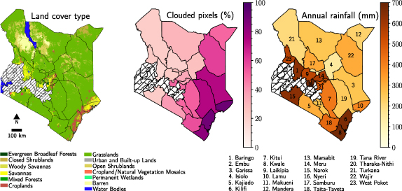
This study is focused on 23 counties within the arid and semi-arid lands (ASALs) of Kenya (see figure 1). The ASALs cover up to 89% of the country and are home to 38% of its population, most of which are pastoralists. Combined, these counties are also home to 85% of the National Livestock herd valued at Ksh.70 billion (Ministry of State for Development of Northern Kenya and other Arid Lands 2012, FAO 2014). Additionally, ASALs host over 90% of the country's wildlife and greatly support the tourism industry which contributes approximately 12% of Kenya's Gross Domestic Product (Ministry of State for Development of Northern Kenya and other Arid Lands 2012). Furthermore, ASALs have huge potential as a result of natural resource exploitation (i.e. solar and wind energy) and economic activities through cross-border trades with neighbouring countries Tanzania, South Sudan, Ethiopia, Uganda, and Somalia.
Figure 1. The 23 counties in the ASALs of Kenya plotted alongside their land cover types (MCD12Q1 land cover product), percentage clouded pixels (MCD43A4 surface reflectance), and annual rainfall (mm; CHIRPS v2.0).
Download figure:
Standard image High-resolution imageThough categorised as ASAL, the 23 counties have vastly different land cover, rainfall, and topography. First, the north and north-eastern areas of the country are generally arid with the south being semi-arid. Subsequently, grasslands, savannas, and shrublands are the dominant land cover type throughout (see figure 1), though there are large disparities in biomass. In part, these disparities can be explained by variation in the annual rainfall of 150–550 and 550–850 mm for arid and semi-arid regions respectively (Ministry of State for Development of Northern Kenya and other Arid Lands 2012). Generally, the rainfall is received in March, April, and May (long rains), and in October, November, and December (short rains). Throughout the country average temperatures and evapotranspiration remain high year-round. Finally, most inhabitants depend upon livestock (i.e. cattle, camels, goat and, sheep) for their livelihoods, though crop cultivation has increasingly been introduced in wetter area as a diversification strategy (Rufino et al 2013). Recently, due to the recurrent droughts, pastoralists are shifting to more drought-resistant animals such as camels and goats (Boru et al 2014).
3. Methods and datasets
3.1. Validation data
This paper compares commonly-used satellite drought indicators to data collected on the ground by the NDMA. Focusing on the grasslands, savannahs, and shrublands in Kenya, we specifically use the information provided by the NDMA on pasture and browse conditions for livestock.
On the ground, the NDMA uses a combination of household surveys and trained ground informants to collect important socio-economic and environmental data across the 23 arid and semi-arid counties of Kenya. The household surveys ask a range of questions regarding food and water sources, health, and finances. The ground informants then assess environmental 'conditions' such as pasture and browse, associated with several selected sites that generally represent all livelihood zones within a given county. Then, these datasets are visible in monthly bulletins, which provide an overview of the drought situation within each county.
The NDMA provide an estimate of the absolute pasture and browse conditions (aPC, aBc—representing current ground conditions) as well as relative pasture and browse conditions (rPCs, rBC—the current conditions compared to normal). These assessments are collected by the ground informants every month. Pastures describe the land upon which domesticated cattle graze while browse condition describes the condition of woody plants such as shrubs, bushes, and small trees, which are more suitable to goats. Table 1 is then used to guide separate visual assessments of the pasture and browse conditions. Absolute conditions are derived from vegetation cover and livestock palatability and then reported as 'good', 'fair', or 'poor'; whereas, the relative conditions are derived using all three rows within table 1, and then reported as 'above normal', 'normal', or 'below normal'.
Table 1. Table used by NDMA ground informants to assess ground conditions.
| Indicator | Good | Fair | Poor |
|---|---|---|---|
| Vegetation cover The percentage of the soil surface covered by plants. | Over 50% | Between 50% and 30% | Below 30% |
| Livestock palatability The percentage of desirable plant species. | Over 50% | Between 50% and 33% | Below 33% |
| Plant vigour Plant growth status compared to a similar time in an average year. | Average to above-average pasture growth, health, and quantity | Average pasture growth, health, and quantity | Below-average pasture growth, health, and quality. |
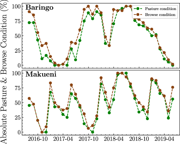
These qualitative assessments of aPC/aBC and rPC/rBC were converted to categorical values of 100, 50, and 0 representing, 'good/above normal', 'fair/normal', and 'poor/below normal' respectively. The monthly mean value of all observed sites within a county was then computed to obtain a monthly, county-wide time-series of aPC/aBC and rPC/rBC from July 2016 to June 2019 (See figure 2). Though the number of observations were mostly consistent, substantial noise was introduced into the time-series where counties had fewer than five observations in a given month. For this reason, the data from these months were removed.
Figure 2. Monthly pasture and browse condition time-series for two example counties.
Download figure:
Standard image High-resolution image3.2. Satellite drought indicators
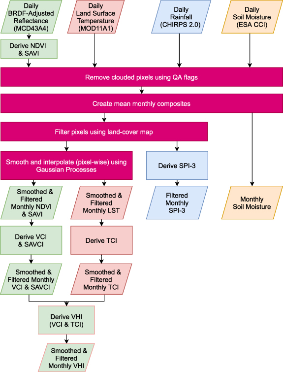
In this study, we included a number of commonly-used agricultural and meteorological drought indicators. The agricultural drought indicators were extracted from the MODerate resolution Imaging Spectroradiometer (MODIS). First, we used the Nadir bidirectional reflectance distribution function-Adjusted Reflectance dataset at 500 m resolution (MCD43A4 v006; Schaaf and Wang 2015) to generate the NDVI and the soil adjusted vegetation index (SAVI; Huete 1988). Additionally, the land surface temperature (LST) at 1 km spatial resolution was obtained from MOD11A1 (v006; Wan et al
2015). These indicators provide an absolute assessment of the environmental conditions. We removed any clouded pixels in these datasets and computed mean monthly composites created for pixels over the IGBP land-cover classes of Grasslands, Savannahs, and open Shrublands (MCD12Q1 v006; Friedl and Sulla-Menashe 2019). Finally, we used Gaussian Processes to smooth and interpolate each pixel temporally (see
Table 2. Overview of drought indicators.
| Name | Resolution [km (∘)] |
|---|---|
| 3-month mean VCI (VCI3M; derived from NDVI) | 0.5 (0.004) |
| 3-month mean VHI (VHI3M; derived from NDVI and LST) | 1.0 (0.009) |
| 3-month standard precipitation index (SPI3; derived from Funk et al 2014) | 5.6 (0.050) |
| Land surface temperature (LST; Wan et al 2015) | 1.0 (0.009) |
| Normalised difference vegetation index (NDVI; derived from Schaaf and Wang 2015) | 0.5 (0.004) |
| Soil adjusted vegetation index (SAVI; derived from NDVI) | 0.5 (0.004) |
| Soil adjusted vegetation condition index (SAVCI; derived from NDVI) | 0.5 (0.004) |
| Soil moisture (SM; Preimesberger et al 2020) | 27.8 (0.25) |
| Temperature condition index (TCI; derived from LST) | 1.0 (0.009) |
| Vegetation condition index (VCI; derived from NDVI) | 0.5 (0.004) |
| Vegetation health index (VHI; derived from NDVI and LST) | 0.5 (0.004) |
Furthermore, SM, another absolute non-vegetation based index for monitoring agricultural drought, was obtained from the ESA CCI COMBINED product at a spatial resolution of 0.25∘ (Preimesberger et al 2020). Clouded data was removed and monthly composites created. However, smoothing was not carried out and, due to its spatial resolution, land cover filtering was not applied here.
Several relative drought indicators were also included by further processing the smoothed time-series of NDVI, SAVI, and LST. We computed the VCI (Kogan 1995), soil adjusted vegetation condition index (SAVCI), and temperature condition index (TCI). Moreover, the combination of VCI and TCI provided the vegetation health index (VHI; Kogan 1997). Since the NDMA uses the three month average VCI to capture persistence in the vegetation, we also computed them for VCI and VHI (VCI3M & VHI3M).
We also included the 3-month Standard Precipitation Index (SPI3) as a commonly-used meteorological drought index. Calculated from the 0.05∘ resolution CHIRPS daily rainfall estimates (Funk et al 2014), this index represents how cumulative rainfall observed over 3 months deviates from the long-term climatological mean (McKee et al 1993). To filter this product we created monthly composites, and then applied a 0.05∘ land cover map (MCD12C1; Friedl and Sulla-Menashe 2015).
Finally, all indicators were spatially and temporally aggregated to obtain a monthly time-series for each county to match the ground-based time-series. An overview on the products used and the derivation processes are described in figure 3 and the
Figure 3. Processing chain for the satellite indices.
Download figure:
Standard image High-resolution image3.3. Statistical analysis
Initially, a correlation analysis was performed to measure which satellite indices showed the best linear relationship with both relative and absolute pasture and browse conditions. However, the most pertinent aspect of this study is not only demonstrating the strength of the correlation, but also understanding the relationships in each different county. To achieve this, scatter plots between the ground-based and satellite-based datasets were visually inspected and a simple exponential equation was used to quantify the relationship:

The quality of the fit for each satellite indicator was assessed using the root mean squared errors, in order to evaluate the same indicator in different counties, and the r2 scores, to evaluate different indicators in the same county.
Once fitted, a simple threshold analysis was then carried out on the data. The NDMA currently use a threshold of VCI3M  35 to categorise a moderate drought condition, so we also applied this same threshold to the ground-based datasets to analyse the response of the satellite indices in each county when the pasture or browse condition is low. Additionally, we grouped the relative satellite indicator values (excluding SPI3) into the drought thresholds described by Klisch and Atzberger (2016) and analysed the corresponding relative pasture and browse conditions.
4. Results
4.1. Correlation analysis
Table 3 shows that the majority of the satellite indicators (except LST and SM) are better correlated to aPC than to aBC though, the maximum difference is only 0.04. Furthermore, table 3 demonstrates the robustness of the two datasets. The absolute satellite indicators (NDVI, SAVI, LST, and SM) are better correlated with the absolute ground conditions than they are with the relative ones. The reverse is then true for the rest of the satellite indicators whose construction rely upon historic distributions. Given this, the best correlated satellite indicator is SAVI closely followed by VHI3M. It is worth noting that a Pearson r score only accounts for linear correlations. Therefore, to decide which indicators have the strongest relationship with pasture and browse conditions on the ground, results from the fitting process should be compared.
Table 3. Country-wide mean Pearson r scores between the ground-based datasets and satellite indicators. The dashed line separates the absolute drought indicators (e.g. NDVI, SAVI, SM, LST) from the relative ones. Underlined values show the strongest correlation to each indicator.
| Satellite indicator | Pasture condition (aPC) | Browse condition (aBC) | Pasture condition compared to normal (rPC) | Browse condition compared to normal (rBC) |
|---|---|---|---|---|
| NDVI | 0.72 | 0.70 | 0.61 | 0.62 |
| SAVI | 0.80 | 0.79 | 0.67 | 0.67 |
| SM | 0.67 | 0.68 | 0.59 | 0.59 |
| LST | −0.73 | −0.74 | −0.64 | −0.63 |
| VCI | 0.66 | 0.63 | 0.71 | 0.68 |
| SAVCI | 0.65 | 0.61 | 0.71 | 0.69 |
| TCI | 0.55 | 0.52 | 0.61 | 0.59 |
| SPI3 | 0.60 | 0.57 | 0.65 | 0.63 |
| VHI | 0.66 | 0.63 | 0.72 | 0.69 |
| VCI3M | 0.60 | 0.57 | 0.68 | 0.65 |
| VHI3M | 0.67 | 0.63 | 0.76 | 0.73 |
4.2. Fitting analysis
We present here the results of our fitting analysis with respect to the aPC. All results for the rPC as well as the aBC, rBC can be found in the supplementary materials (available online at stacks.iop.org/ERL/16/084066/mmedia).
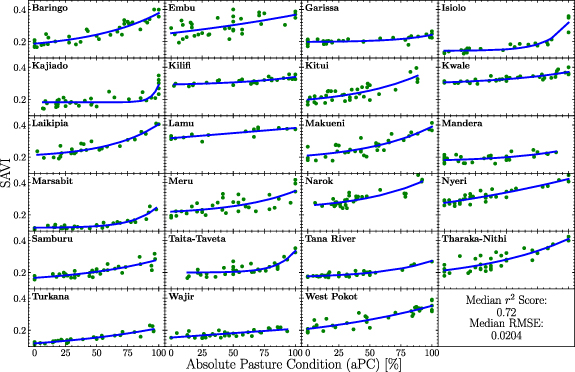
The fitted and original SAVI values plotted against aPC are shown in figure 4. Though identical land cover types were selected, the relationships vary widely from county to county both in terms of accuracy and shape. The variation in shape can be explained by the county's climate: semi-arid counties such as Laikipia, Baringo, and Kitui have a large variation in SAVI resulting in a steep slope, whereas arid counties such as Wajir, Mandera, and Garissia have a low variation in SAVI. NDVI is the only other indicator that follows the same pattern with SAVI, though there is not much variation in shape for LST and SM. The relative indicators then appear to follow random variations likely owning to their derivation from historical distributions. The scatter plots and fitted data for all other indicators can be found in supplementary material figures 5–47.
Figure 4. Exponential fits for each county between SAVI and the absolute pasture condition (aPC). Similar graphs for other satellite indicators (and browse condition) can be found in the supplementary materials.
Download figure:
Standard image High-resolution imageTable 4 summarises the r2 scores for each satellite indicator in each county when fitted against aPC. SAVI is shown to perform best both in terms of average r2 score and consistency (lowest total rank) over all counties. This is not surprising as SAVI is a direct measure of vegetation greenness that mitigates the negative affects of soil brightness. While other indicators such as SAVCI and VHI3M are better related to the relative ground conditions (see supplementary material table 1 and 3), SAVI exhibits the strongest overall relationship. This being said, it can be seen that the variation in indicator performance per county is generally smaller than the variation of one indicator across all counties. For example, table 4 shows that certain counties such as Embu, Mandera, and Wajir relate badly to most, if not all satellite indicators. The reasons for this are unclear, as the ground-based datasets for these counties are collected in the same format, with an equal amount of assessments contributing to each monthly data-point as that of other counties.
Table 4. r2 scores between the original and fitted satellite indicators for absolute pasture condition (aPC) in each county. Indicators were ranked from 1 to 11 in each county based upon the r2 score. The lower the total rank, the better the indicator performs across all counties.
| County | NDVI | SAVI | LST | SM | VCI | SAVCI | TCI | VHI | VCI3M | VHI3M | SPI3 |
|---|---|---|---|---|---|---|---|---|---|---|---|
| Baringo | 0.79 | 0.84 | 0.66 | 0.51 | 0.88 | 0.93 | 0.77 | 0.88 | 0.82 | 0.84 | 0.78 |
| Embu | 0.10 | 0.36 | 0.49 | 0.11 | 0.26 | 0.42 | 0.21 | 0.32 | 0.19 | 0.41 | 0.56 |
| Garissa | 0.40 | 0.57 | 0.16 | 0.21 | 0.72 | 0.73 | 0.34 | 0.59 | 0.71 | 0.77 | 0.51 |
| Isiolo | 0.87 | 0.88 | 0.45 | 0.53 | 0.71 | 0.67 | 0.59 | 0.73 | 0.62 | 0.70 | 0.60 |
| Kajiado | 0.59 | 0.65 | 0.46 | 0.48 | 0.63 | 0.76 | 0.55 | 0.68 | 0.44 | 0.53 | 0.60 |
| Kilifi | 0.29 | 0.61 | 0.60 | 0.60 | 0.28 | 0.12 | 0.23 | 0.35 | 0.30 | 0.41 | 0.31 |
| Kitui | 0.68 | 0.66 | 0.57 | 0.28 | 0.45 | 0.44 | 0.19 | 0.38 | 0.23 | 0.34 | 0.47 |
| Kwale | 0.41 | 0.72 | 0.59 | 0.66 | 0.43 | 0.18 | 0.27 | 0.44 | 0.33 | 0.46 | 0.34 |
| Laikipia | 0.78 | 0.85 | 0.68 | 0.52 | 0.78 | 0.80 | 0.66 | 0.76 | 0.71 | 0.75 | 0.58 |
| Lamu | 0.64 | 0.69 | 0.82 | 0.64 | 0.81 | 0.19 | 0.64 | 0.74 | 0.65 | 0.57 | 0.53 |
| Makueni | 0.55 | 0.74 | 0.55 | 0.35 | 0.16 | 0.26 | 0.19 | 0.22 | 0.04 | 0.15 | 0.37 |
| Mandera | 0.07 | 0.41 | 0.45 | 0.35 | 0.29 | 0.39 | 0.33 | 0.39 | 0.29 | 0.59 | 0.48 |
| Arsabit | 0.87 | 0.87 | 0.50 | 0.40 | 0.67 | 0.67 | 0.33 | 0.57 | 0.56 | 0.61 | 0.61 |
| Meru | 0.44 | 0.50 | 0.34 | 0.33 | 0.57 | 0.55 | 0.33 | 0.50 | 0.51 | 0.58 | 0.62 |
| Narok | 0.68 | 0.74 | 0.57 | 0.54 | 0.36 | 0.35 | 0.19 | 0.32 | 0.19 | 0.29 | 0.36 |
| Nyeri | 0.73 | 0.83 | 0.62 | 0.49 | 0.49 | 0.57 | 0.38 | 0.51 | 0.16 | 0.32 | 0.36 |
| Samburu | 0.76 | 0.70 | 0.61 | 0.48 | 0.79 | 0.82 | 0.54 | 0.73 | 0.77 | 0.80 | 0.60 |
| Taita-Taveta | 0.47 | 0.71 | 0.54 | 0.53 | 0.28 | 0.37 | 0.36 | 0.40 | 0.11 | 0.27 | 0.47 |
| Tana River | 0.57 | 0.84 | 0.45 | 0.35 | 0.54 | 0.59 | 0.23 | 0.45 | 0.39 | 0.57 | 0.48 |
| Tharaka-Nithi | 0.74 | 0.73 | 0.70 | 0.36 | 0.34 | 0.32 | 0.23 | 0.33 | 0.10 | 0.15 | 0.34 |
| Turkana | 0.89 | 0.88 | 0.76 | 0.66 | 0.74 | 0.73 | 0.43 | 0.63 | 0.77 | 0.80 | 0.65 |
| Wajir | 0.24 | 0.51 | 0.31 | 0.29 | 0.23 | 0.28 | 0.12 | 0.19 | 0.25 | 0.35 | 0.22 |
| West Pokot | 0.80 | 0.81 | 0.68 | 0.45 | 0.71 | 0.70 | 0.47 | 0.64 | 0.71 | 0.71 | 0.68 |
| Mean | 0.58 | 0.70 | 0.55 | 0.44 | 0.53 | 0.51 | 0.37 | 0.51 | 0.43 | 0.52 | 0.50 |
| Total Rank | 89.0 | 36.5 | 106.0 | 143.5 | 101.0 | 98.0 | 192.5 | 116.0 | 157.0 | 103.0 | 122.5 |
This analysis also reveals that VCI is not the best indicator to monitor relative ground conditions (see supplementary material table 1 and 3). With the additional information provided by TCI, VHI has the edge over VCI and is better related to the relative ground conditions in most counties. Furthermore, VCI3M on average, performs worse than VCI whereas VHI3M performs much better than VHI. This hints that TCI over the previous three months is better related to ground conditions than the current TCI is.
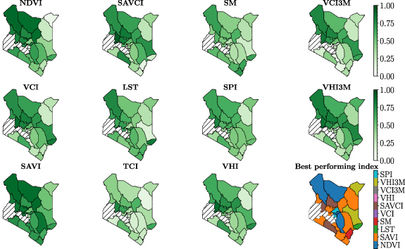
To identify spatial patterns in performance, the information within table 4 was superimposed onto maps of Kenya as seen in figure 5. This has revealed that the satellite indicators relate better to aPC in the west of country than they do in the east. This pattern also holds true for rPC and aBC/rBC (see supplementary material figures 1–3). Conversely, this pattern does not follow climate as both arid and semi-arid counties in the east perform similarly. Cloud coverage is a possible explanation for the disparity as it plays a large role in the degradation of satellite imagery, and is seen at much higher levels in the east than in the west (see figure 1). Figure 5 also displays which indicator is best related to aPC in each county. SAVI and NDVI perform best in the majority of the country with various other indicators being better related in the remaining 40% of counties.
Figure 5. The r2 score between the fitted and actual satellite indicator values in each county for absolute pasture condition (aPC), alongside a plot of the best suited indicator for each county.
Download figure:
Standard image High-resolution image4.3. Threshold analysis
Contained within table 5 are the resultant fitted satellite indicator values when aPC is at 35%, mirroring NDMA's current operational drought threshold of VCI3M  . As can be seen, each indicator has a wide spread of values that differ from county to county. For example, when aPC is registered to be 35% in Garissa, the corresponding fitted VCI3M is 26.1 whereas in Nyeri, the same aPC results in a fitted VCI3M of 48.9. Despite this variation, for both aPC and aBC, the mean thresholds of the relative agricultural indicators are close to the country-wide threshold of 35, with the mean SPI3 threshold also in agreement with a moderate drought (see supplementary materials table 5 for aBC thresholds). On the other hand, rPC and rBC exhibit higher mean thresholds across all indicators (lower for LST, see supplementary materials table 4 and 6). Consequently, county specific thresholds for each indicator would be a more effective at detecting drought onset than a single country wide threshold.
Table 5. Resultant fitted satellite indicator value when at a threshold of 35% absolute pasture condition (aPC).
| County | NDVI | SAVI | LST (∘C) | SM | VCI | SAVCI | TCI | VHI | VCI3M | VHI3M | SPI3 |
|---|---|---|---|---|---|---|---|---|---|---|---|
| Baringo | 0.38 | 0.22 | 36.38 | 0.08 | 32.90 | 30.11 | 37.13 | 34.96 | 37.21 | 37.56 | −0.61 |
| Embu | 0.41 | 0.29 | 33.39 | 0.04 | 40.97 | 47.50 | 46.79 | 43.88 | 42.39 | 45.05 | −0.29 |
| Garissa | 0.26 | 0.20 | 37.93 | 0.05 | 27.31 | 25.21 | 28.54 | 27.89 | 26.12 | 26.56 | −0.23 |
| Isiolo | 0.20 | 0.15 | 39.88 | 0.05 | 25.73 | 28.60 | 32.06 | 28.70 | 31.87 | 31.95 | −0.20 |
| Kajiado | 0.28 | 0.18 | 37.06 | 0.07 | 26.65 | 22.83 | 31.25 | 28.76 | 30.83 | 33.22 | −0.31 |
| Kilifi | 0.43 | 0.30 | 36.31 | 0.05 | 36.83 | 32.82 | 31.62 | 34.22 | 36.83 | 34.12 | −0.23 |
| Kitui | 0.33 | 0.23 | 35.23 | 0.07 | 36.74 | 40.18 | 35.86 | 36.35 | 38.70 | 37.46 | −0.14 |
| Kwale | 0.47 | 0.32 | 35.77 | 0.05 | 43.20 | 40.05 | 39.36 | 41.28 | 44.26 | 42.20 | −0.06 |
| aikipia | 0.37 | 0.24 | 34.28 | 0.07 | 32.98 | 32.54 | 33.99 | 33.45 | 34.20 | 34.19 | −0.12 |
| Lamu | 0.52 | 0.34 | 34.36 | 0.04 | 41.14 | 37.23 | 35.02 | 38.69 | 45.00 | 41.20 | −0.56 |
| Makueni | 0.35 | 0.24 | 35.16 | 0.04 | 43.62 | 41.65 | 44.93 | 44.13 | 47.96 | 46.10 | −0.27 |
| Mandera | 0.25 | 0.19 | 37.66 | 0.06 | 34.52 | 37.16 | 38.94 | 36.61 | 35.94 | 37.32 | 0.14 |
| Marsabit | 0.19 | 0.12 | 39.95 | 0.07 | 27.22 | 26.70 | 40.46 | 33.71 | 30.92 | 34.91 | −0.25 |
| Meru | 0.39 | 0.24 | 34.84 | 0.07 | 36.60 | 34.81 | 32.44 | 34.44 | 37.74 | 34.21 | −0.39 |
| Narok | 0.45 | 0.29 | 32.14 | 0.07 | 35.93 | 37.76 | 36.39 | 36.05 | 40.14 | 38.19 | −0.23 |
| Nyeri | 0.51 | 0.32 | 27.31 | 0.06 | 48.98 | 42.55 | 41.37 | 45.63 | 48.92 | 45.25 | 0.08 |
| Samburu | 0.28 | 0.19 | 37.46 | 0.07 | 27.89 | 27.04 | 30.03 | 28.96 | 28.85 | 29.73 | −0.29 |
| Taita-Taveta | 0.29 | 0.20 | 38.43 | 0.07 | 30.87 | 34.48 | 32.53 | 31.57 | 33.77 | 32.85 | −0.15 |
| Tana River | 0.25 | 0.19 | 37.74 | 0.06 | 33.74 | 29.58 | 38.25 | 35.60 | 35.38 | 36.09 | −0.10 |
| Tharaka-Nithi | 0.39 | 0.26 | 36.76 | 0.03 | 33.02 | 34.43 | 29.94 | 30.74 | 36.83 | 33.99 | −0.29 |
| Turkana | 0.23 | 0.14 | 40.87 | 0.07 | 42.40 | 37.13 | 39.61 | 41.36 | 43.09 | 41.22 | −0.26 |
| Wajir | 0.22 | 0.17 | 40.17 | 0.08 | 35.04 | 30.97 | 37.66 | 35.35 | 32.56 | 33.60 | 0.05 |
| West Pokot | 0.39 | 0.25 | 34.48 | 0.06 | 28.76 | 28.75 | 30.69 | 29.71 | 33.49 | 33.94 | −0.57 |
| Mean | 0.34 | 0.23 | 36.24 | 0.06 | 34.92 | 33.92 | 35.86 | 35.31 | 37.09 | 36.56 | −0.23 |
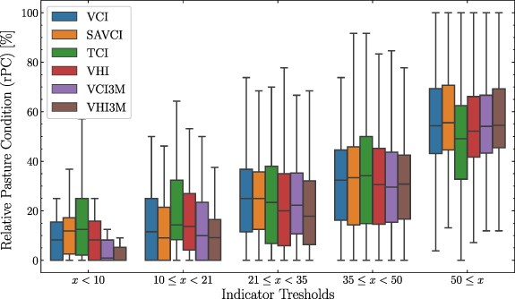
Using five drought thresholds used for VCI3M within Kenya (Klisch and Atzberger 2016), figure 6 illustrates how rPC responds to each different relative indicator (excluding SPI3). The resultant range covered by rPC is always larger than that of the original threshold however, the mean rPC generally increases in accordance with the threshold. This is consistent with the non-linear relationship that was found. See supplementary materials figure 4 for the rBC box plot.
Figure 6. Box plot detailing the range of relative pasture conditions (rBC) when at different thresholds of satellite indicator.
Download figure:
Standard image High-resolution imageIn saying this, it is clear figure 6 has a very large overall variability. This is due to data from all counties being used to produce the graph. In most counties, the satellite indicators were in good agreement with the ground dataset which can be seen in the sensible interquartile ranges. However, in some counties there are very low levels of agreement which lead to the whiskers on the plot being large. Consequently, it can be stated that in counties with low agreement, the derived thresholds will be less accurate.
5. Discussion
Due to their complexity and lack of a central definition, droughts are incredibly difficult to monitor and forecast (Lavaysse et al
2018). In an attempt to achieve this, several satellite-based indicators have been created ranging from simple precipitation based metrics to more elaborate multi-sensor models (AghaKouchak et al
2015, Jiao et al
2021). This study has investigated the efficacy of 11 commonly used satellite drought indicators for monitoring agricultural drought within Kenya. We explored their relationship to ground-based pasture and browse observations collected by Kenya's NDMA. Our results show strong overall correlations (r
 ) which become stronger when a non-linear model is taken into account, moreover we also analysed the country-wide drought threshold (Klisch and Atzberger 2016, VCI3M
  ) on the county level, revealing that each Kenyan county responds differently to the various drought indicators.
As this research was carried out on a unique dataset, there is no study that offers a direct comparison in results. That being said, numerous studies have utilised satellite-based indicators as predictors for crop yields where data is more readily available (Salazar et al
2007, Kogan et al
2012, Labudová et al
2017, Bachmair et al
2018, García-León et al
2019). The explained variability (r2 ∼ 0.7) we found in a simple exponential model relating SAVI to the aPC is similar to those found between VCI/SPI and crop yield. Though deviating from the purpose of DEWs, this type of study is a good benchmark due to the more detailed nature of the ground-based yield datasets. Generally, we found better relationships between the ground and satellite data in the North-West areas of the country, with there being no apparent correlation to the size of the county, nor the amount of ground-based measurements (see
A key result of this research was that VCI[3M] is not the most suitable indicator for monitoring drought in Kenya's pastoral communities. The absolute conditions of pasture and browse are better described by SAVI and then by NDVI. This is not surprising as both indicators are physical measurements of how 'green' the current vegetation is over any given area, rather than a metric derived from historic distributions. SAVI's better performance can then be attributed to its mitigation of soil reflectance. On the other hand, VCI[3M] is also outperformed by VHI[3M] and then by SAVCI when describing the relative pasture and browse conditions. This is due to the additional temperature information contained by VHI[3M], and soil reflectance mitigation contained by SAVCI. Having said this, VCI is still more suitable at monitoring relative and absolute conditions than SM, SPI3, or TCI. Ultimately, these three indicators are proxy variables for the condition of vegetation and therefore least suitable to be used as stand-alone monitoring tools for pasture and browse conditions.
Even when using VCI a drought onset threshold must still be set, and in Kenya, this is currently VCI3M  35 for every county. On average, we have shown this is roughly true however, when a county's VCI3M is extracted at a pasture condition of 35%, it can be anywhere between ∼50 and ∼25 (see table 5). This is strong evidence for the necessity of county based thresholds which would enable the DEWs to be tuned to each county's unique flora. To further improve the DEWs' effectiveness, the thresholds in table 5 could be directly applied to real-time observations of NDVI or SAVI to obtain a live picture of pasture and browse conditions on the ground. Though this research provides a good foundation for the improvement of DEWs, care must be taken when implementing thresholds such as these. Different NDVI datasets or VCI baselines could respond differently at a pasture condition of 35% and therefore, this analysis should be repeated for any dataset used (the same is true for the ground dataset, as within this study the data was collected and quality controlled by a single organisation working over several different counties). If this is not the case, it would be unwise to set a country wide threshold derived from the ground-based datasets.
Several caveats remain with the dataset that was used to validate the drought indicators. The pasture and browse observations used within this study were collected from various sentinel sample sites around each county. Given that many of the counties are larger than 10 000 km2, noise will get included in the satellite-based data when aggregating. In addition, plant species denoted by 'pasture' or 'browse' can vary across regions and their conditions are assessed qualitatively, which often depends upon the experience of field monitors, and only provides three categories. More detailed and robust ground-based datasets that characterise and quantify vegetation conditions can help improve methods to monitor and forecast drought onset, severity, and extent from space.
6. Conclusion
In conclusion, our models linking ground-based pasture and browse datasets collected by Kenya's NDMA to commonly-used drought indicators for use in monitoring agricultural drought help identify the best indicators for different counties. This spatial heterogeneity suggests that Drought Early Warning System should include a variety of such indicators. Additionally, we have also highlighted the spatial variability in thresholds that should be used to classify drought severity. Such information is key for disaster risk agencies (e.g. NDMA) who aim to monitor and intervene in order to mitigate the impacts of drought on lives and livelihoods.
Acknowledgments
This research was funded by the Science for Humanitarian Emergencies and Resilience (SHEAR) consortium project 'Towards Forecast-based Preparedness Action' (ForPAc, www.forpac.org), Grant Number NE/P000673/1, funded by the UK Natural Environment Research Council (NERC), the Economic and Social Research Council (ESRC), and the UK Department for International Development (DfID). EES acknowledges support from the UK Newton Fund as part of the Development in Africa with Radio Astronomy (DARA) Big Data project delivered via STFC under Grant Number ST/R001898/1 and JMM was funded by the NERC-SHEAR Studentship Cohort Grant Number NE/R007799/1. This is a contribution from the Sussex Sustainability Research Programme (SSRP).
Conceptualization, AB and PR; Data curation, AB, EES, and KG; Methodology, AB, EES, KG, and JMM; Formal Analysis, AB; Writing—original draft, AB; Writing—review & editing, AB, EES, KG, JMM, and PR; Supervision, AB and PR; Funding Acquisition, PR.
Data availability statement
All satellite data are freely available, the aggregated ground observations and code that support the findings of this study are openly available at the following URL/DOI: https://doi.org/10.5281/zenodo.4670526.
Appendix
Appendix. Satellite-based indicator derivations
NDVI was calculated from the red and near-infrared (NIR) bands of the MODIS MCD43A4 product using the following equation,

SAVI was then calculated in a similar way,

where L is 0.5 in order to minimise soil brightness (Huete 1988). VCI and SAVCI were then calculated for each pixel, at each monthly time-step using the standard formula,

where  is the current NDVI/SAVI and where
  and
and  are the minimum and maximum NDVI/SAVI values at each month throughout the period of 2001-2015 (Kogan 1995).
Table A1. Overview of satellite products used to create the drought indicators.
| Satellite product | Resolution | Product name |
|---|---|---|
| BRDF Reflectance | 500 m: daily | MCD43A4 (Schaaf and Wang 2015) |
| Land surface temperature | 1 km: daily | MOD11A1 (Wan et al 2015) |
| IGBP land cover | 500 m: yearly | MCD12Q1 (Friedl and Sulla-Menashe 2019) |
| IGBP land cover | 0.05∘: yearly | MCD12C1 (Friedl and Sulla-Menashe 2015) |
| Rainfall estimates | 0.05∘: daily | CHIRPS v2.0 (Funk et al 2014) |
| Soil moisture | 0.25∘: daily | ESA CCI (Preimesberger et al 2020) |
TCI was calculated from the raw LST product for each pixel, at each time-step in the following way:

where  and
and  are the minimum and maximum LST values at each month throughout the period of 2001–2015 (Kogan 1995). Subsequently, VHI (Kogan 1997) was calculated assuming an equal combination of VCI and TCI (α = 0.5),

The 3-month standardized precipitation index (SPI3) was calculated from 40 years of historic rainfall data fitted to a gamma distribution, then transformed to a Gaussian distribution (McKee et al 1993). The two other three month indicators (VHI3M and VCI3M) were calculate by taking the mean of the past three months of data.
Appendix. Smoothing and interpolation of satellite-based indicators
Pixel-wise Gaussian Processes smoothing and interpolation was performed on the NDVI, SAVI, and LST time-series. A radial basis function (RBF) kernel was used with a lengthscale of 50 and a variance of 0.5 (Barrett et al 2020).
Appendix. Performance correlation with r2 results
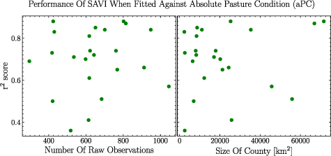
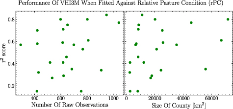
The amount of raw observations in the ground data as well as the size of the county have no-to very week correlation with the performance of the indicators. The two best performing indicators (SAVI for absolute conditions and VHI3M for relative conditions) have been displayed in figures A1 and A2. A Pearson r of 0.098 was found between SAVI's performance and the number of observations in a county's dataset, while a Pearson r of 0.147 was found between the size of the county and the performance. For VHI3M, a Pearson r of 0.291 was found between the number of observations and the performance, while a Pearson r of 0.323 was found between the size of the county and the performance.
Figure A1. The r2 score of each county fit for SAVI and absolute pasture condition (aPC) plotted against the raw number of observations in each county and the size of each county.
Download figure:
Standard image High-resolution imageFigure A2. The r2 score of each county fit for VHI3M and relative pasture condition (rPC) plotted against the raw number of observations in each county and the size of each county.
Download figure:
Standard image High-resolution image