Freedom’s natal day is here.
Fire the guns and shout for freedom
See the flag above unfurled!
Hail the stars and stripes forever
Dearest flag in all the world.
~Florence A. Jones
The 4th of July celebrations are just around the corner, in all their grandeur, festivities, and throngs of people who amass to observe and partake each year in the parade on Constitution Avenue in Washington D.C., a true kaleidoscope of American heroes, dynamic spirit, and abiding vision. And the echoes of the star spangled banner, emanating from the earth itself, would resonate from every nook and cranny of the country, its strains permeating the listeners with an unflinching spurt of patriotism and bittersweet nostalgia.
The glorious red, white, and blue banner would rise and stand tall and erect, evoking poignant songs of freedom, valor, fair maidens, and chivalrous knights to mind. At the first hint of dusk, the sky would light ablaze with an explosion of vibrant colors, exuberantly showering down like shooting stars upon a mesmerized mob. With such splendor, it’s hard not to puff up with pride and get heady on the forbidden fruit that is freedom.
As if to instill a deeper sense of patriotism, the entire country has conspired to paint the town red (white and blue). Take a look around and you’ll be bombarded by the sea of potent trio pervading all and sundry. From conspicuous festive specialty packaging to 4th of July inspired dresses, cakes, cocktails, desserts, nail art, greetings, and even red, blue, and white wall papers, the world seems speckled with these hues. Even your favorite brands seem to have ventured a dip into patriotic packaging and are looking to capitalize on seasonal packaging trends.
Hershey’s Presents The True Sweetness Of Freedom
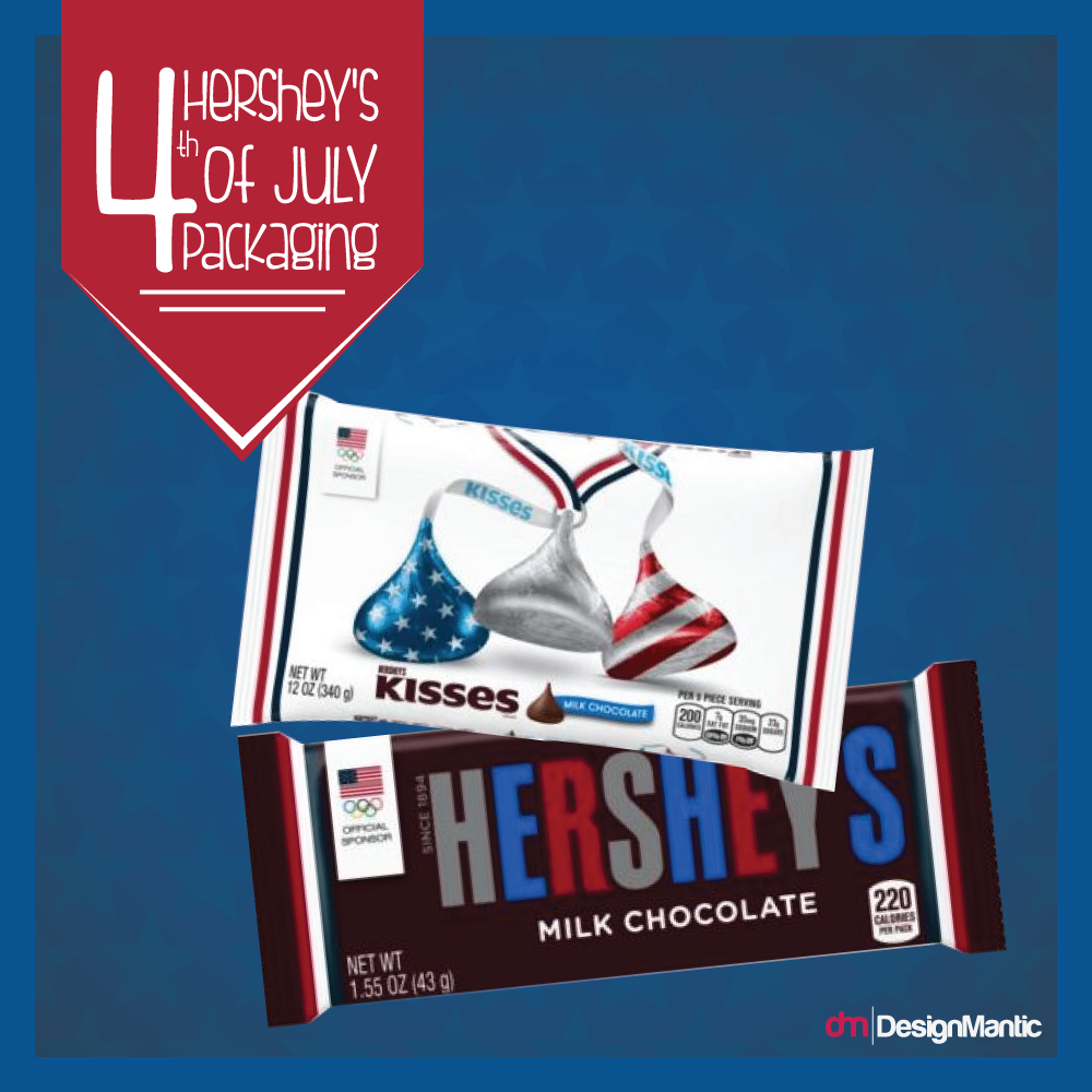
If you wander over to the candy isle, the Hershey’s chocolate bar would make you double over in surprise, especially since the brand hasn’t changed its packaging in the last 122 years! The silver trademark Hershey’s milk chocolate bar lettering has been replaced with blue, white, and red lettering, and the brand has also introduced special-edition products running the gamut from 12 ounce bags of Rolo candies, York kisses, Hershey’s Miniatures, Reese’s miniatures, and Hershey’s kisses chocolates.
Red, White, Or Blue? Hand Me The Entire Packet And No One Gets Hurt
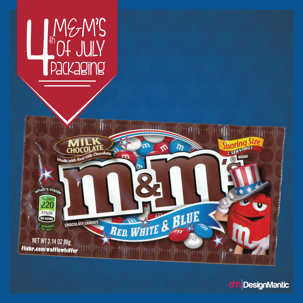
Other brands are also giving their products a patriotic make over. What with dedicated bags of M&M’s incorporating red, blue, and white drops of heaven.
Freedom Is “Heady” Or “Boozy”
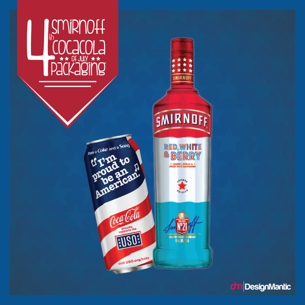
Talking about the “spirit” of the day, Smirnoff is reveling in American pride with the release of Smirnoff Berry, white, and red; a sweet blue raspberry, citrus, and cherry flavored vodka. In combination with “its share a coke and a song” campaign, limited edition cans have been released by Coca Cola to commemorate the USO through 4th of July. The blue, white, and red cans feature the lyrics “I’m proud to be an American,” from the Lee Greenwood classic “God Bless the U.S.A”.
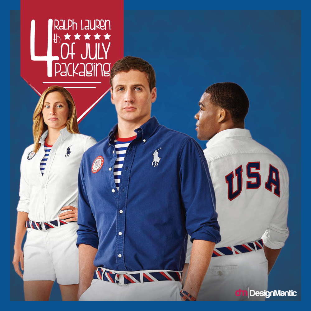
Ralph Lauren Tells Us To “Wear” Freedom Like A Badge
Ralph Lauren has unveiled its new clothing designs for the U.S. Olympic team for this summer’s closing ceremonies in Rio, and Oh my are they preppy!
Don’t Judge A Book By It’s Cover But Judge A Logo By Its Colors!
Now, While we have come to percieve this handsome trio with something hinting at reverence and are absolutely smitten by it (also seen it pervading every aspect of our lives recenly), have you ever stopped to think why these hues inspire such passion, loyalty, trust, and allegiance. After all, a flag can be construed as a country logo, and couldn’t just have been designed without ample forethought.
Sure the patriotic element does strike a cord deep within and we have grown up associating them with colors of freedom, but there is a subtle psycology to colors and the feelings they arouse in people, which is how designers and businesses leverage them in their logos for maximum marketing impact. Here’s an anatomy of these three hues and how we have come to discern them (In a nutshell: What’s the great deal about them):
Red; The Intensity Of Fire And Blood
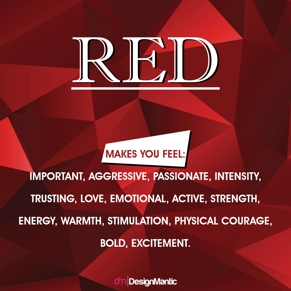
Being a dominant color, red conveys an impression of attractiveness and grace, and simultaneously adds heightened awareness and gravity, since the color is linked to elevated metabolism, breathing rates, heartbeat, and blood circulation, and is known to whet appetite and lust (Hint: Valentine’s day). Red can take on a plethora of diverse meanings, associated with both war and love, but the underlying unifying meaning in all contexts comes down to a sense of importance (Hint: The red carpet). Playful and stimulating, the color has what it takes to stir up all the right emotions.
Being a potent and intense color, red is also associated with rage and romance. Red is synonymous to a “call to action” color in the business world (Hint: Press me), since it’s knack for conspicuously attracting attention makes it a winner for designers over the globe. Darker shades of red emphasize durability and power and evoke visceral responses, while lighter hues point towards more energetic aspects, such as youthfulness. Myriad business aspire for gleaning red logos as the color depicts a sense of self assurance and expertise that is indispensable for businesses. A study of the world’s top 100 brands revealed that 29% brands incorporate some element of red in their logos. Look at Red bull, Netflix, ESPN, CNN, Coco Cola, and YouTube; all poised towards inciting excitement and hence the red logo!
White; The Beauty Of Serenity
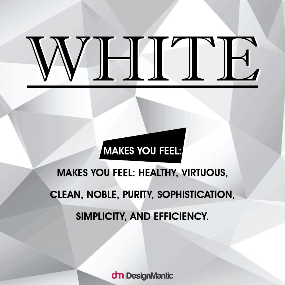
The color White exudes a minimalistic impression that is construed as both chaste and clean. Almost sterile, while gives off a spotless feel that seems completely effortless. Its association with the “holiness” and the “good” renders it a pious and virtuous feeling as well (Hint: Wedding dresses). White is total reflection, just as black is pure absorption. White seeks to reflect the entire force of the spectrum into the eyes of the onlookers. White is purity and uncompromising; it is sterile, hygienic, and utterly clean (Hint: Surgical Coats). Visually, white exudes an elevated perception of space.
At the farthest end of the spectrum, the color white complements every color, such as red, beautifully, making it an ideal secondary color. The negative effect of white on warm colors is deliberate to make them feel and look garish. White draws out the elements of stimulating colors and is often used in conjunction with bold hues than standalone. This is why white is used in conjunction with bolder colors, such as blue, in business logos, especially those falling in the healthcare, Airline, and clothing sector.
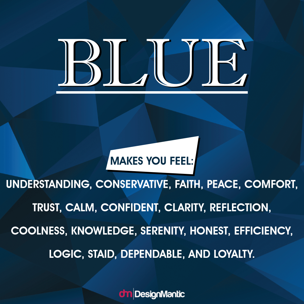
Blue; The Stability And Depth Of The Sea And Sky
Blue is the color of clear communication. Being the color of the mind, blue is essentially soothing; it has a conspicuous effect on our minds, rather than inducing the physical reactions synonymous with red. Softer shades of blue aid concentration and serve to soothe the mind, while the brighter counterparts can stimulate clarity of thoughts.
Businesses that cater to a wide demographics often incorporate blue in their logos to inspire trust, confidence, and loyalty, exude an air of success and credibility, inculcate a feeling of reliability and dependability, and to entice consumers in. Since blue is reminiscent of the ocean and the sky, it is said to placate people and induce a feel good reaction. A study of the world’s top 10 brands revealed that 33% brands incorporate some element of blue in their logos, especially those in the energy, finance, Airlines, technology, healthcare, household, and agriculture sector, a figure significantly more staggering than for any other color.
A Polygamy Affair
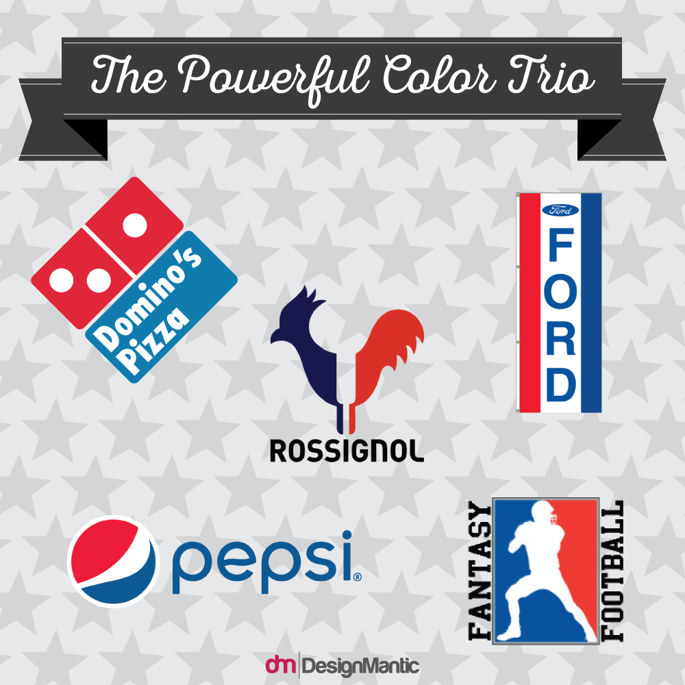
Balance valor and hardiness with flecks of serenity, perseverance, and vigilance, and toss in a speck of purity, innocence, and sophistication. What do you get? The American Flag, Ford, Fantasy football, Pepsi, and Dominoes of course, but also a powerful trio; one that is hard to contend with.
The logo of your brand can say it all in that first fleeting glance. Inadvertently, the colors of your logo can communicate an entirely wrong message to your audience. Would you take CNN as seriously if it sported a pink logo? Since different colors invoke different feelings and memories in people, why not play a game of colors and code a strong message inside. While 95% of all brands prefer to go monochromatic or make do with 2 colors at most, do you dare to stay in the remaining 5%?
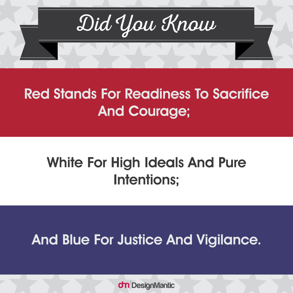
If so, here’s why the trio would prove to be an ideal color palette for your brand’s logo: The color red seeks to excite the onlookers, promising an intimation of thrill and exhilarating passion lying underneath. The blue counters pure adventure and stimulation with a promise of stability, dependability, confidence, and business like credibility. To bridge the gap between the two starkly varying hues, white provides the perfect balance, exuding a subtle yet uncompromising will to maintain integrity and purity of the brand, and uphold the values that form the foundation of the brand.

