GM’s all-new logo: why???
Last Updated:
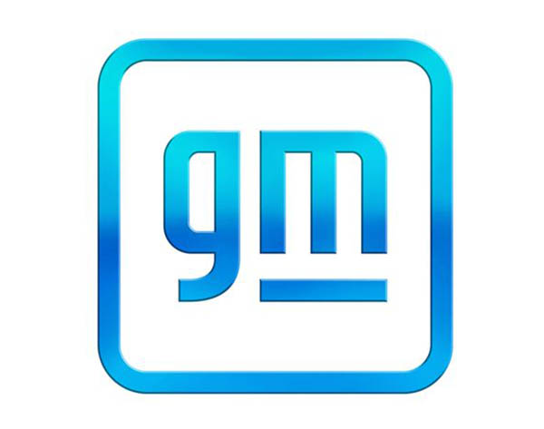
For some reason, GM has decided they need a new logo. (top pic)
I guess this is that old fashion idea that a new logo will make the whole company seem more modern. (Since they are at the beginning of a huge EV push)
I think the new logo is actually horrible. There were zero reasons to change what they had. If they wanted to actually change something, they do have a few logos that actually are in desperate need of improvement.
How about getting rid of that tacky gold color in the Chevrolet bowtie?
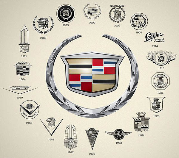
The Cadillac logo should also be updated. I know they change it a little bit a few years ago. But it still looks old. Really old.
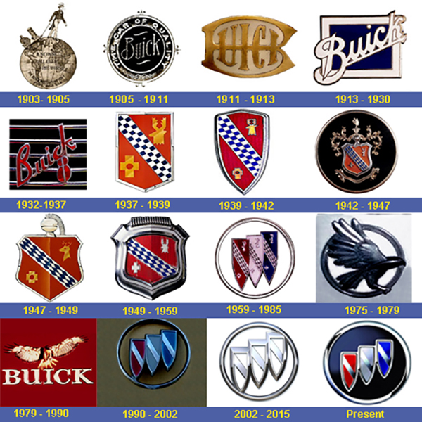
The Buick logo could use some work too.
I remember a few years ago, in the ’90s when Chrysler redesigned their logo in a very retro way. using parts of their old 1930’s logo.
I think GM could maybe do the same for Cadillac and Buick. (The Chevy one is simple enough and OK without the gold)
Here is a picture of various Cadillac logos throughout the ages. They could really use a modernized version of one of these instead of that old fashion, complicated crest design no one can actually relate to anymore…
And here are some ideas for Buick. My vote goes to that 1st one from 1903. As standing up hood ornament, this would look insane on a modern EV…
Too bad we don’t have logo designers like Raymond Loewy anymore…


The Cadillac crest pictured was retired after the 2014 model year. The new one isn't great as it gives Superhero vibes.
okay so for Buick I'm digging the 1911-13 one… and for Cadillac I'm liking the old stamp look of 1925… don't hate me…. haha
GM has been restructured / reformatted and rebranded.
– they will now manufacture vehicles extremely Eco friendly and made entirely from medical marijuana. General Marijuana's new logo reflects the GM that will take shareholders , employees and customers to great new highs. I mean Heights.
Bring back the merlettes and pearls!
Cadillac Standard of the world. Classy. Might draw chuckles today.
I see an electric plug with the lights e under the “m”
I see an electric plug with the line under the “m”
Weird that BMW just ditched the gradient/3d look for a super-basic flat design for their marketing logo, while GM does the exact opposite with theirs…
You ok grandpa?
I really like the old one better but I don't really care much because as far as I understand this won't be on any car. This is the new logo for the company but there are no GM car (as a brand). GMC is the closest and theirs is not changing.
Frankly, whatever. Either GM logo is incredibly generic and way too literal. They might as well call it "Associated Food Stores" or "Amalgamated Bank." DIdn't anyone tell GM that gradients have been "out" for at least five years.
Raymond Loewy also designed things like the Avanti.