Project Overview
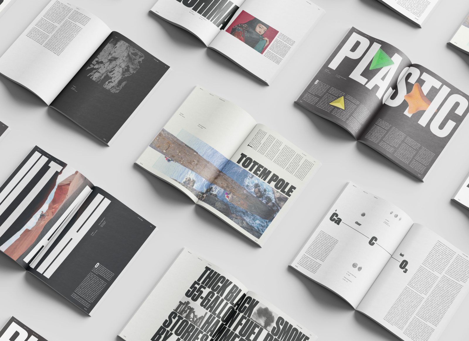
Monolith is a bi-annual rock climbing magazine that focuses on long form journalism, intimate interviews and stunning photography. Borrowing from its namesake, the magazine plays off the idea of magnitude in both content and form, providing the real sense of scale that the audience lives for. The goal of this project was to create a dynamic magazine that showcased the athletic achievement of climbers in a unique way, fostering intrigue and wonder from readers and differentiating Monolith from its bland, mass-market competitors. The target audience for the magazine is climbing experts and enthusiasts, ages 26–41.
Branding and Covers
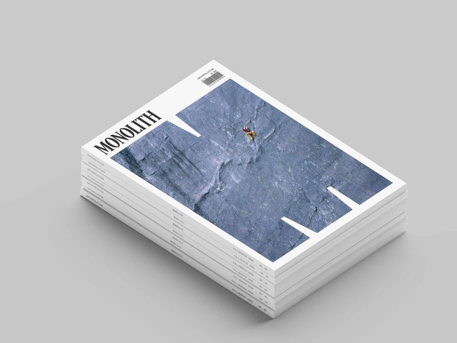
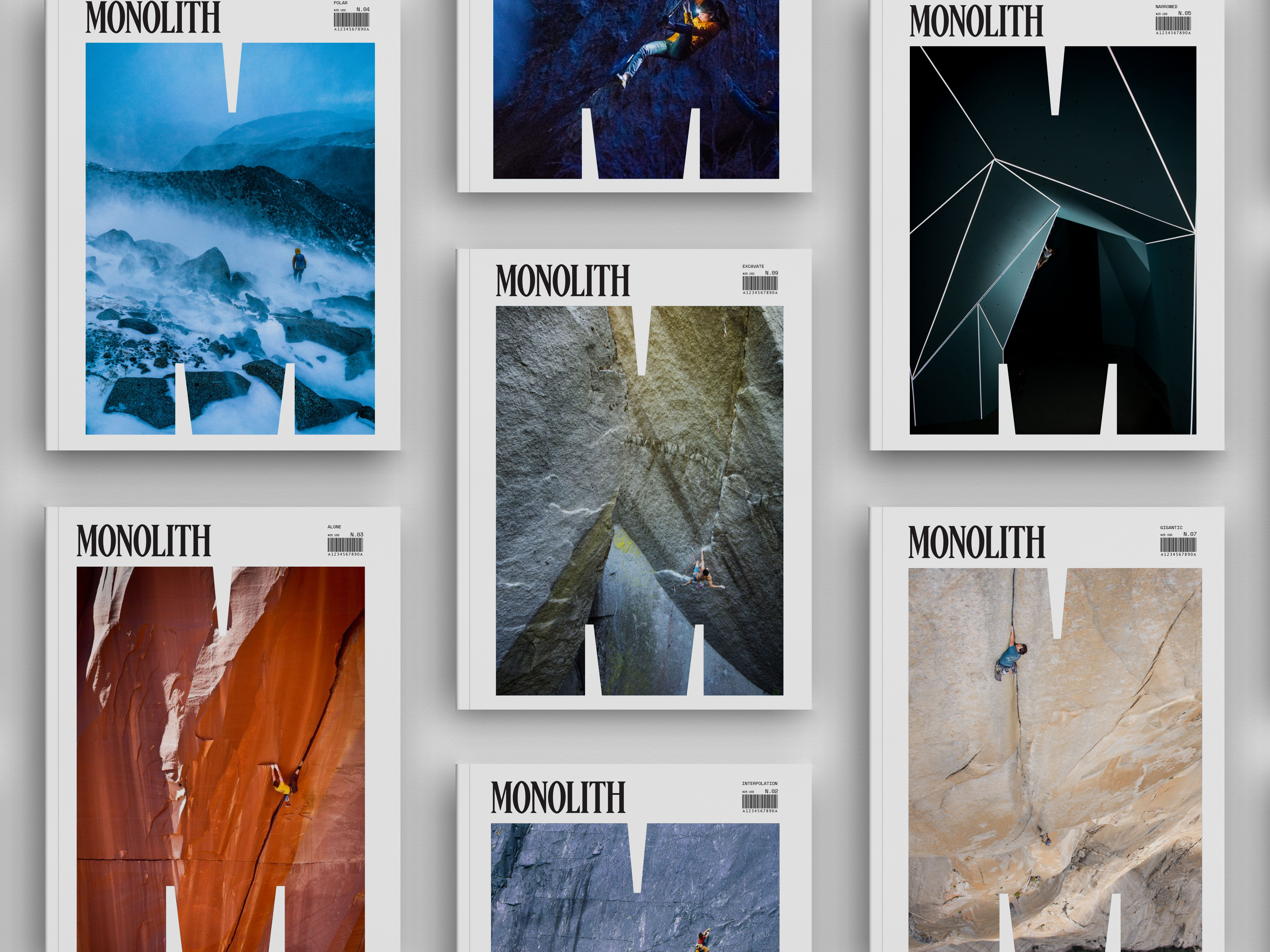
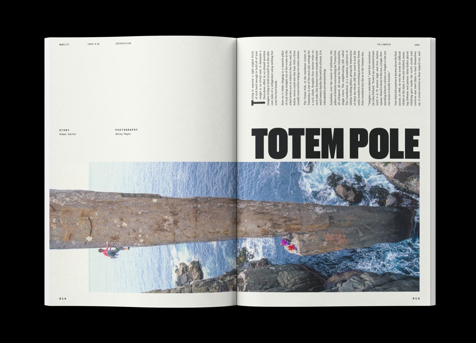
The type system for Monolith is simple, but with large, bold forms. The understated magazine logo is juxtaposed with a giant ‘M’ container for photography on the covers. Photographs convey a balance between climber and landscape, and always show people engaged in the act of climbing.
Interior Spreads
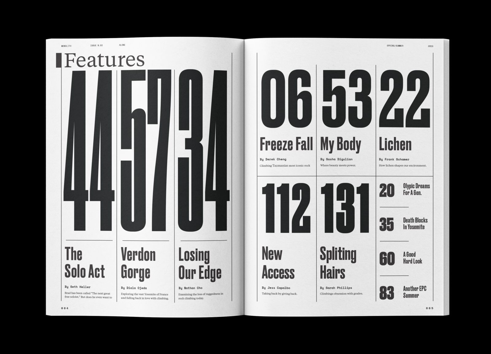
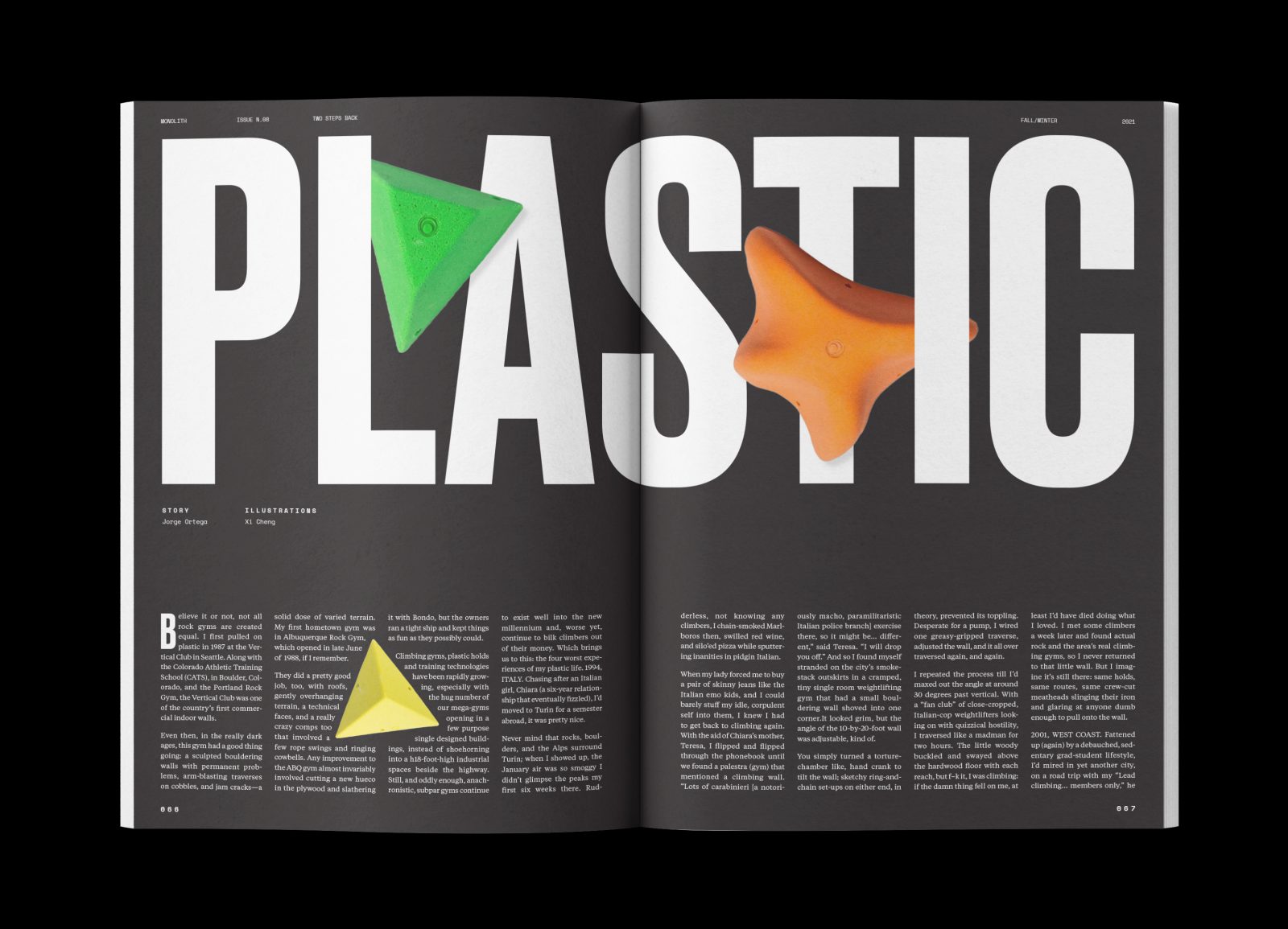
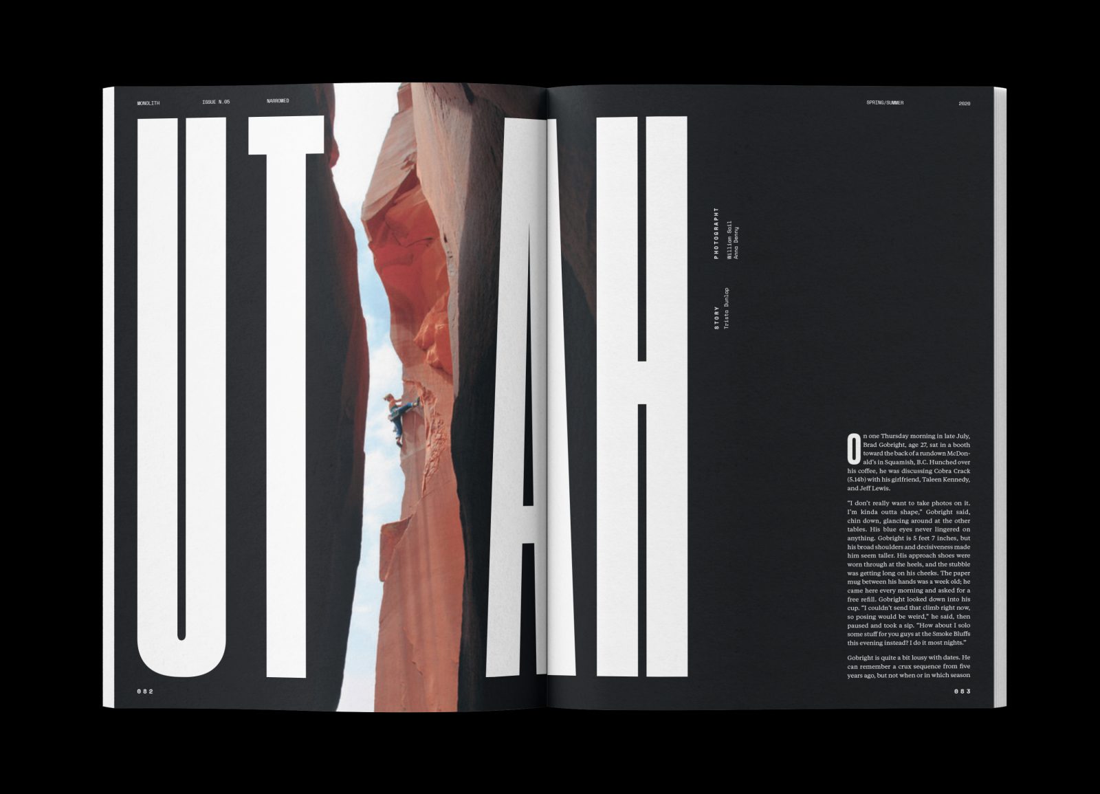
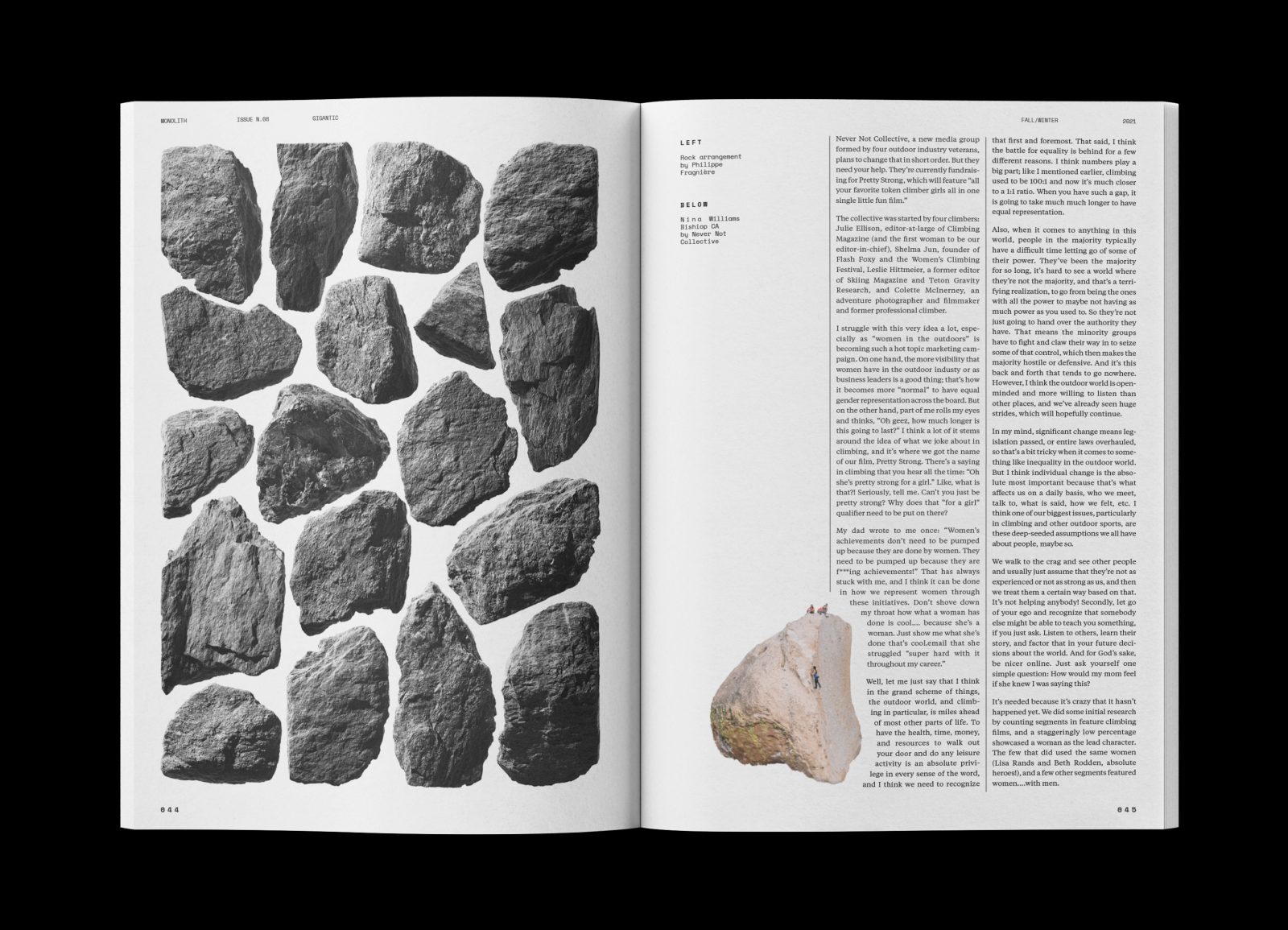
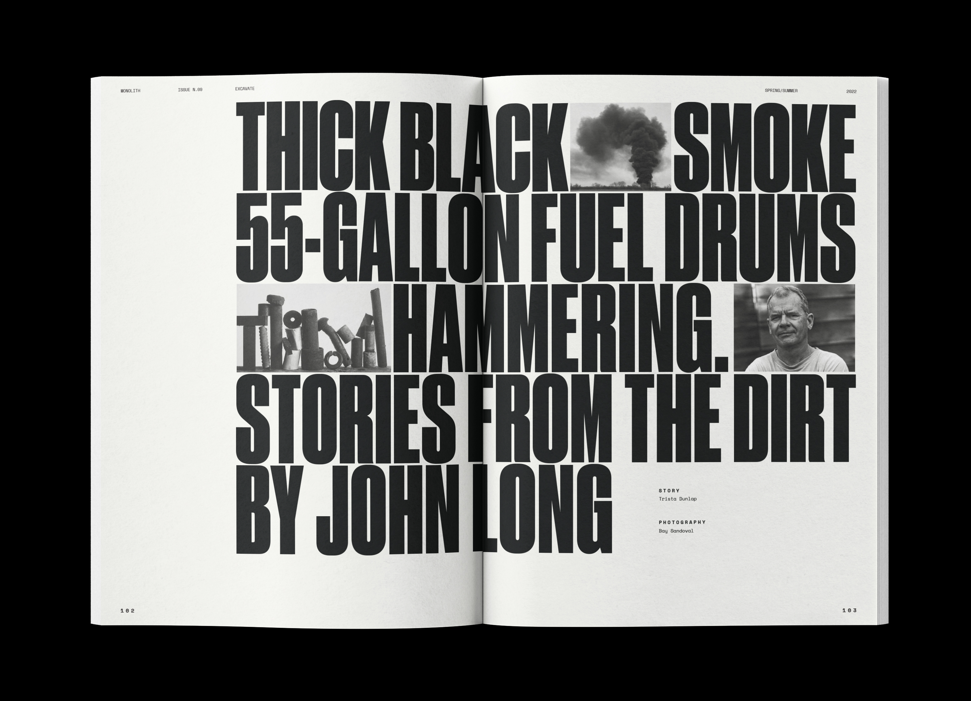
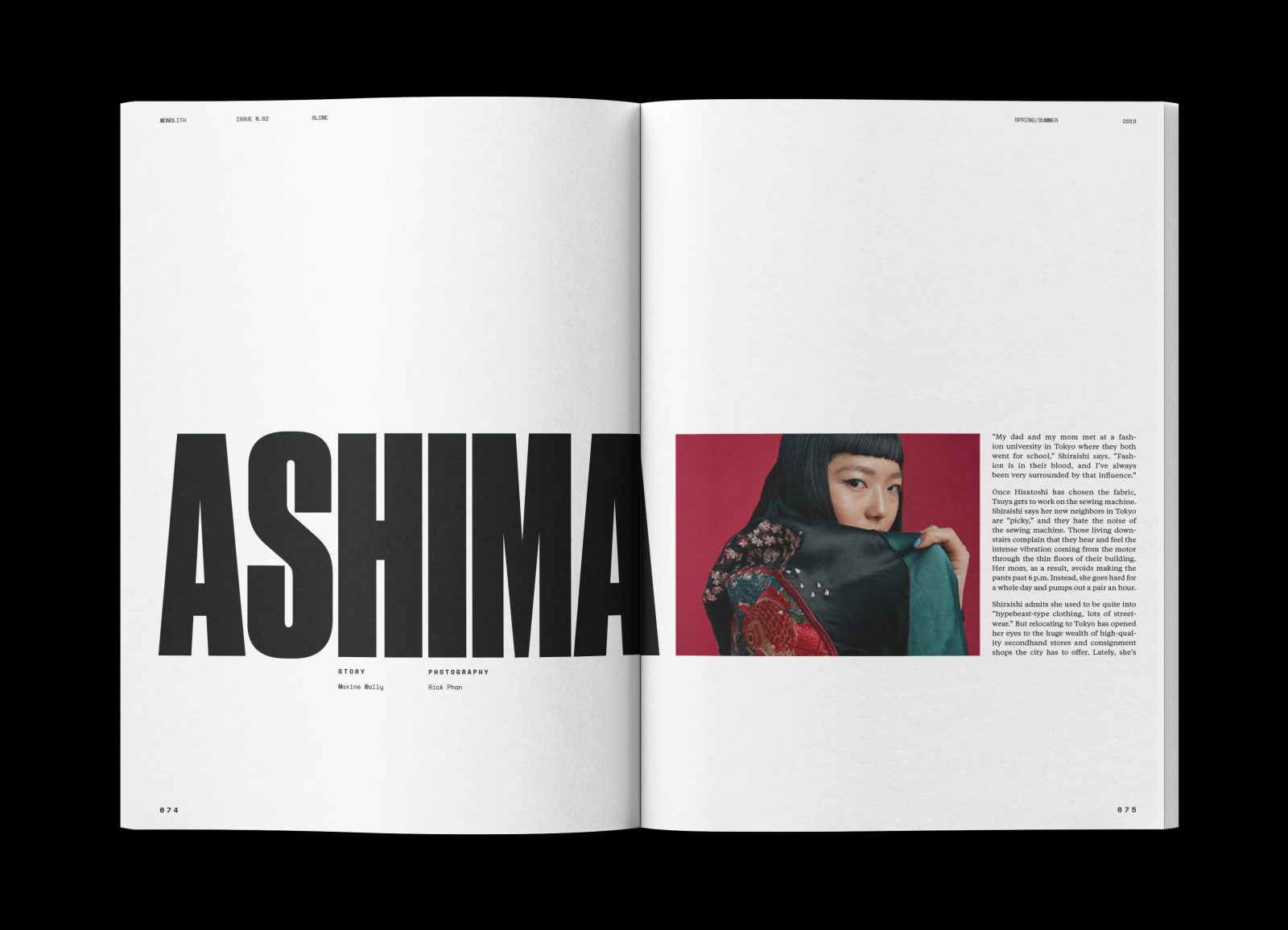
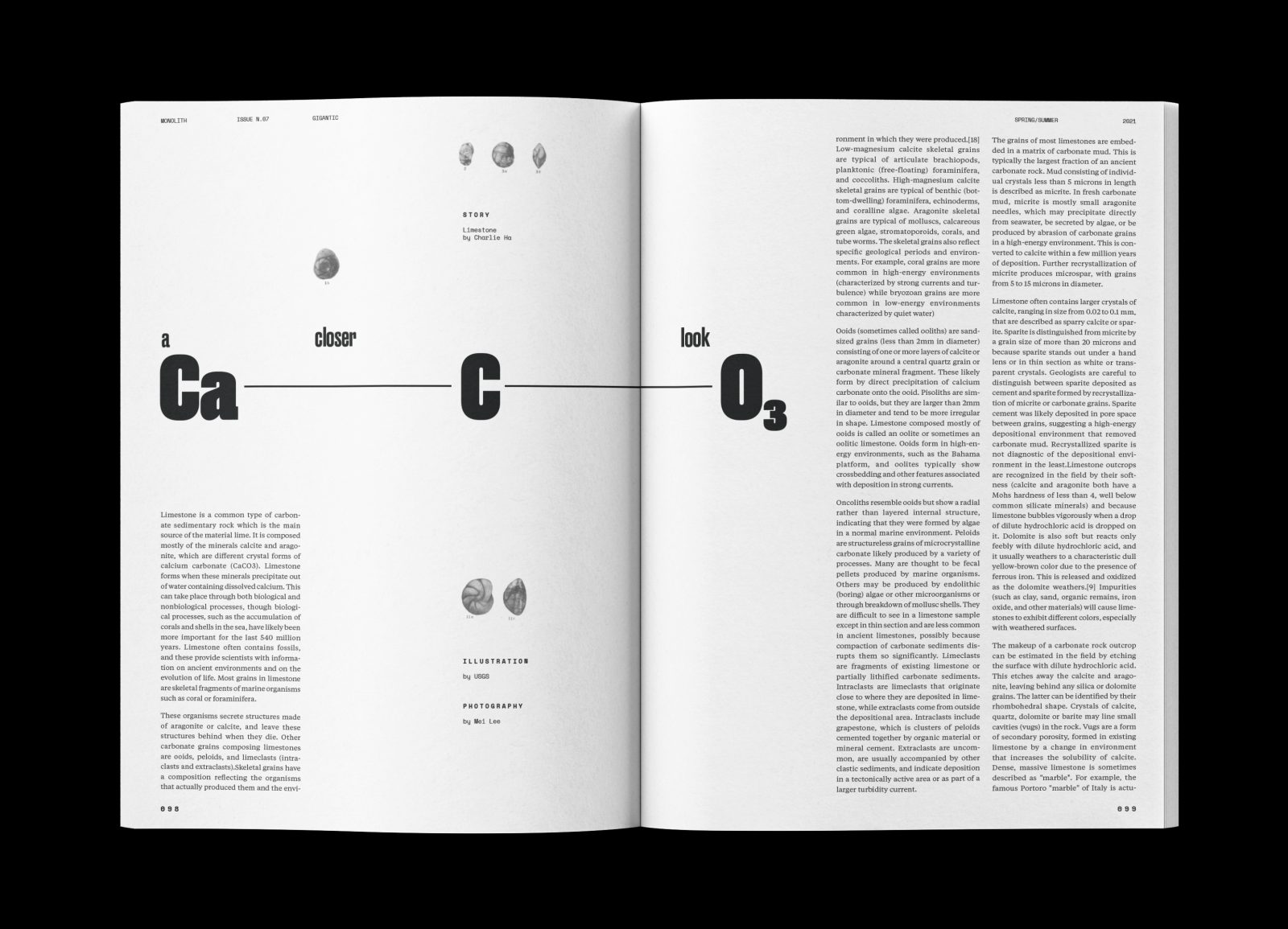
Interior spreads make use of the Druk typeface’s ultra condensed forms, highlighting the verticality of climbing photography and giving headlines a lot of weight. This is paired with Tiempos, a reliable serif with strong readability, and Space Mono, a crisp monospace that gives a technical look to labels and subheads. Each page is designed on a 6 column grid, providing a rational framework for the magazine with plenty of flexibility. The table of contents takes a bold approach by removing imagery, drawing focus to headlines and page numbers. White space is ample throughout interior layouts, giving the magazine a sophisticated appearance with plenty of variation. Article content also includes equipment reviews, materials, and the science behind the sport, playing to the reader’s obsession with important details of climbing. These articles use cut out images and stark visual aids that help support critical information.
CREDIT
- Agency/Creative: Jonathan Welch
- Article Title: Monolith Graphic Design for Publication
- Organisation/Entity: Student
- Project Type: Graphic
- Project Status: Non Published
- Agency/Creative Country: United States of America
- Agency/Creative City: San Diego
- Industry: Mass Media
- Keywords: WBDS Student Design Awards 2022/23
-
Credits:
Educational Institution : San Diego City College - Sean Bacon and Bradford Prairie - Graphic Design
