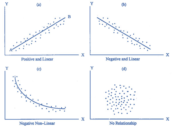
The Scatter Diagram
A scatter diagram is a graphic picture of the sample data. Suppose a random sample of n pairs of observations has the values $$\left( {{X_1},{Y_1}} \right),\left( {{X_2},{Y_2}} \right),\left( {{X_3},{Y_3}} \right), \ldots ,\left( {{X_n},{Y_n}} \right)$$. These points are plotted on a rectangular co-ordinate system putting the independent variable on the $$X$$-axis and the dependent variable on the $$Y$$-axis. No matter what the independent variable is, it must be placed on the $$X$$-axis.
Suppose the plotted points are as shown in figure (a). Such a diagram is called a scatter diagram. In this figure, we see that when $$X$$ has a small value $$Y$$ is also small, and when $$X$$ has a large value $$Y$$ also has a large value. This is called a direct or positive relationship between $$X$$ and $$Y$$. The plotted points cluster around a straight line. It appears that if a straight line is drawn passing through the points, the line will be a good approximation to represent the original data.
Suppose we draw a line $$AB$$ to represent the scattered points. The line $$AB$$ rises from left to right and has a positive slope. This line can be used to establish an approximate relation between the random variable $$Y$$ and the independent variable $$X$$. It is a nonmathematical method in the sense that different people may draw different lines. This line is called the regression line obtained by inspection or judgment.

Making a scatter diagram and drawing a line or curve is the primary investigation to assess the type of relationship between the variables. The knowledge gained from the scatter diagram can be used for further analysis of the data. In most of the cases, the diagrams are not as simple as in figure (a). There are quite complicated diagrams and it is difficult to choose a proper mathematical model to represent the original data. The scatter diagram gives an indication of the appropriate model which should be used for further analysis with the help of the method of least squares.
Figure (b) shows that the points in the scatter diagram are falling from the top left corner to the right. This is a relation called inverse or indirect. The points are in the neighborhood of a certain line called the regression line.
As long as the scattered points show closeness to a straight line in some direction, we draw a straight line to represent the sample data. But when the points do not lie around a straight line, we do not draw the regression line. Figure (c) shows that the plotted points have a tendency to fall from left to right in the form of a curve. This is a relation called non-linear or curvilinear. Figure (d) shows points which apparently do not follow any pattern. If $$X$$ has a small value, $$Y$$ may have a small or large value. There seems to be no relationship between $$X$$ and $$Y$$. Such a diagram suggests that there is no relationship between the two variables.